The network for creativity
Join 1.25M professional creatives like you
Connect with clients, get discovered, and run your business 100% commission-free
Creatives on Contra have earned over $150M and we are just getting started
Back to feedPost

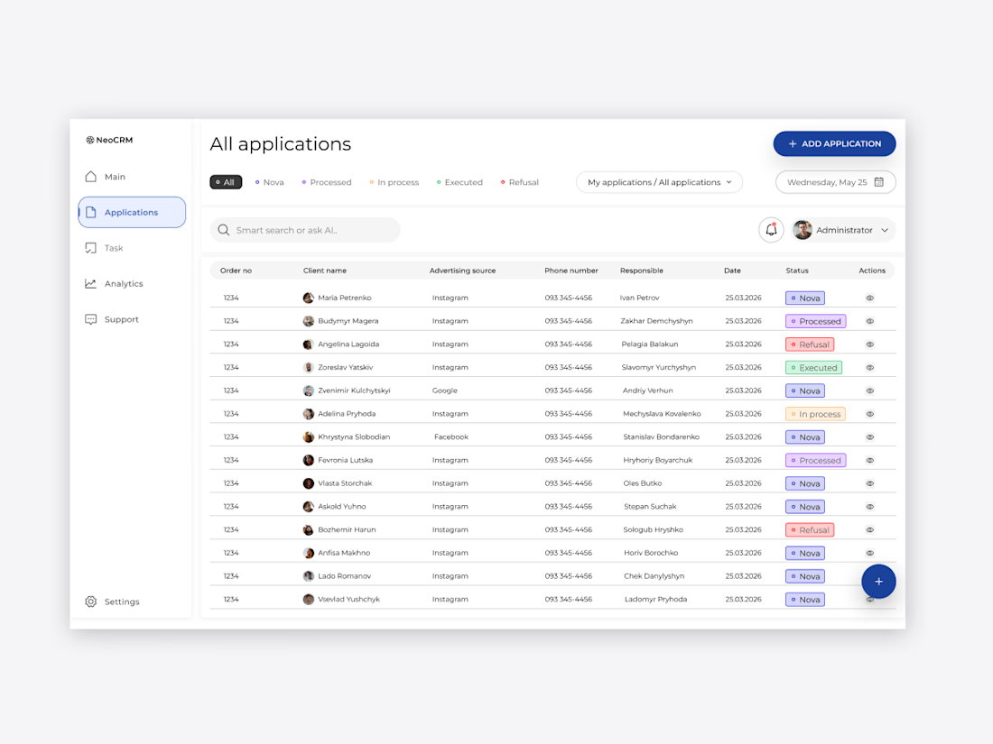
NeoCRM: B2B Dashboard Interface Design
I designed a clean and efficient CRM dashboard focused on the B2B sector. The main goal was to create a seamless user flow for processing daily applications with high precision.
Key features of this update:
Visual Hierarchy: Improved status indicators and priority alerts for better focus.
Consistency: Unified corner radius and spacing for a premium minimalist look.
User Experience: Integrated quick action shortcuts to reduce time-on-task.
Built with a focus on 'dev-ready' quality and Swiss-style aesthetics


The network for creativity
Join 1.25M professional creatives like you
Connect with clients, get discovered, and run your business 100% commission-free
Creatives on Contra have earned over $150M and we are just getting started

Challenges
View all


Related posts



Luxury Fashion E-commerce Landing Page
A premium e-commerce website concept created for a modern luxury fashion brand. The experience focuses on elegant visuals, refined typography, and an intuitive shopping journey that reflects the brand's premium identity.
Project Goal💯
The objective was to design a sophisticated online shopping experience that combines visual storytelling with seamless product discovery. Every section was crafted to highlight the brand's quality, build trust, and encourage conversions while maintaining a clean, minimal aesthetic.


Stunning work

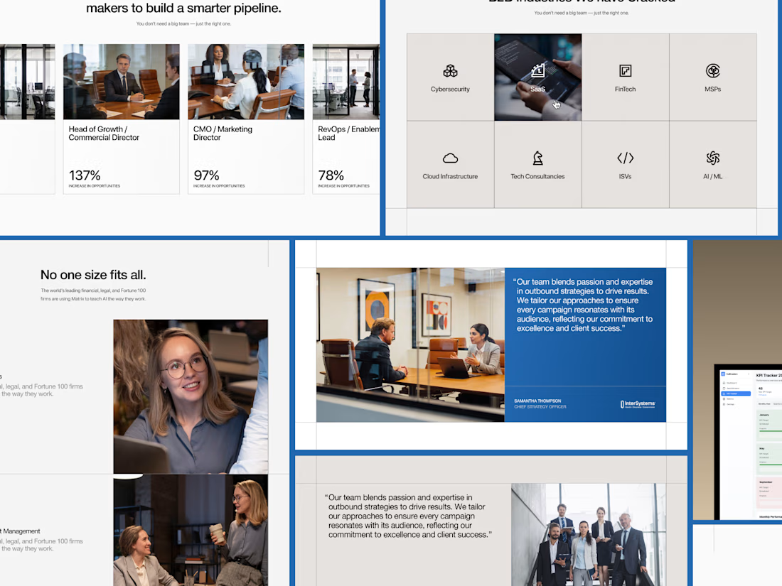
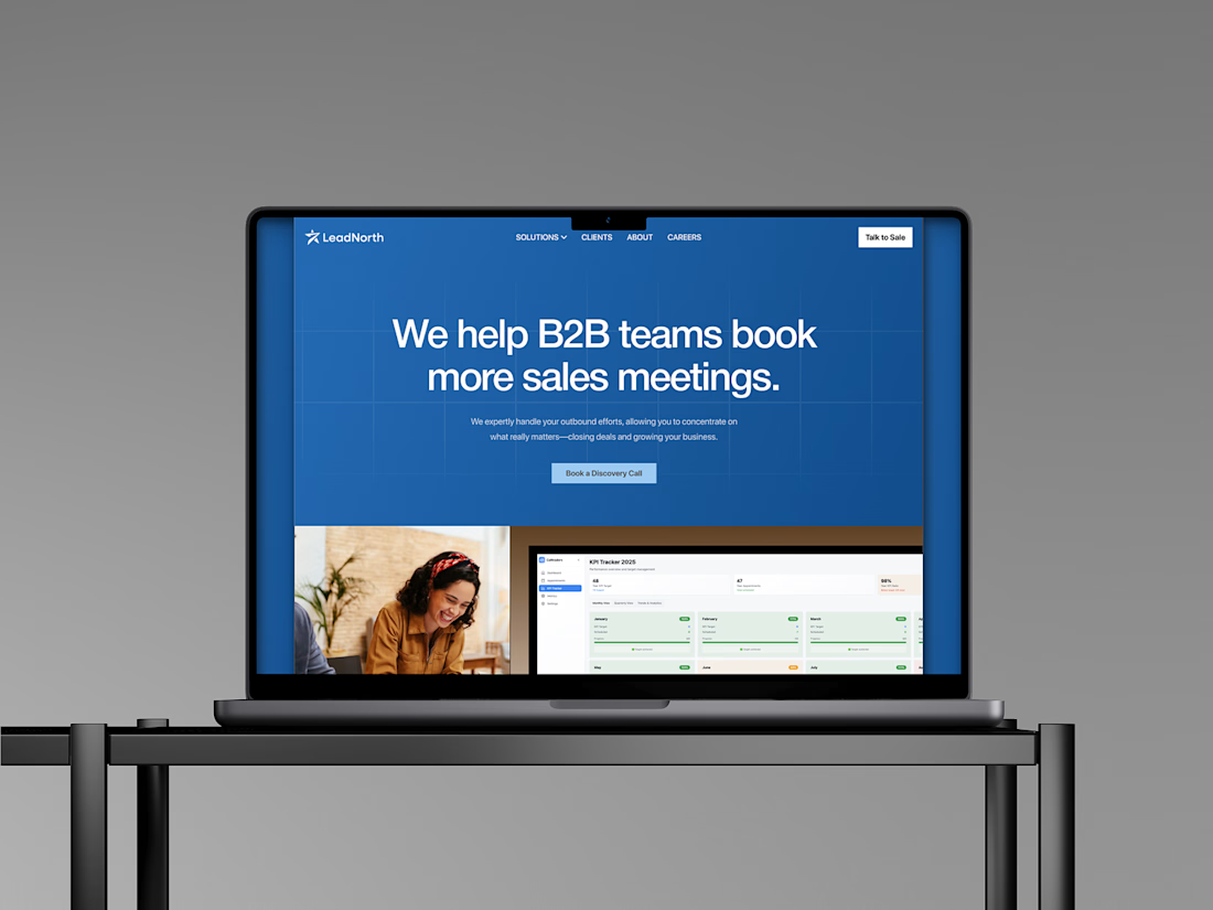
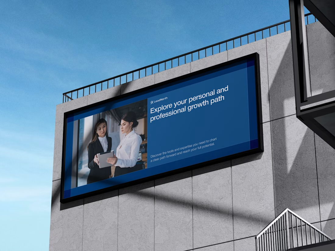
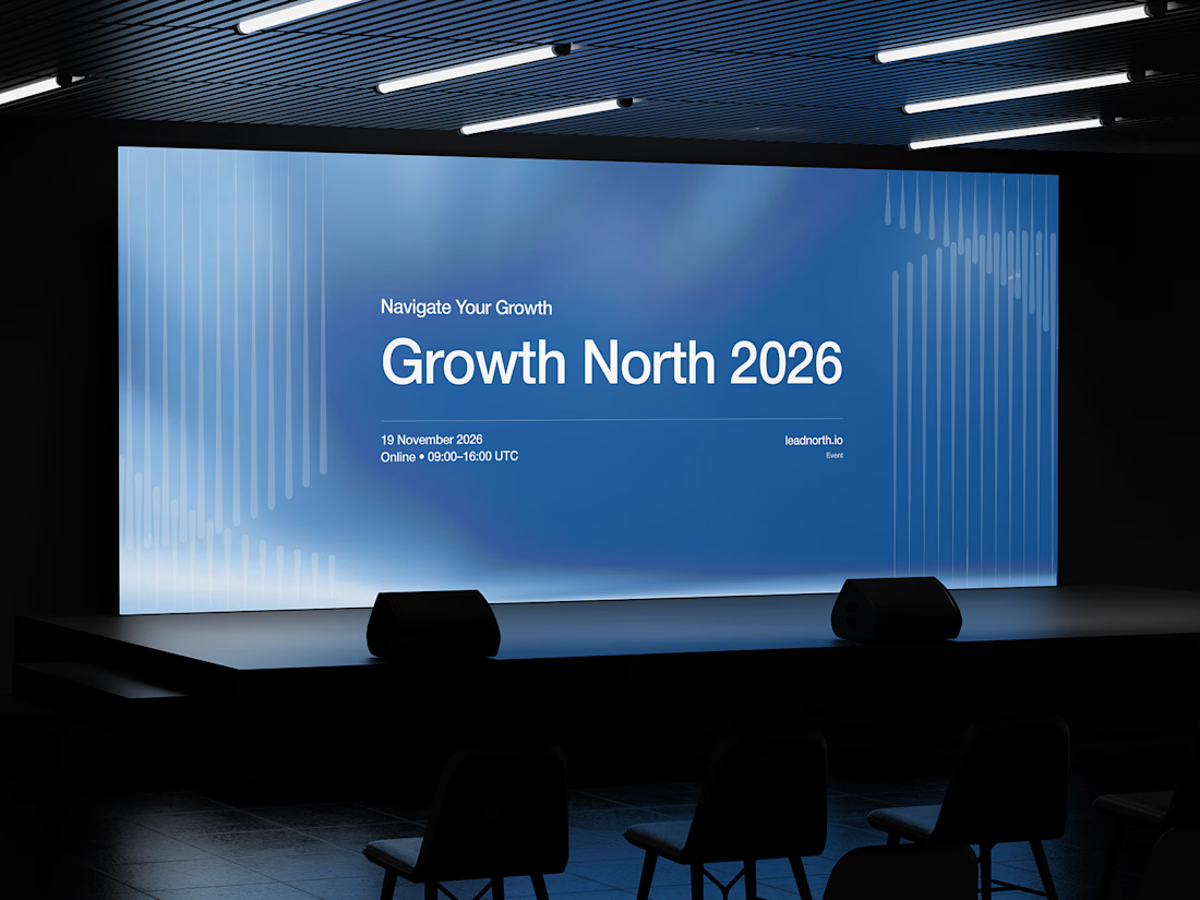


That saturated cobalt blue carries cleanly from the laptop hero onto the outdoor billboard and the Growth North 2026 stage screen.