The network for creativity
Join 1.25M professional creatives like you
Connect with clients, get discovered, and run your business 100% commission-free
Creatives on Contra have earned over $150M and we are just getting started
Back to feedPost

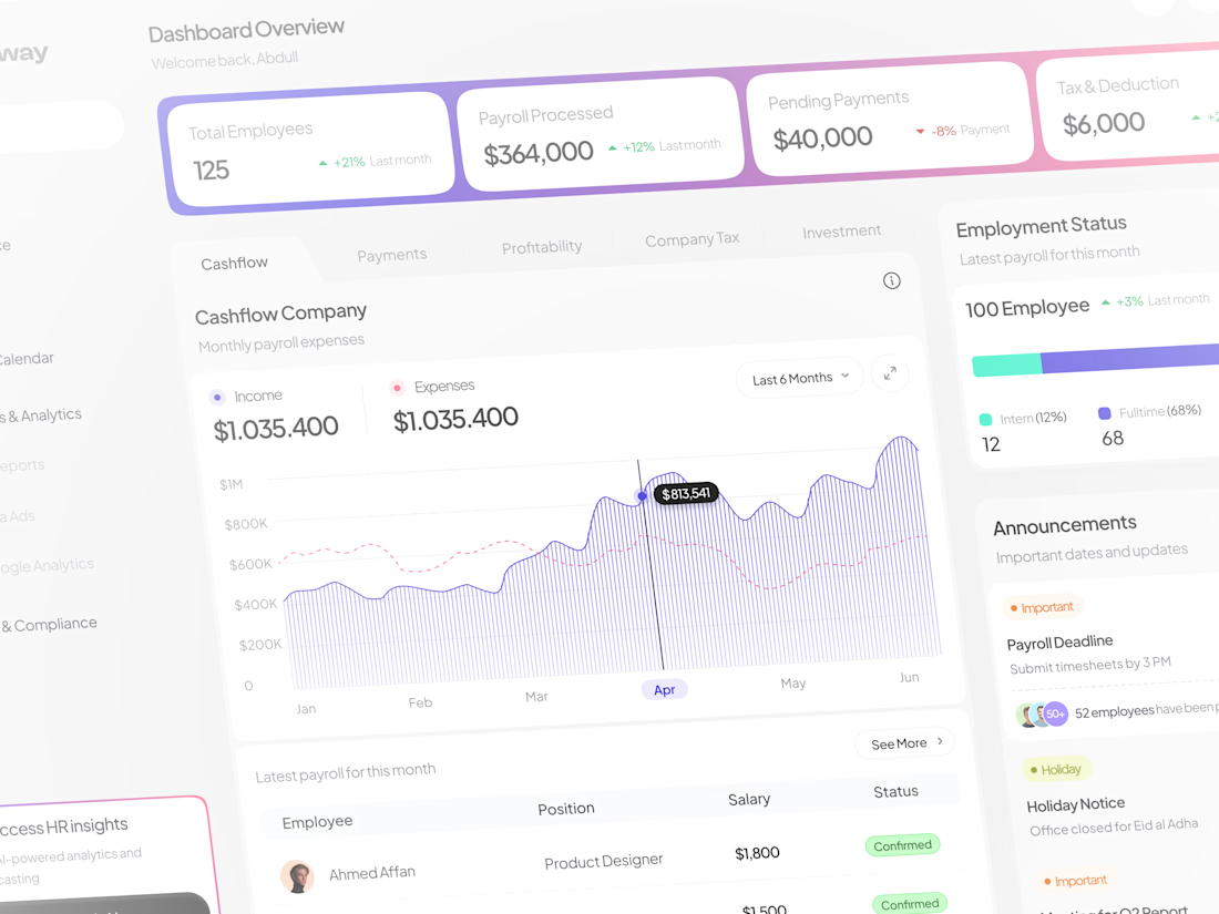
Every HR dashboard makes the same mistake: drowning users in pretty charts instead of scannable, actionable data.
I avoided it on the Ourasoway redesign. Here’s how.
🧵👇(1/5)
The final dashboard. Built around real-time cashflow visualization, instant status tracking, and 1-click payroll approvals—not complex menus.
(2/5)
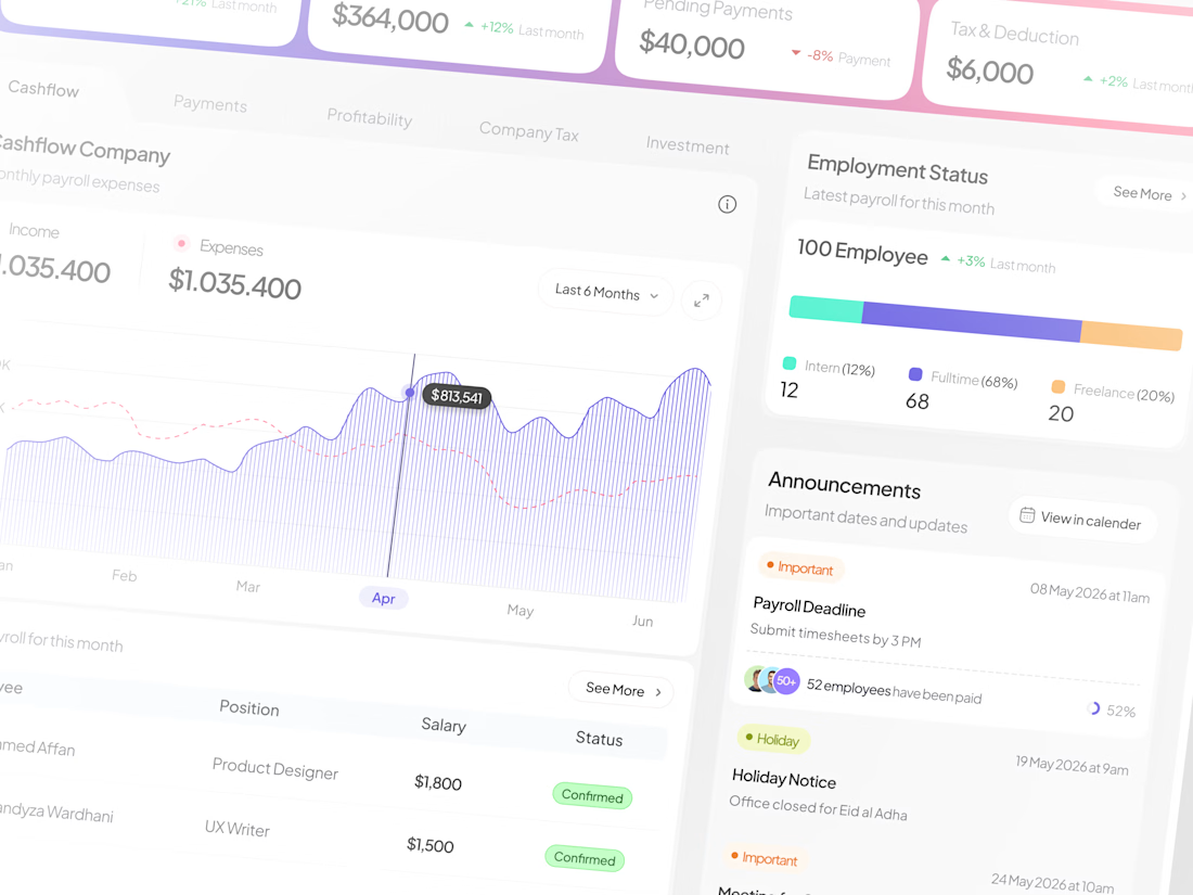
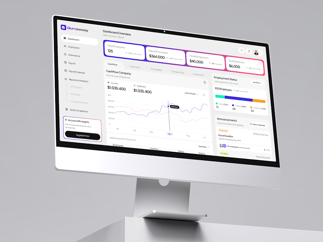
On real devices. Designed with clear data hierarchy so finance and HR teams can process monthly payroll in seconds without missing key metrics. (3/5)
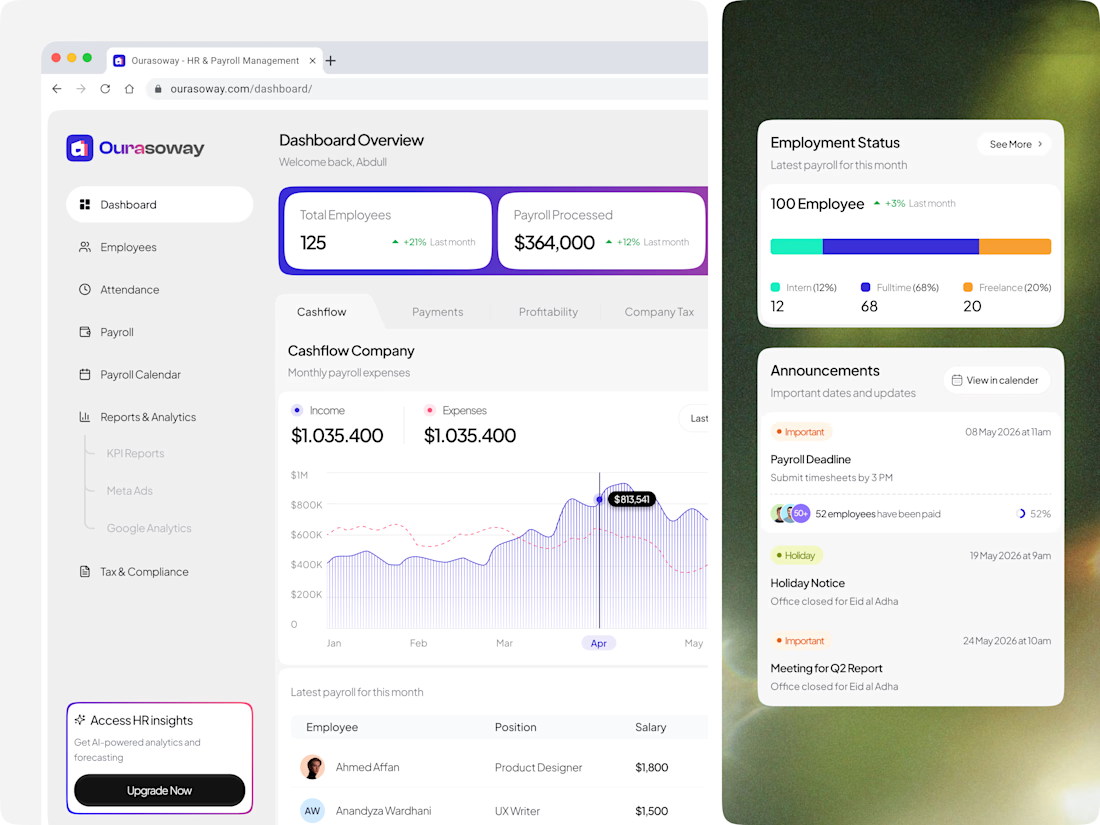
Brand system, applied. From dark UI analytics to modern light mode interfaces—maintaining one seamless visual identity across all operations. (4/5)
Full case study on Behance: https://behance.net/gallery/253113247/OuraSoway-Dashboard-for-Managing-employee-workforce
Working on a SaaS dashboard or HR tech app? Please do reach me! Dms are open!
(5/5)
The network for creativity
Join 1.25M professional creatives like you
Connect with clients, get discovered, and run your business 100% commission-free
Creatives on Contra have earned over $150M and we are just getting started
Challenges
View all


Related posts

little late to #FigmaMotion...was busy with Claude 😅... and of course the concept had to do something about data privacy in #femtech
btw, i changed the visual story many times...I know I could still make the transitions smoother, but let's call it a day.


The cycle calendar and feeling picker make the privacy story feel lived-in, not abstract. The pink frame holding those small checks is what makes the motion worth the extra passes.

Built a “living” AI mascot dashboard in a day. No code.
Already working:
Mascot reacts to your cursor before you even click
6+ animated interaction states
Live stat UI (streaks, energy %, session tracking)
Fully generated, fully animated, Blender, Three Js.


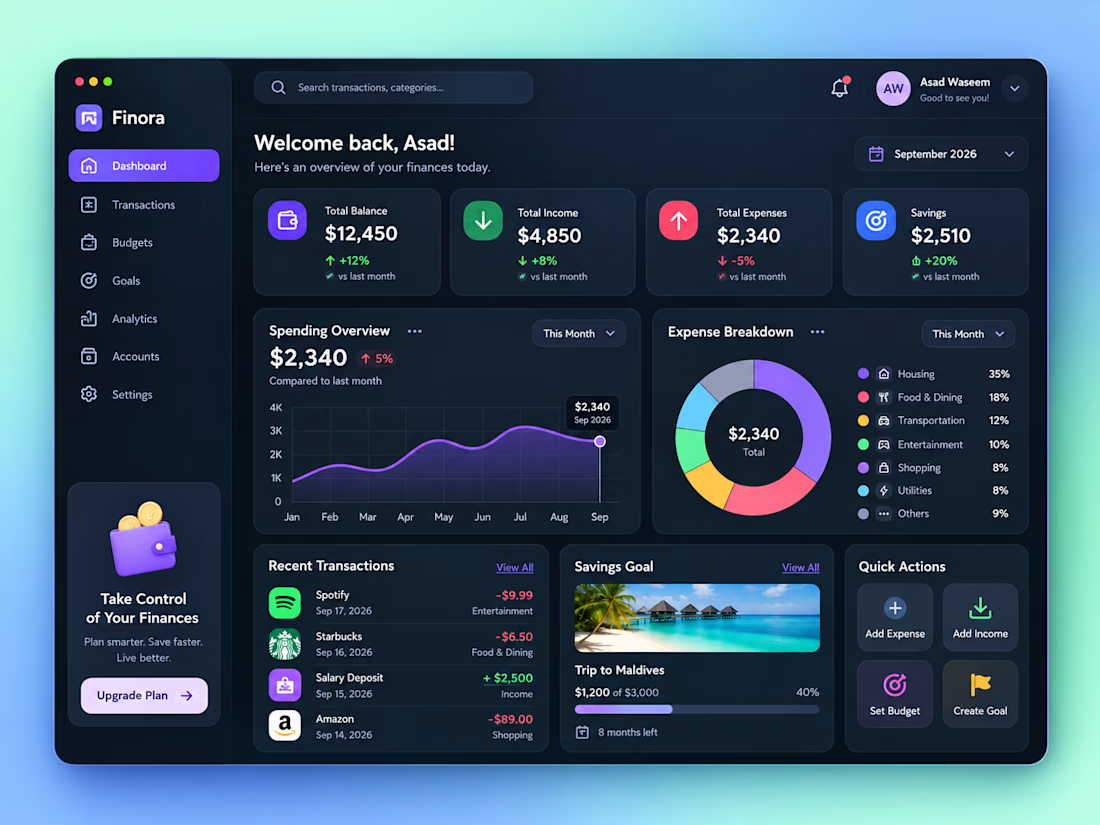
Personal Finance Dashboard UI/UX Design
Designed a modern Personal Finance Dashboard UI/UX, focused on making financial management simple, clear, and visually engaging.
The dashboard includes financial overview cards, income and expense tracking, spending analytics, expense breakdown, recent transactions, savings goals, budgets, accounts, and quick actions.
The dark-mode interface combines a clean layout, modern typography, subtle shadows, gradient background, rounded cards, and vibrant accent colors to create a premium SaaS dashboard experience.

How did you prioritize the financial overview over the deeper analytics?