The network for creativity
Join 1.25M professional creatives like you
Connect with clients, get discovered, and run your business 100% commission-free
Creatives on Contra have earned over $150M and we are just getting started
Back to feedPost

Not every AI company needs to look like an AI company.
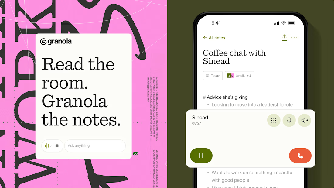
One of my favourite recent examples is Granola's identity by Ragged Edge.
Instead of gradients, glowing orbs, and futuristic interfaces, they went with an imperfect hand-drawn logo, earthy colours, and a custom typeface based on the founder's actual handwriting.
And somehow, that makes the product feel much more approachable.
I think this is a good reminder that branding isn't about visually fitting into your industry. Sometimes the strongest decision is to look completely different from everyone else in it.
Especially in AI, where so many products are starting to look interchangeable.
The network for creativity
Join 1.25M professional creatives like you
Connect with clients, get discovered, and run your business 100% commission-free
Creatives on Contra have earned over $150M and we are just getting started
Related posts


Motion Design without AI, what do you think?
This is a short self-promo video showcasing our approach to motion design and how I help brands present their products in a more engaging way.
It’s always a good reminder that we should invest in our own brands just as much as we do in our clients.


Proof that human taste and frame by frame intention still beat generative video every single time. Did you plan the entire script upfront in Figma?


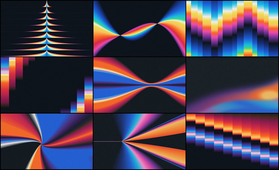
We designed the visual identity for an early-stage studio that helps AI companies adapt one product story for different audiences and channels.
Its positioning was already defined. Our job was to make it visible.
The organizing idea was refraction: one source opening into multiple expressions.
Rays expand from a shared point. Color fields stretch, compress and change direction, which gives a still image a sense of movement.
If your brand needs a lot of variety, decide first what every variation stays connected to.

I’m Juan Carlos, I run Oragus from Santiago, Chile. I design the brand and the interface, and I build the thing that goes live. AI sits in my process, not just in my portfolio, so clients see working screens in week one instead of static mockups in week three.
Recent work: AI product design, a bank’s innovation lab, and brand and jersey design for cycling expeditions in Patagonia.
Open to new projects.


Bold type works here.