The network for creativity
Join 1.25M professional creatives like you
Connect with clients, get discovered, and run your business 100% commission-free
Creatives on Contra have earned over $150M and we are just getting started
Back to feedPost

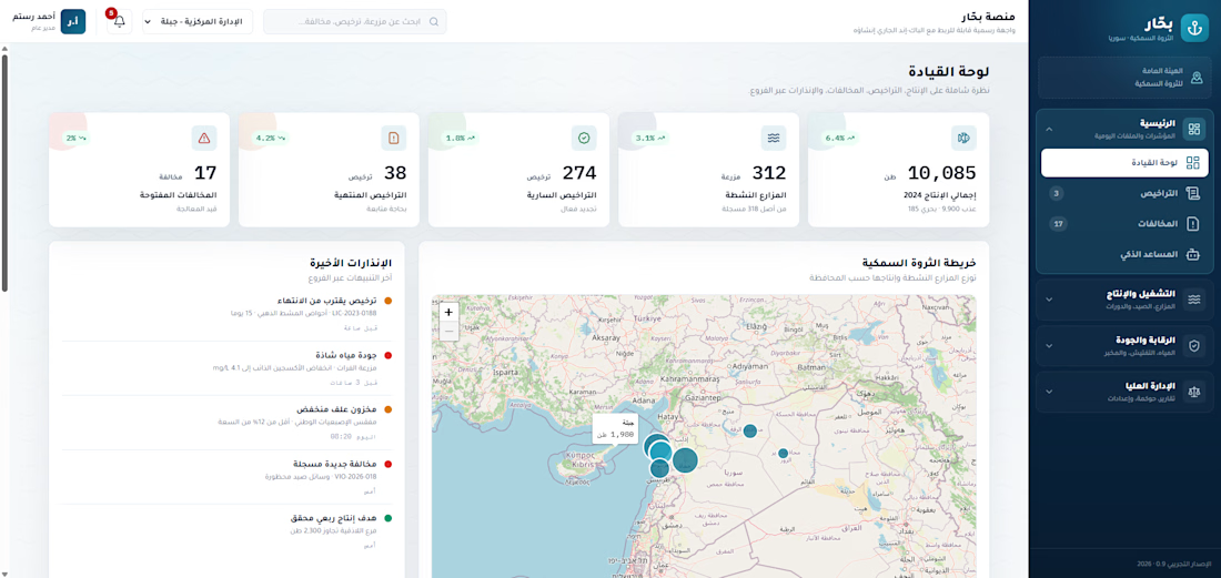
A digital management system for modernizing fisheries operations — from catch tracking to licensing and oversight.
Short description:
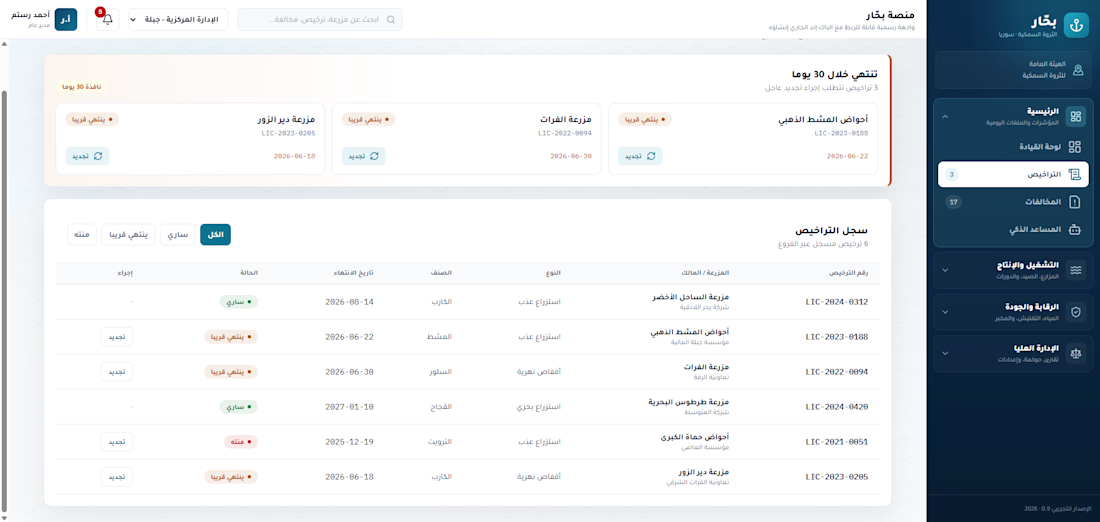
A fisheries management platform built to bring an entire sector online: digitizing vessel and license registration, tracking catch data, and giving regulators a clear operational picture of activity across the industry.
short (Case Study):
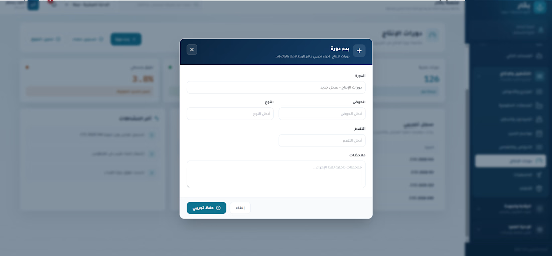
This is an MVP for a fisheries management system, designed for a government pitch to modernize how the sector is tracked and regulated. It digitizes the core workflows of the industry — vessel and operator registration, licensing, and catch reporting — and surfaces that data in a dashboard built for regulatory oversight.
The aim was to replace fragmented, paper-based processes with a single source of truth: a system where licenses, vessels, and catch records live in one place, giving authorities both day-to-day operational control and the data needed for longer-term planning and sustainability decisions.

The network for creativity
Join 1.25M professional creatives like you
Connect with clients, get discovered, and run your business 100% commission-free
Creatives on Contra have earned over $150M and we are just getting started
Challenges
View all


Related posts


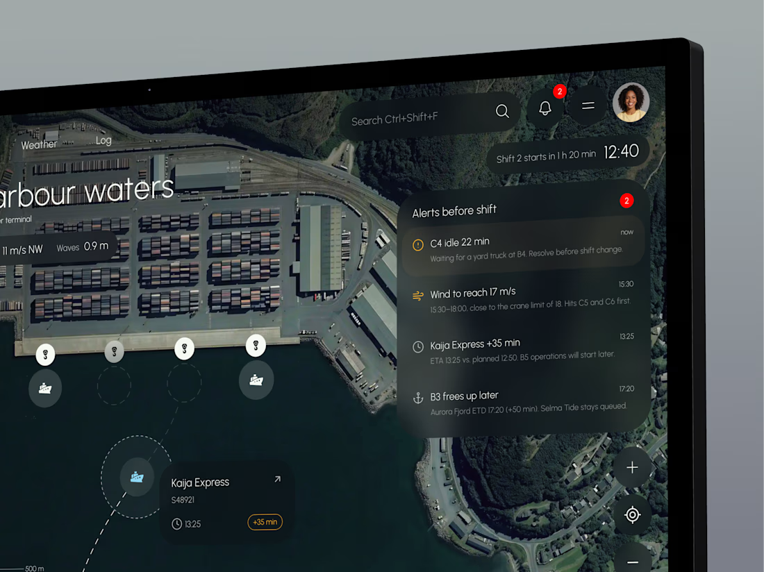
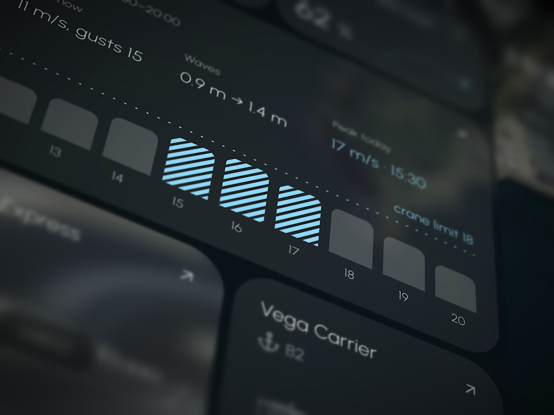
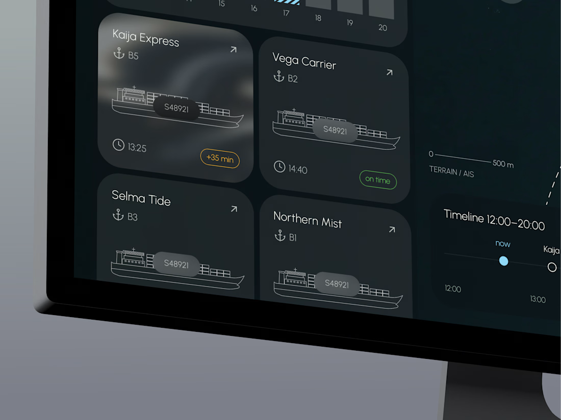
TideGrid – one view of the whole port
Port teams track berths, cranes, vessel ETAs and weather in separate systems, so delays and idle time are often spotted too late.
TideGrid brings everything onto one map. Each vessel shows its ETA, each crane its load, and each berth its occupancy, with wind and waves right beside them. Alerts appear before the shift starts. It runs on existing AIS, crane and sensor data, with a desktop console for operators and a mobile app for foremen on the quay.




AI Plant Care & Disease Detection Mobile App Design
An AI-powered Plant Health Monitoring mobile app designed to help users identify plant diseases, track plant health, monitor environmental conditions, and receive personalized care recommendations. The app combines intelligent diagnostics, smart reminders, and real-time health insights to make plant care simple, proactive, and accessible for both home gardeners and plant enthusiasts.

Premium and eye catching work

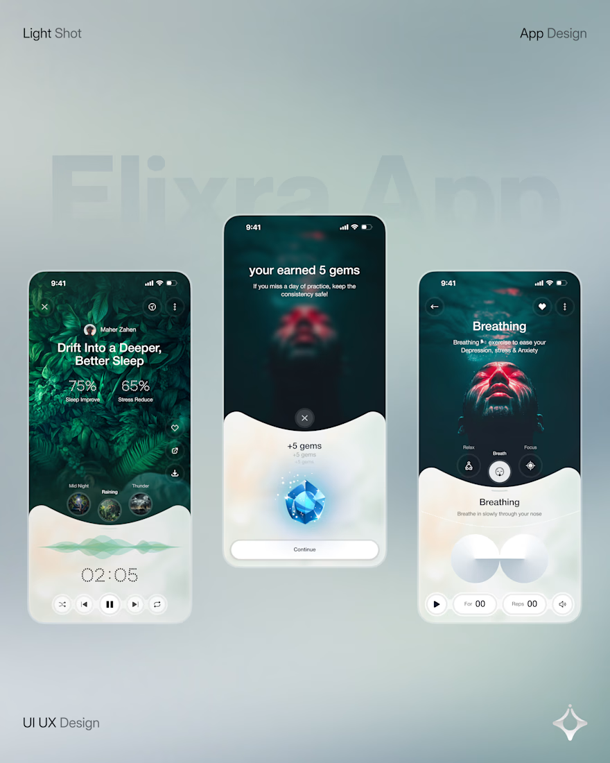
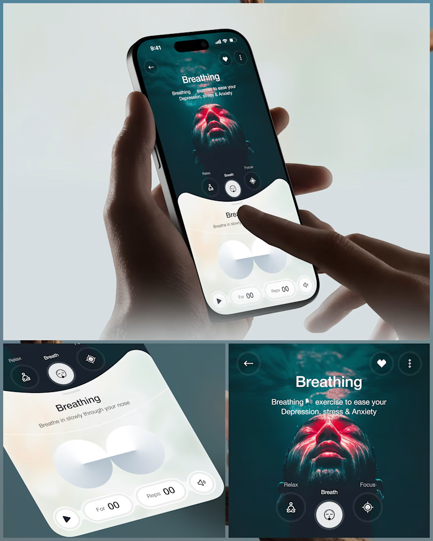
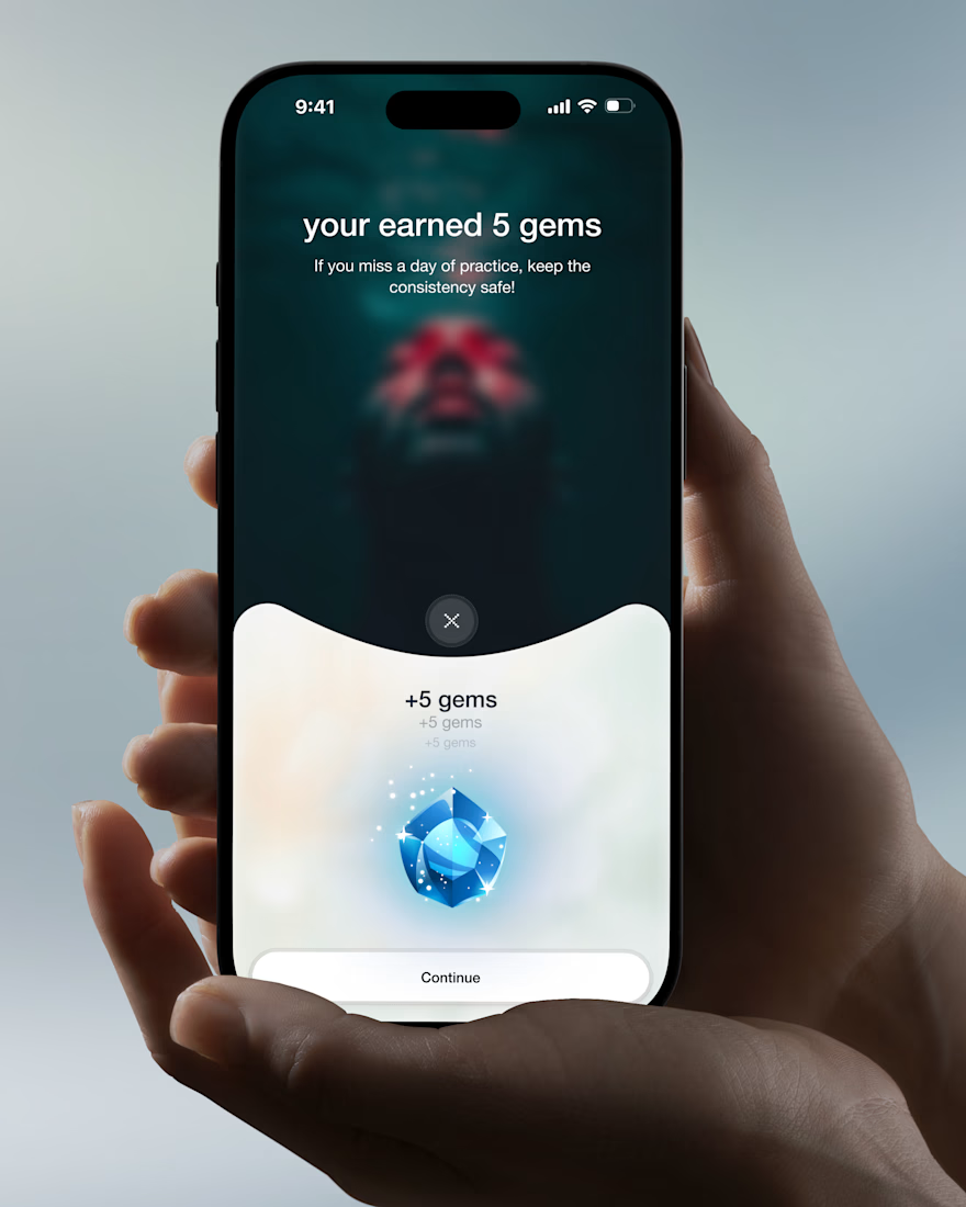
Wellness shouldn’t feel like another task on your to do list.
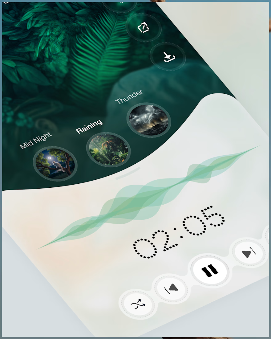
Elixra turns breathing, sleep, and mindful routines into an immersive digital experience through cinematic visuals, soft interactions, and rewarding micro moments.
What if wellness felt like this?



Love the soft interactions and micro moments idea. The cinematic approach makes wellness feel calm, not clinical.