The network for creativity
Join 1.25M professional creatives like you
Connect with clients, get discovered, and run your business 100% commission-free
Creatives on Contra have earned over $150M and we are just getting started
Back to feedPost

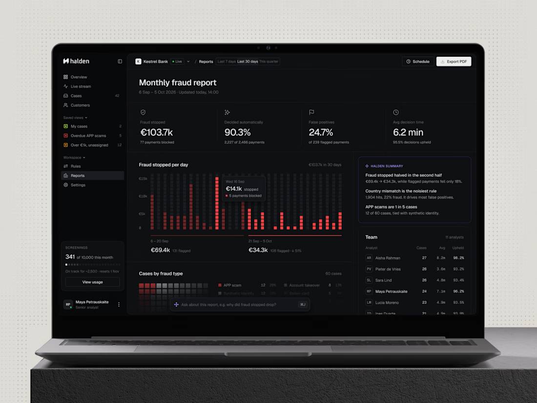
The monthly report is the screen a bank's leadership actually reads, so in Halden it got the same care as the main dashboard: one look should tell you if it's working. One of my favourite screens to design.
The network for creativity
Join 1.25M professional creatives like you
Connect with clients, get discovered, and run your business 100% commission-free
Creatives on Contra have earned over $150M and we are just getting started





Related posts



Super clean work!

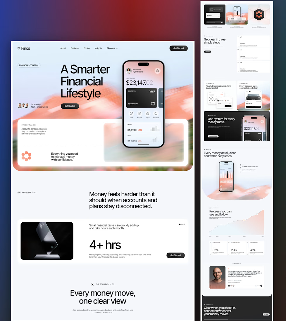
Home page for Finos, a personal finance app template. Before it shows a single feature it spends a whole section on the problem, numbered 01, with one big "4+ hrs" stat, and only then gets to the solution as 02.
Curious if anyone still does problem first on a landing page or if that feels dated now.

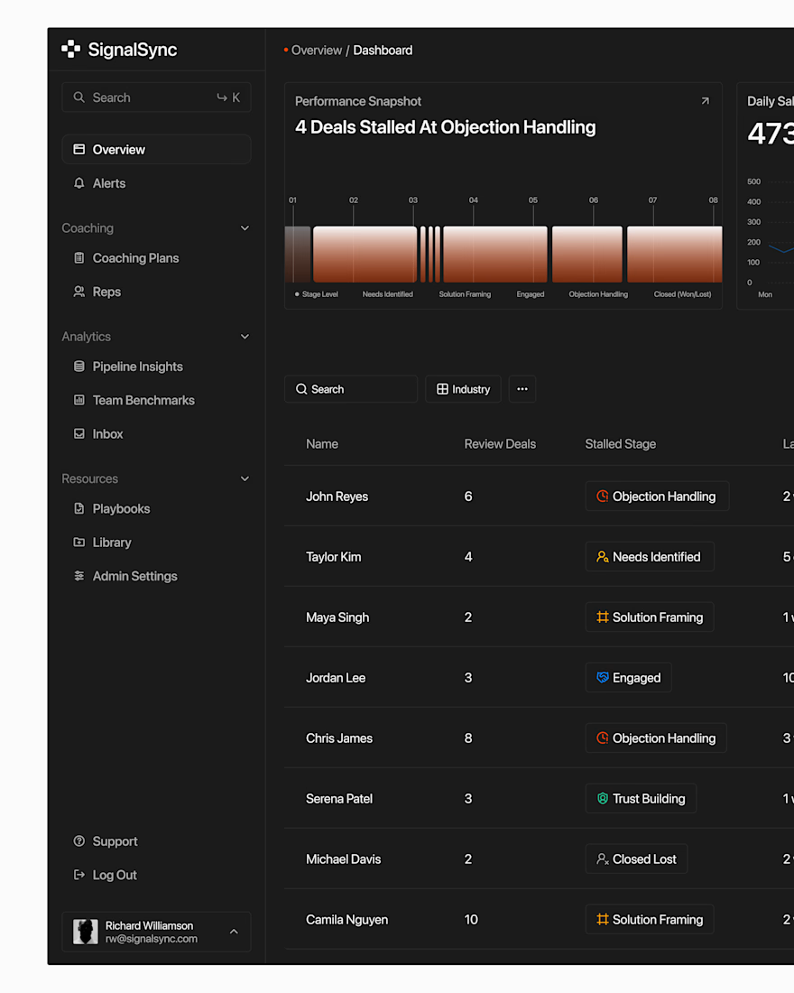
Great visual hierarchy.

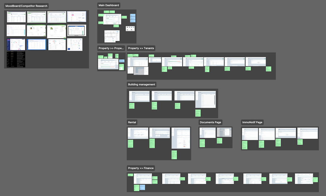
UX Audit: ImmoAdmin (Property Management SaaS)
-> UX issues mapped with improvement notes
-> Competitor research & mood board
-> 8 modules audited screen by screen
-> Wireframes with cleaner flows

Really thoughtful approach to simplifying complex SaaS flows. 👏