The network for creativity
Join 1.25M professional creatives like you
Connect with clients, get discovered, and run your business 100% commission-free
Creatives on Contra have earned over $150M and we are just getting started
Back to feedPost


The network for creativity
Join 1.25M professional creatives like you
Connect with clients, get discovered, and run your business 100% commission-free
Creatives on Contra have earned over $150M and we are just getting started











Related posts


EarthHub – A Platform for Nature Expeditions ⛰️
Stumbled upon this project in my hard drive, had to publish!


Top to bottom nice work

Designing a fragrance website with 2 sections that feels as premium as the product.
Built a fragrance experience where the product takes center stage.
I wanted the website to feel as refined as the fragrances themselves minimal layout, strong typography, immersive product visuals, and subtle interactions that make exploring each scent feel premium.
The goal wasn’t to fill the page with elements, but to give every product enough space to create its own presence.
Built with Next.js, with a focus on responsive design, smooth interactions, and a polished browsing experience.


The product imagery is doing most of the work here. Did you use art-directed mobile crops, or keep one image with a different object position? That can preserve label detail without loading the full desktop asset.

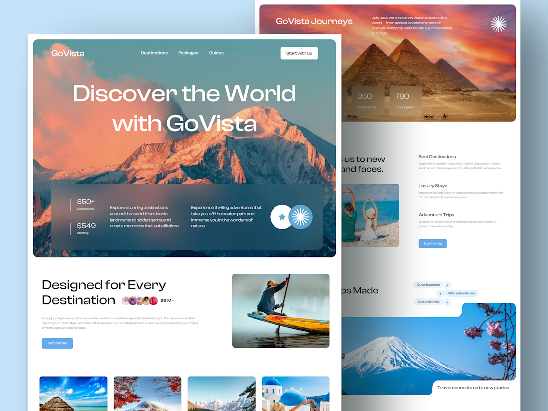
GoVista Journeys - A travel landing page designed to make people dream of their next destination.
A travel company based in Leicester, UK, needed a visually engaging landing page to showcase its destinations and travel experiences while its larger website was being prepared.
The goal was simple: make a strong first impression through beautiful travel imagery, a clean layout, and a design that makes people want to explore more.
Because in travel, the journey can begin long before the booking. ✈️
What catches your attention first on a travel website: the images, the destinations, or the overall design? 👇


I like this very much, very good concept