The network for creativity
Join 1.25M professional creatives like you
Connect with clients, get discovered, and run your business 100% commission-free
Creatives on Contra have earned over $150M and we are just getting started
Back to feedPost


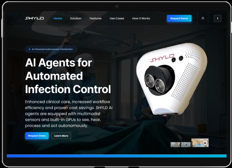
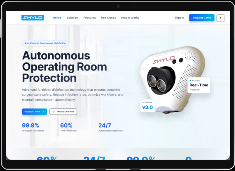
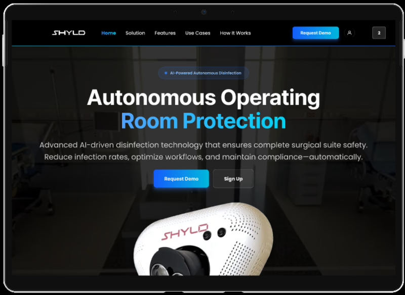
SHYLD Website Design – Autonomous Infection Control & Healthcare Technology Platform
- Project Overview
SHYLD is an innovative healthcare technology platform focused on autonomous infection prevention and operating room protection. The project involved designing a modern, enterprise-grade website that communicates complex healthcare technology in a clear, visually engaging, and conversion-focused manner. The design highlights SHYLD's AI-powered disinfection solution while emphasizing product innovation, clinical efficiency, and healthcare safety.
- Design Goal
The objective was to create a professional healthcare technology website that effectively showcases SHYLD's autonomous infection control solution, educates healthcare professionals about its benefits, and drives product demonstrations through a clear and engaging user journey.
- Design Process
The project started with information architecture planning, user journey mapping, and content hierarchy definition to simplify complex technical messaging. Multiple design explorations were created, including light and dark theme variations, allowing stakeholders to evaluate different visual directions before finalizing the user experience and interface design.
- UI/UX Approach
The design combines modern SaaS design principles with healthcare-focused visual language. Large typography, product-focused hero sections, data-driven content blocks, and strategic call-to-action placement were used to communicate trust, innovation, and clinical effectiveness. Special attention was given to readability, visual hierarchy, and conversion optimization throughout the website.
- Design Deliverables
Information Architecture
User Flow Design
Low-Fidelity Wireframes
High-Fidelity UI Design
Interactive Prototypes
Responsive Website Design
Design System & Component Library
Light & Dark Theme Exploration
Landing Page Experience Design
- Tools & Skills
Figma, UI Design, UX Design, Wireframing, Prototyping, Information Architecture, User Flow Design, Responsive Web Design, Design Systems, Interaction Design, Visual Design, Landing Page Design, SaaS Website Design, Conversion Optimization.
- Project Summary
The SHYLD website demonstrates a modern approach to healthcare technology design by combining strong visual storytelling, product-focused experiences, and conversion-driven user journeys. Through thoughtful UX strategy, scalable design systems, and polished interface design, the platform effectively communicates advanced infection control technology while maintaining clarity, trust, and usability for healthcare professionals.

The network for creativity
Join 1.25M professional creatives like you
Connect with clients, get discovered, and run your business 100% commission-free
Creatives on Contra have earned over $150M and we are just getting started







Related posts

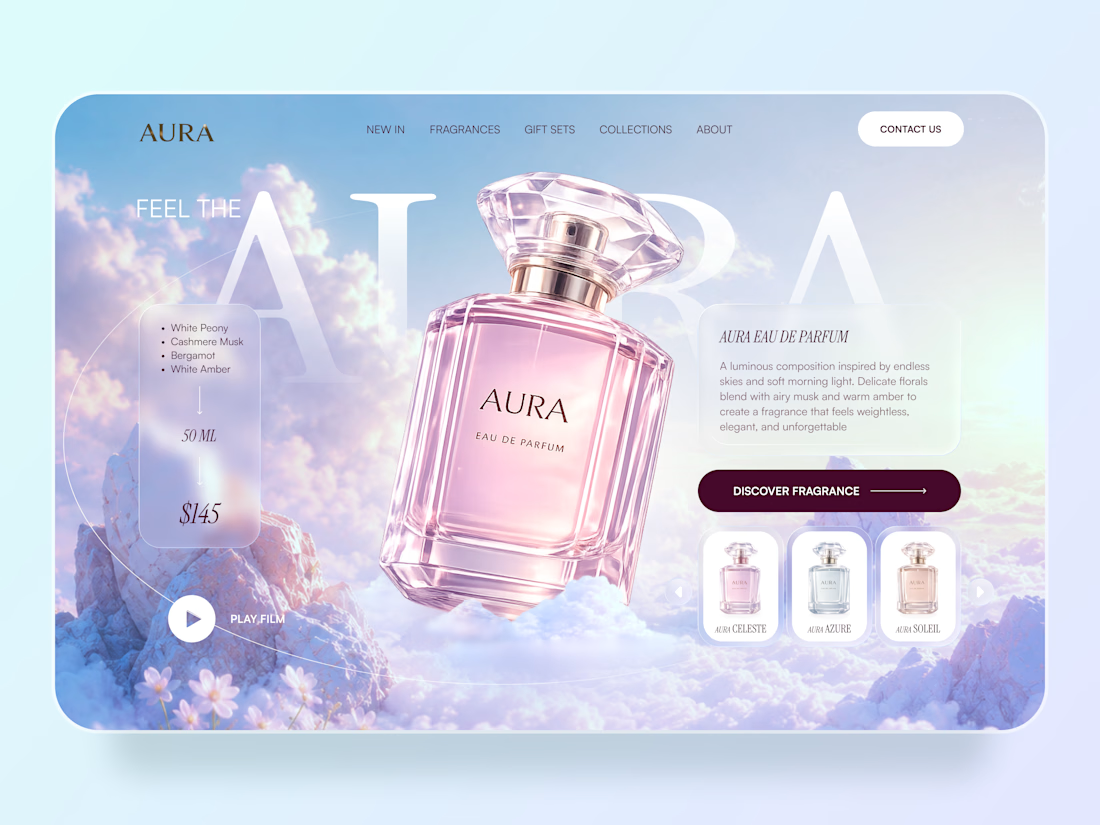
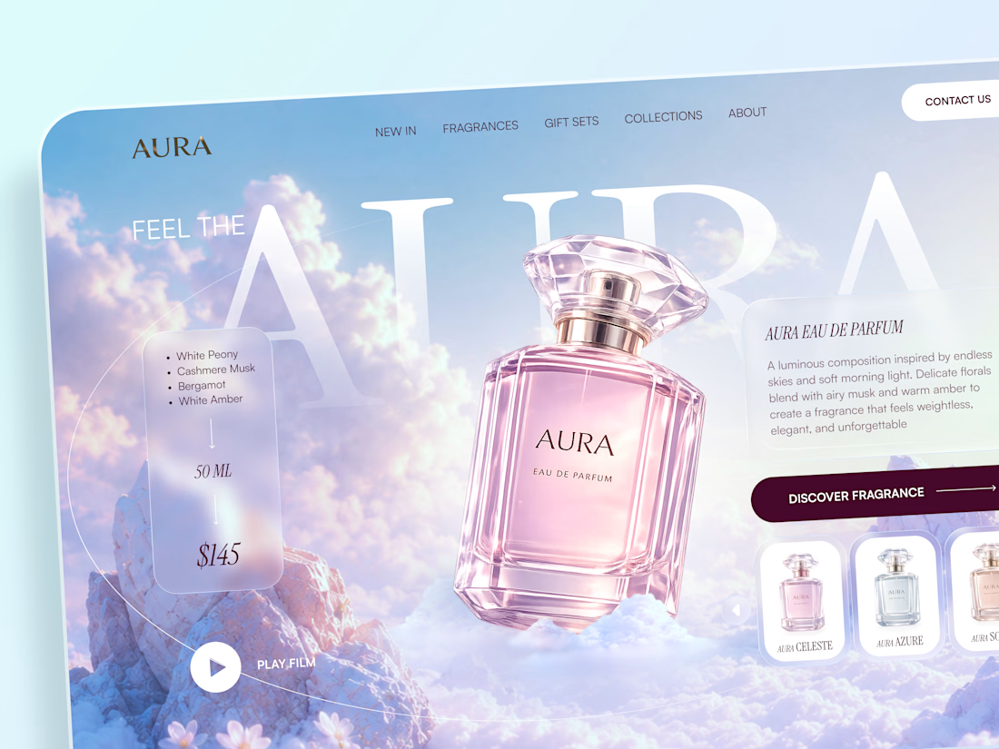
AURA — Luxury Fragrance Website 🌸✨
AURA is a luxury fragrance website concept built around softness, atmosphere, and product storytelling.
The goal was to make the perfume feel almost weightless — combining dreamy skies, delicate pastel tones, translucent UI elements, and an oversized product visual to create an emotional first impression.
Special attention was given to:
• a product-focused hero that makes the fragrance the main visual anchor
• soft glassmorphism cards for fragrance notes, pricing, and product details
• an airy pastel palette inspired by clouds, light, and floral notes
• elegant typography that adds a premium editorial feel
• a fragrance selector that introduces different scents without distracting from the hero
• clear product discovery and shopping actions
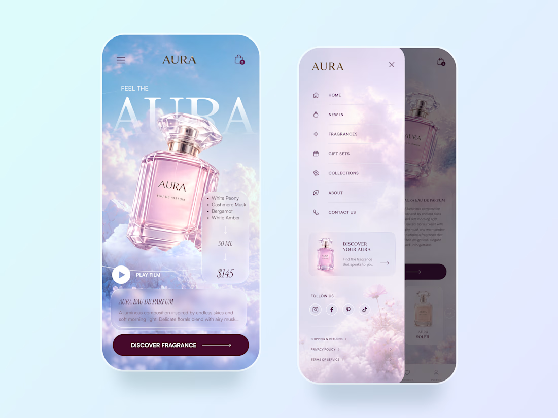
• a mobile experience that keeps the same immersive visual atmosphere
• a lightweight mobile menu with product discovery and social touchpoints
The result is a soft, premium digital experience that combines luxury storytelling with clear e-commerce functionality.
Looking to create a distinctive website for your beauty, fragrance, or lifestyle brand? Let’s create something memorable ✨



The typography fits the fragrance vibe perfectly 🌷


The hardest brief in identity work is "make us look serious without making us look corporate."
Serious comes from consistency. Corporate comes from removing anything a person chose.

"Corporate comes from removing anything a person chose" is going straight in my notes. I'd push it further though, I think a lot of that removal happens in legal and stakeholder review, not the initial design pass. Do you find the fight is more with the client's own instincts or with whoever signs off after them?