The network for creativity
Join 1.25M professional creatives like you
Connect with clients, get discovered, and run your business 100% commission-free
Creatives on Contra have earned over $150M and we are just getting started
Back to feedPost

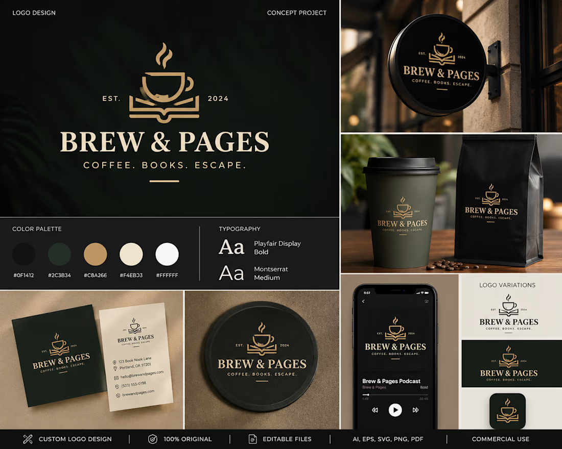
Brew & Pages — Brand Identity (Concept Project)
Industry: Coffee Shop & Bookstore
Brew & Pages is a concept branding project created to explore timeless logo design and cohesive visual identity for a modern café that blends specialty coffee with a love of books.
The goal was to develop a memorable brand system that feels warm, sophisticated, and instantly recognizable across both physical and digital touchpoints.
Deliverables
Primary logo
Secondary logo variations
Color palette
Typography system
Business card design
Coffee cup mockup
Product packaging
Store signage
Mobile app branding
Design Approach
The logo combines a coffee cup and an open book into a single minimalist symbol, creating an identity that communicates the brand's purpose in one memorable mark.
The overall visual language emphasizes elegance, simplicity, and scalability, ensuring consistency across packaging, signage, social media, and merchandise.
Services
Brand Identity • Logo Design • Visual Identity • Packaging • Print Design • Mockups


The network for creativity
Join 1.25M professional creatives like you
Connect with clients, get discovered, and run your business 100% commission-free
Creatives on Contra have earned over $150M and we are just getting started





Related posts

Nike × Champions League Ball Concept
An independent concept exploring what a Champions League ball could look like through Nike’s visual language.
The idea starts with a star containing a Swoosh in the negative space, then extends into a complete ball system using Nike’s existing panel construction.
Designed and animated with Spline, After Effects, and a custom 3D ball tool built for the project.
Unofficial concept. Not affiliated with Nike or UEFA.


This is very well thought of and creative


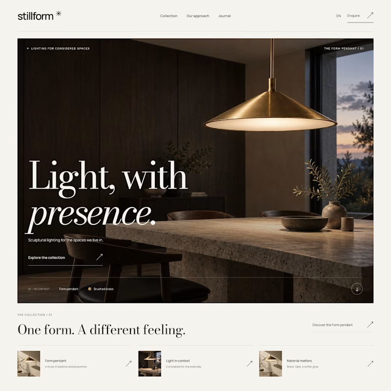
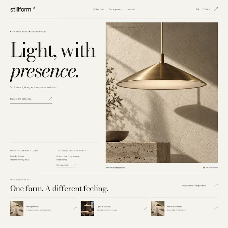

Atmospheric, and it was the photography that decided it. A lamp is a product you buy for what it does to a room, so seeing the warm glow pooling across a dark surface sells the feeling before the layout even registers. Sculptural is gorgeous but shows the object, Atmospheric shows the outcome.

Does a fintech brand actually need to look like fintech?
We don’t think it does.
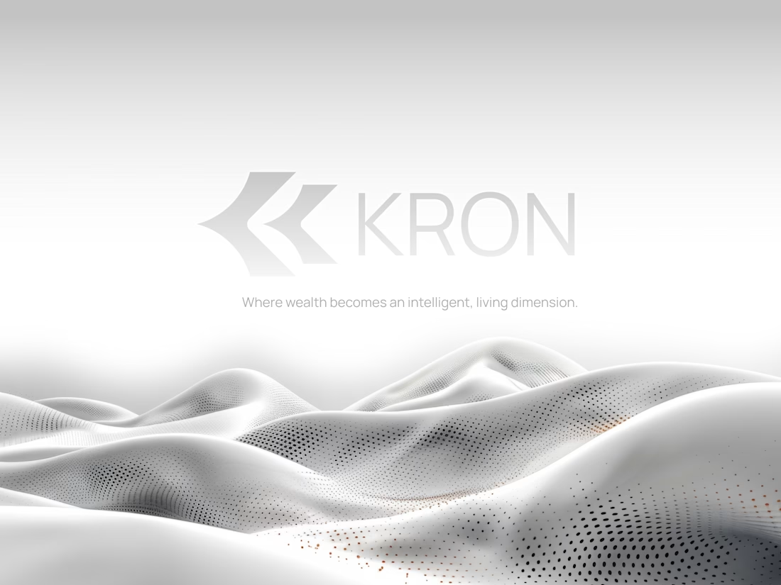
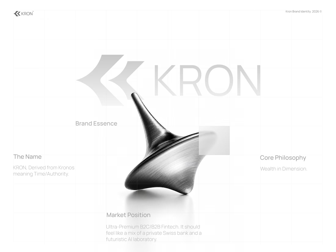
For KRON, we wanted to move away from the visual language you’d normally associate with finance.
No banking blue.
No obvious financial symbols.
No trying to scream “AI.”
Instead, we started with one idea:
What if wealth had depth?
That led us toward a much more spatial identity built around form, movement, architecture, and dimension.
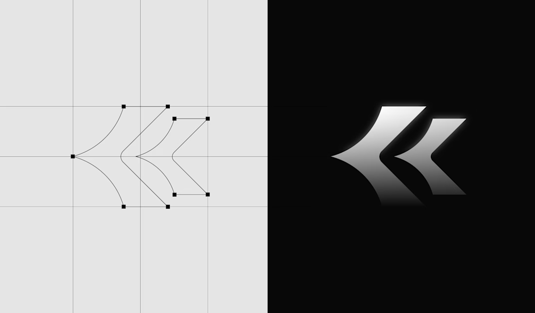
Even the K started becoming less of a letter and more of a structure we could build around.
Still exploring how far this system can go.
Would you know this was a fintech brand without being told?
And more importantly, does it need to?
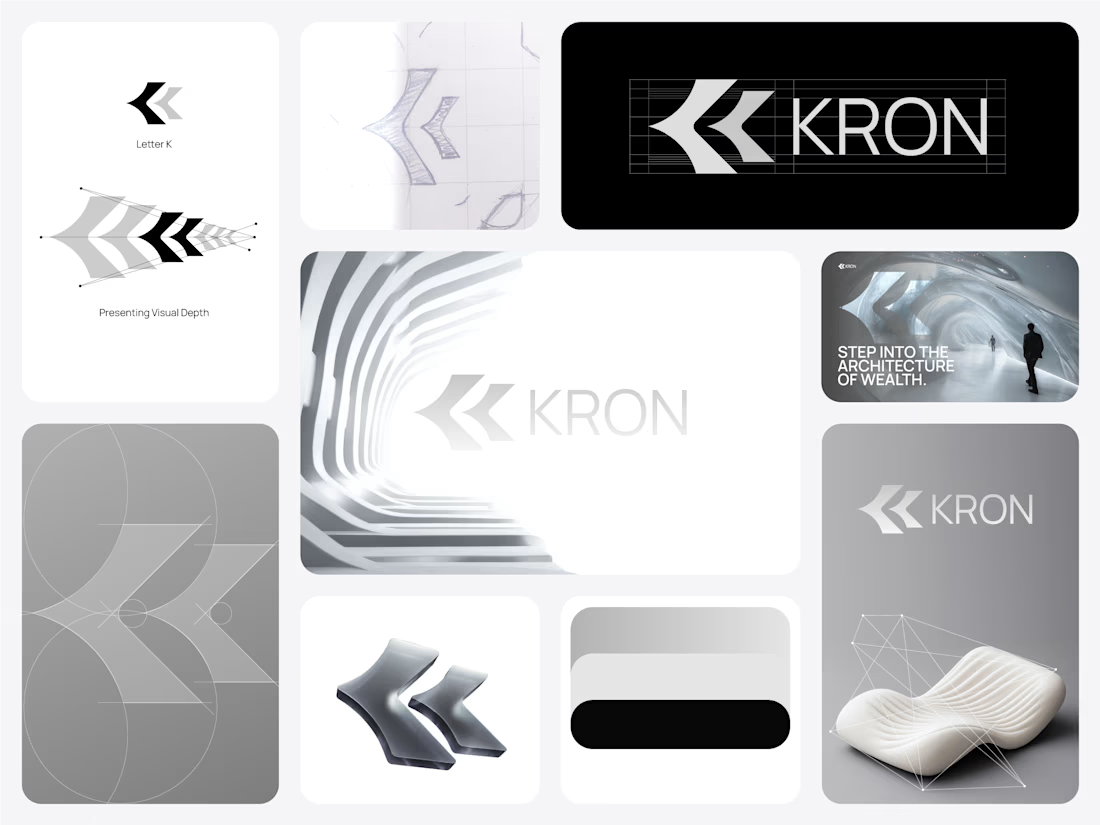

Honestly this branding kit feels luxury specially with high contrast and soft colors good job 🎉🎉❤️❤️