The network for creativity
Join 1.25M professional creatives like you
Connect with clients, get discovered, and run your business 100% commission-free
Creatives on Contra have earned over $150M and we are just getting started
Back to feedPost

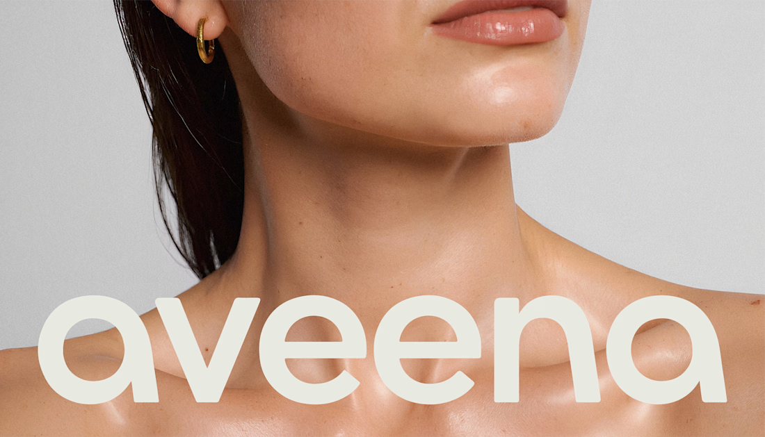
A softer approach to everyday body care.
Aveena is a modern body care brand built around comfort, gentle care, and skincare-level treatment for the entire body.
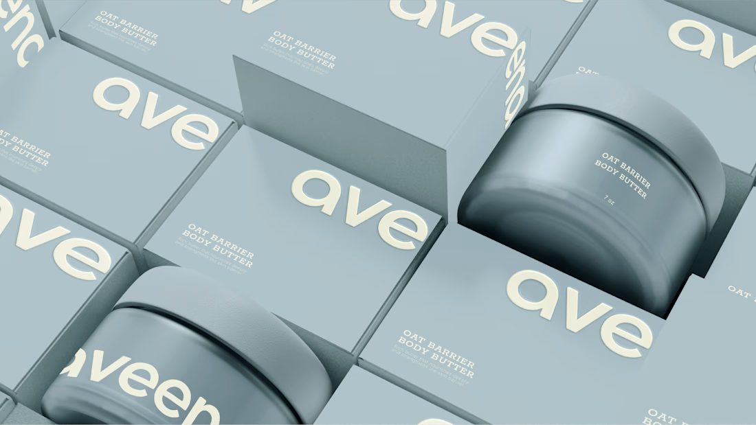
The brand combines oat extract, ceramides, and niacinamide to create formulas designed for sensitive and dry skin. The challenge was to translate this science-driven foundation into an identity that felt warm, refined, and approachable rather than overly clinical.
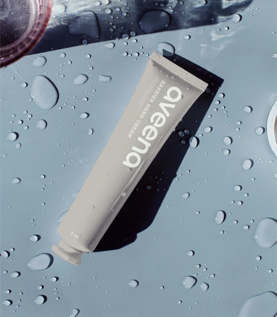
We developed a soft minimal visual system using organic typography, warm neutrals, generous whitespace, and refined packaging details. The result is a calm and understated identity that bridges dermatological credibility with sensorial warmth.
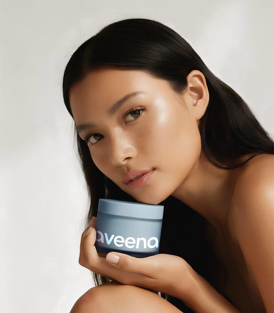
A brand designed to make everyday body care feel less like a routine and more like a moment of comfort.
Brand Identity · Art Direction · Packaging Design · Visual Identity
The network for creativity
Join 1.25M professional creatives like you
Connect with clients, get discovered, and run your business 100% commission-free
Creatives on Contra have earned over $150M and we are just getting started











Related posts

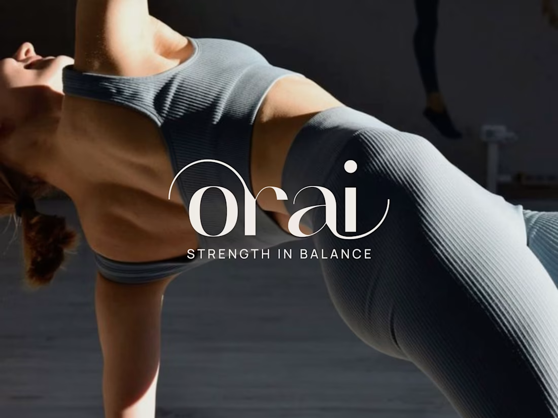
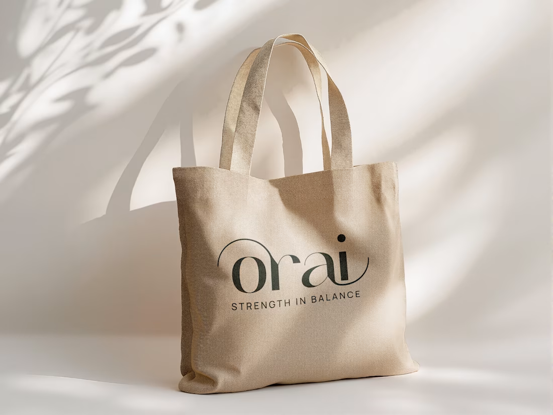
Orai’s branding reflects the flow of yoga and pilates. Its custom typography integrates fluid body silhouettes into a refined, minimalist design system.
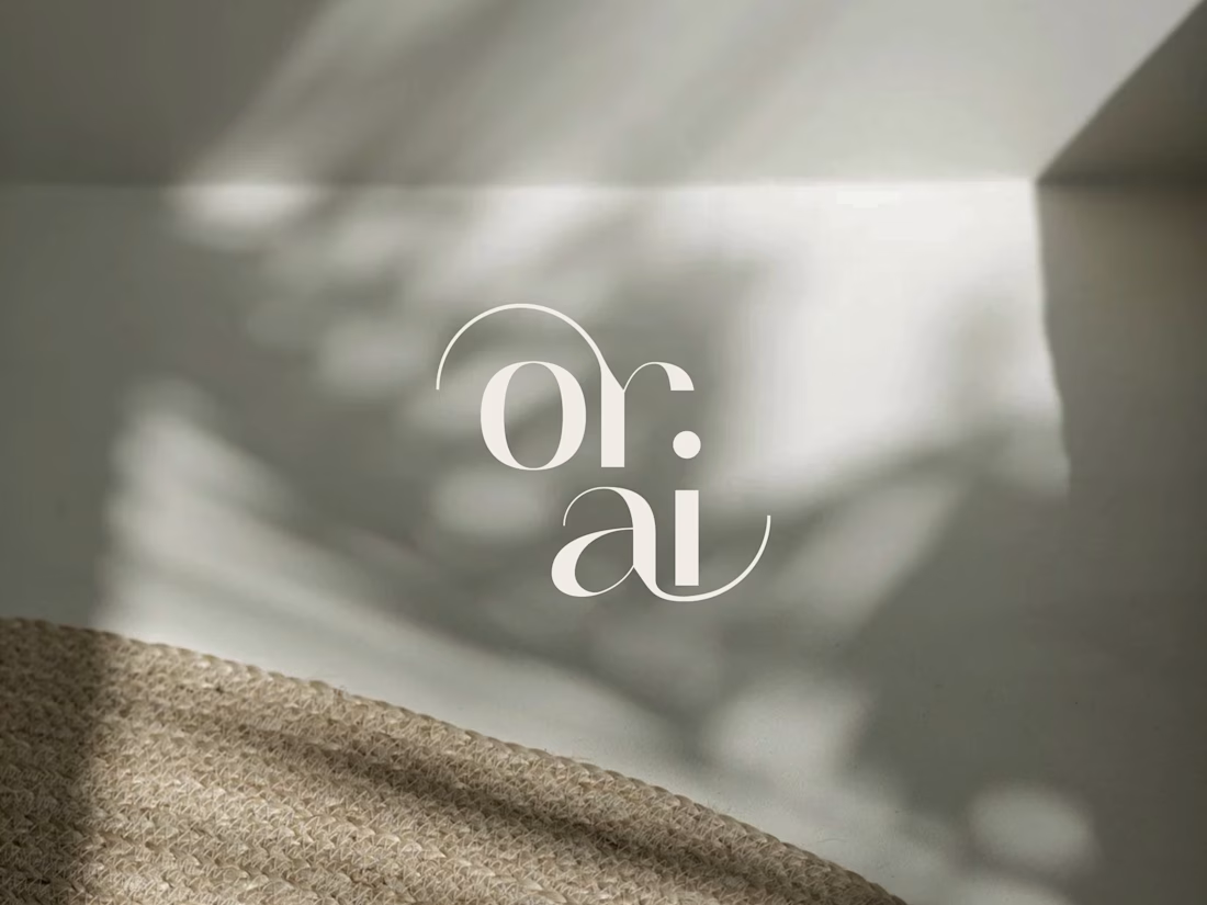

Awesome! I love how it works in both horizontal and stacked formats.

Can two different typographic directions change how you perceive the same skincare brand? 👀
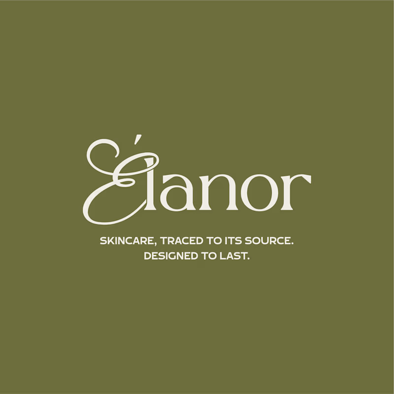
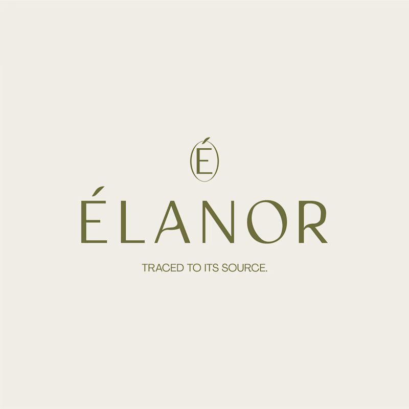
For Elanor, a skincare brand I’ve worked on, I’m putting two wordmark directions head to head.
A. Script Combo brings more personality and a distinctive, expressive touch.
B. Contemporary feels cleaner, more restrained, and modern.
Now I want your honest opinion: A or B? Which direction feels right for Elanor, and why?
26 voted
58%
19 voted
42%
45 votes
Closed

Absolutely! Typography changes everything. For Élanor, I love the contemporary direction - it feels elegant, clean and very premium for a skincare brand like this. The É icon on top is a beautiful touch! Script has personality but contemporary feels more timeless for skincare. Great exploration!

A visually engaging 2D motion graphics advertisement showcasing how a commercial skincare product is made.
Created using Claude Opus 5.5 at medium effort and ElevenLabs, featuring a unique hatching animation style, crisp visuals, and satisfying transitions designed to capture attention and keep viewers engaged.


