The network for creativity
Join 1.25M professional creatives like you
Connect with clients, get discovered, and run your business 100% commission-free
Creatives on Contra have earned over $150M and we are just getting started
Back to feedPost
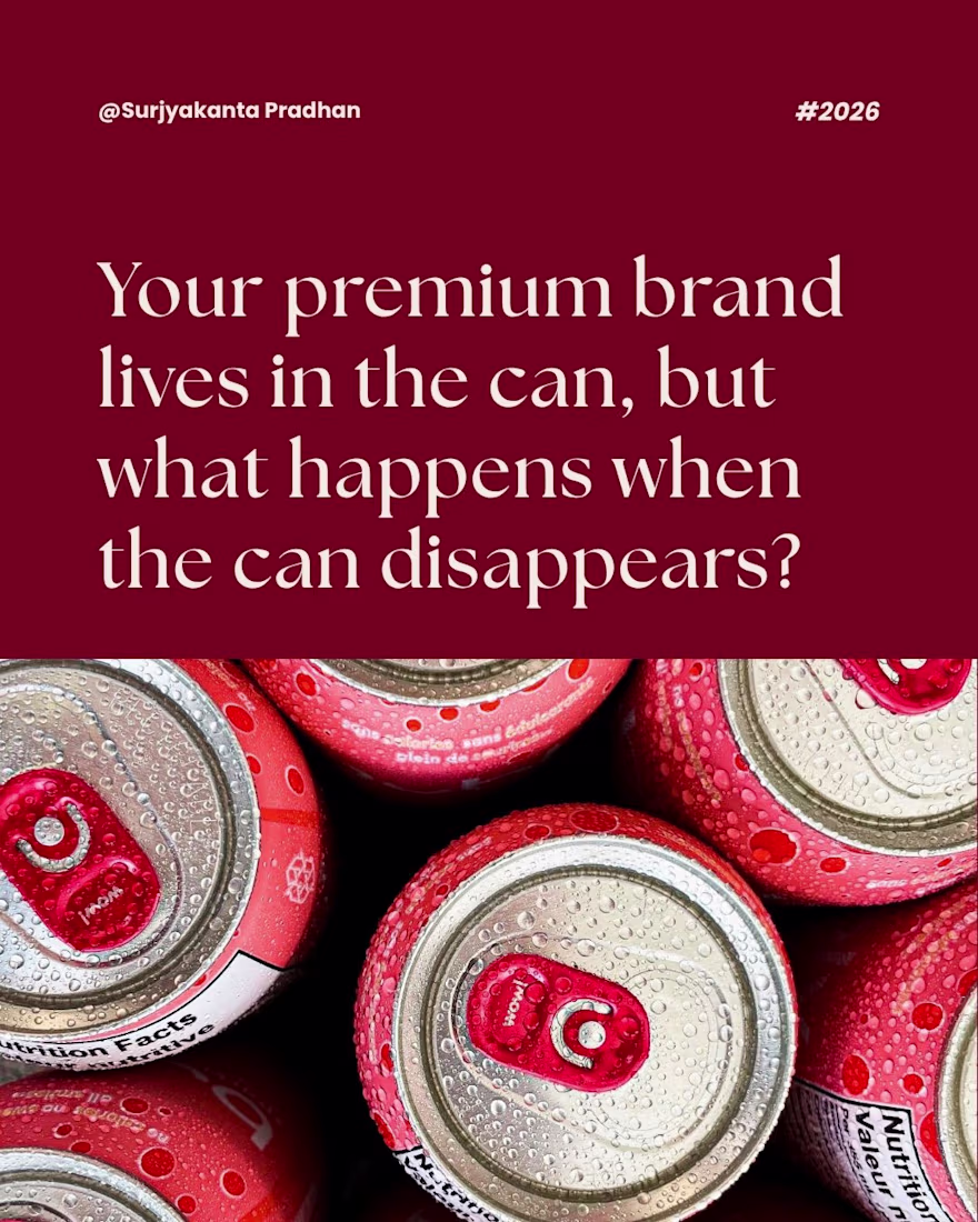
Most beverage brands don't lose premium positioning to competitors; they lose it to their own packaging decisions.
When aluminium shortages hit, beverage founders scrambled to glass and PET alternatives overnight; something uncomfortable became visible. It stripped away the can, and then there was no brand underneath.
The real cost wasn't logistical; it was identity.
Brands that survived had one thing in common: their identity lived in the typography, the colour system, the visual language, not the material. The format has changed, but the brand didn't.
If your premium positioning only works in one format, then it doesn't feel like a brand. You have a fragile packaging decision.
Build an identity that travels across formats. Your logo, colour hierarchy, and visual language should work equally on a can, a glass bottle, and a pouch. That's resilience. That's real premium.
📩 Save this! If you're scaling F&B, skincare or wellness, this is the layer most brands ignore.
Source - ET BrandEquity
The network for creativity
Join 1.25M professional creatives like you
Connect with clients, get discovered, and run your business 100% commission-free
Creatives on Contra have earned over $150M and we are just getting started
Related posts
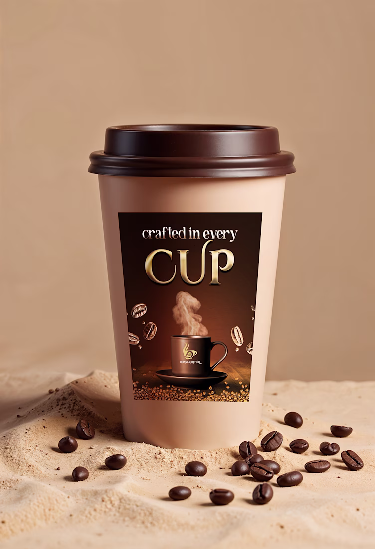
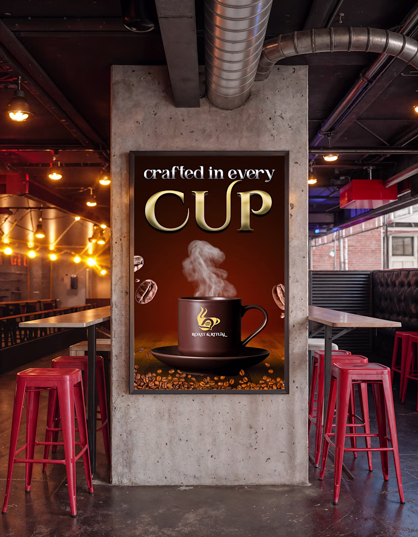
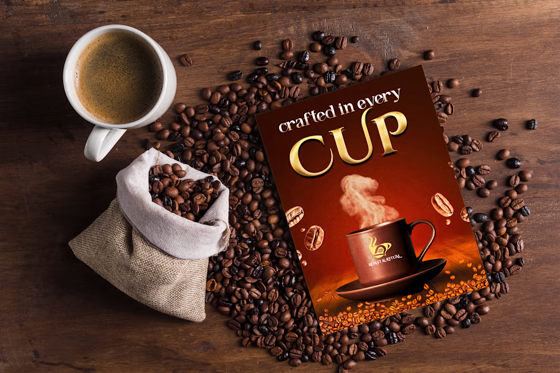
Crafted a premium coffee brand visual identity featuring product design, packaging mockups, and promotional creatives. Created using Adobe Photoshop with a focus on realistic presentation, branding, and elegant visual storytelling. ☕✨

Recently, I did branding & packaging for the premium functional beverage brand Pure Froot. It's live on Behance, let me know how it is.
Premium Fruit Juice Commercial Advertisement.
A vibrant and energetic premium fruit juice commercial created to showcase high-end beverage advertising aesthetics. This concept focuses on dynamic fruit splashes, refreshing visuals, crystal-clear ice, and luxury product presentation to communicate freshness, flavor, and premium quality.
The project highlights cinematic lighting, photorealistic liquid simulations, colorful fruit compositions, and modern commercial storytelling designed for digital advertising and social media campaigns.
The goal was to create a visually striking advertisement that captures the essence of refreshment while maintaining a premium brand identity through professional product visualization and high-end commercial art direction.
🖤 PORTFOLIO PROJECT NOTICE: This work was created as a self-initiated portfolio and creative showcase project. It was not commissioned by, created for, sponsored by, or affiliated with any real client, company, or brand. All visuals and concepts are presented solely to demonstrate creative, advertising, and production capabilities.
Trending
Claude
Claude has entered the design space. How are you using Claude Design?
Contra University
Learn from expert creatives how to earn more using next-gen AI tools.
MagicPath
The canvas is infinite, and exploration is becoming the workflow. How are you using MagicPath?
creativeaiflow
Creative AI workflows are evolving. What tools do you use, and what are their strengths and weaknesses?
freelancerlife
Freelancer life is wins, pivots, and everything in between. What’s yours right now?