The network for creativity
Join 1.25M professional creatives like you
Connect with clients, get discovered, and run your business 100% commission-free
Creatives on Contra have earned over $150M and we are just getting started
Back to feedPost

Helping Educators & Content Creators Launch Successful Online Course Businesses 🎓
A great online course needs more than just good content it needs an engaging landing page that turns visitors into students.
Here is a look at a recent website project created for COET, an online education platform designed to help course creators build, manage, and scale their education businesses.
Key Features of This Project:
Engaging Hero Video Showcase: Features an embedded video player upfront to immediately grab visitor attention and showcase course previews.
Modern Purple & Dark Theme: Designed with a sleek dark aesthetic and vibrant purple accent buttons for a clean, modern SaaS vibe.
Conversion-Driven Layout: Highlights clear call-to-action buttons ("Partner with us" and "Watch full course demo") to boost conversion rates.
Social Proof Integration: Built-in student badges and community stats to build immediate trust and credibility.
Responsive & Mobile-Friendly: Optimized for smooth performance across desktops, laptops, tablets, and smartphones.
UI/UX & Visual Design: Figma
Web Development: Webflow / HTML, CSS & JavaScript
Whether you are launching an online course, a membership site, or need a high-converting landing page converted from Figma to Webflow, I am here to help.
📩 Ready to build a website that sells your courses? Send me a direct message or leave a comment below to get started!
#WebflowDeveloper #WebDesign #UIUXDesign #FigmaToWebflow #CourseCreator #OnlineEducation #LandingPageDesign #FrontendDeveloper #EdTech

The network for creativity
Join 1.25M professional creatives like you
Connect with clients, get discovered, and run your business 100% commission-free
Creatives on Contra have earned over $150M and we are just getting started











Related posts

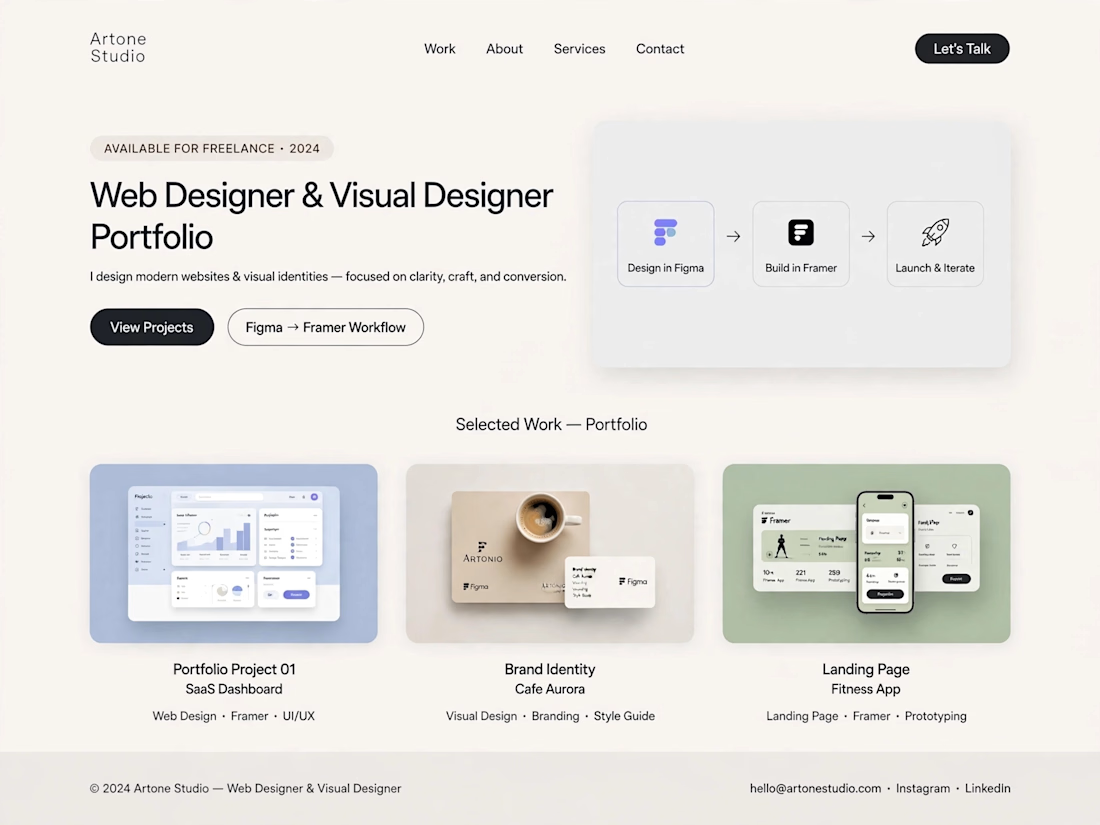
Title: Modern Website Portfolio | Clean UI & Visual Design
About this work:
I designed a modern, light-themed portfolio concept with a focus on simplicity, visual consistency, and a smooth user experience. The layout presents a structured design workflow, from initial ideas and interface design to website presentation.
The portfolio includes sample concepts for SaaS dashboards, brand identity, and landing pages, demonstrating how thoughtful layouts and consistent visual styling can help businesses present their services effectively.
Skills: Web Design, Visual Design, UI Design, Landing Page Design
Tools: ChatGPT, Figma, Framer



Not bad but need more improvement

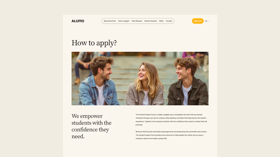
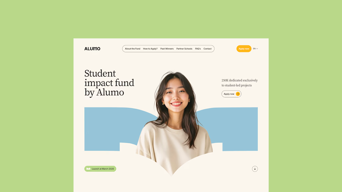
The Client: Alumo is a student impact fund that pools collective influence from influencers and partner schools to deliver a $250,000 annual grant program for student-led projects across Canada.
The Issue: The fund needed a website that could communicate trust and purpose to two very different audiences — students applying for grants and partner schools or influencers considering joining — while also showcasing past winners and guiding applicants through the process clearly.
The Solution: A multi-page website was designed with a warm, approachable visual identity using earthy tones, generous imagery, and clear information hierarchy. Each section — About, Past Winners, and How to Apply — was structured to reduce friction and build confidence, making it easy for students to understand eligibility and take action before the deadline.
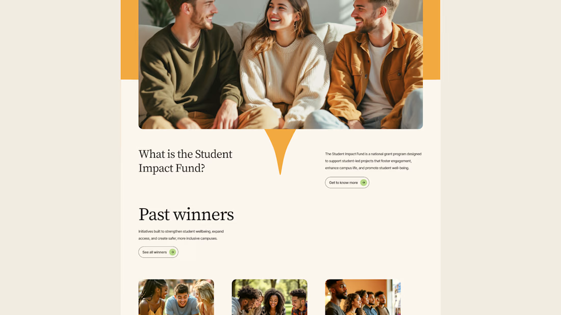
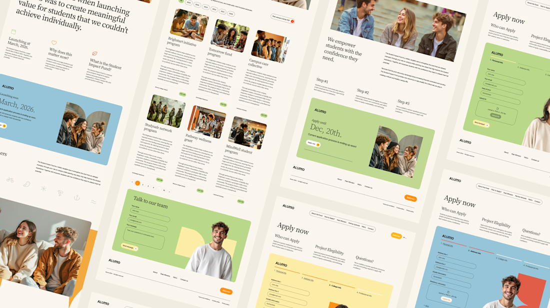

Love how you're tackling trust + purpose for a $250K fund - that's a tough balance with two audiences. Communicating credibility for a student-led initiative across Canada is huge. Would love to see how you solved it!

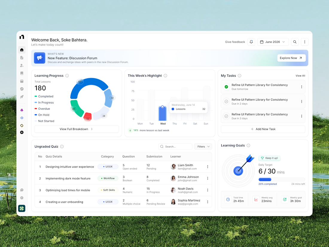
A modern learning platform dashboard designed to make education management, lesson tracking, and learning progress easier to monitor. The interface brings together course progress, weekly learning analytics, quiz submissions, task management, and daily learning goals in one organized workspace. With clean white layouts, colorful data visualization, intuitive navigation, and structured dashboard cards, this education SaaS UI creates a more focused, engaging, and efficient learning management experience.
📩 Collaborate with Us? Contra Cansaas Agency