The network for creativity
Join 1.25M professional creatives like you
Connect with clients, get discovered, and run your business 100% commission-free
Creatives on Contra have earned over $150M and we are just getting started
Back to feedPost

Back in brand content production mode this week — shaping ideas into finished posts, reels, and graphics that all feel like they belong together. When the look, voice, and rhythm line up, showing up consistently gets a whole lot easier.
The network for creativity
Join 1.25M professional creatives like you
Connect with clients, get discovered, and run your business 100% commission-free
Creatives on Contra have earned over $150M and we are just getting started



Related posts

Exploring Brand assets. Which one feels good?
24 voted
80%
6 voted
20%
30 votes
Closed

stack is cool but linear is doing the job better :)


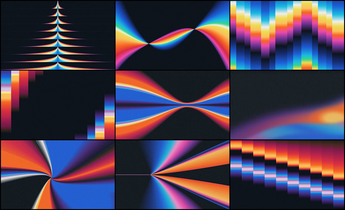
We designed the visual identity for an early-stage studio that helps AI companies adapt one product story for different audiences and channels.
Its positioning was already defined. Our job was to make it visible.
The organizing idea was refraction: one source opening into multiple expressions.
Rays expand from a shared point. Color fields stretch, compress and change direction, which gives a still image a sense of movement.
If your brand needs a lot of variety, decide first what every variation stays connected to.

Hello Contrarians! Excited to finally start my Contra journey after having my account set up forever.
If you're looking for a copywriter, storyteller, or content writer who thinks strategically about where and how to create content to properly showcase your business or position your team leaders with thoughtful pieces, send me a DM!
Also, if you want to chat about how fast work is evolving, or just discuss the future of content, I'd love to connect.
Excited to start talking to fellow creatives and build community here.