The network for creativity
Join 1.25M professional creatives like you
Connect with clients, get discovered, and run your business 100% commission-free
Creatives on Contra have earned over $150M and we are just getting started
Back to feedPost
Taste Test
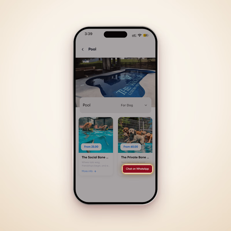
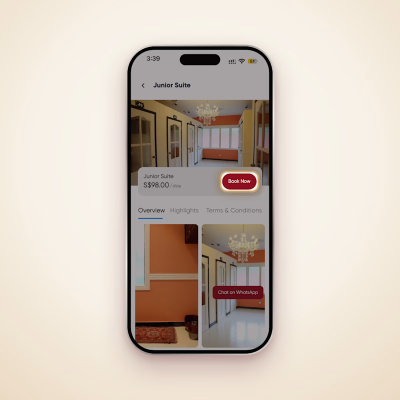
Premium pet hotel, premium customers. Which booking button gets more bookings?
The Wagington app offers both: chat on WhatsApp for questions, or Book Now straight in the app.
Which would you tap?
4 votes
Ends in 8h


That's a fair point! 😄 A direct booking option makes perfect sense for customers who already know what they want. WhatsApp is more for those who need a little extra information before booking. Thanks for sharing your perspective! 🙌


For a premium pet hotel the in-app Book Now is the stronger default — people buying premium want the shortest path to a confirmed booking. The WhatsApp option is still useful as a secondary route for guests who want to ask questions first, so the pairing makes sense if Book Now sits at the top of the flow.
The network for creativity
Join 1.25M professional creatives like you
Connect with clients, get discovered, and run your business 100% commission-free
Creatives on Contra have earned over $150M and we are just getting started

Challenges
View all


Related posts


Should a flower shop ever go black and white?
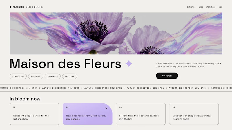
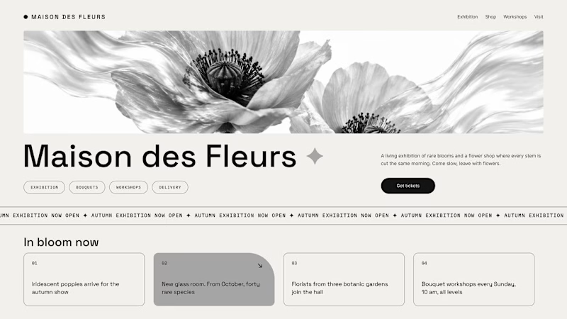
Same flower house, same layout. We only took the color out.
1. Full color. The iridescent petals do the selling: lilac, pink, a little shimmer. The photo is the brand, and every accent on the page borrows from it.
2. Monochrome. No color at all. Shape, texture and typography have to carry everything, and the page suddenly reads like a gallery catalogue.
Color sells the flower. Monochrome sells the exhibition.
Which one would get you through the door?
67 voted
91%
7 voted
9%
74 votes
Closed

The problem with monochrome is that, throughout computer history, it has conditioned users to associate gray and monochrome with being disabled, dysfunctional, or something to ignore and avoid.

My first preloader code component for Framer became a huge hit and ranked #1 in the paid Loaders category on the Framer Marketplace. I received so many sales from it in just a few days, so I decided to create another one.
As usual, I packed multiple options into a single code component. This time, you can choose from 4 different preloader styles.
These are 2 of the 4 options. Which one is your favorite? Check out the live preview here
14 voted
50%
14 voted
50%
28 votes
Closed

Wave on image is svg filter ?


45 screens for a running app with that level of polish is massive work! Love the bold orange + black combo and the data viz. Guessing this was a premium project - easily 4-5k+ for this system? Super clean motion design.