The network for creativity
Join 1.25M professional creatives like you
Connect with clients, get discovered, and run your business 100% commission-free
Creatives on Contra have earned over $150M and we are just getting started
Back to feedPost
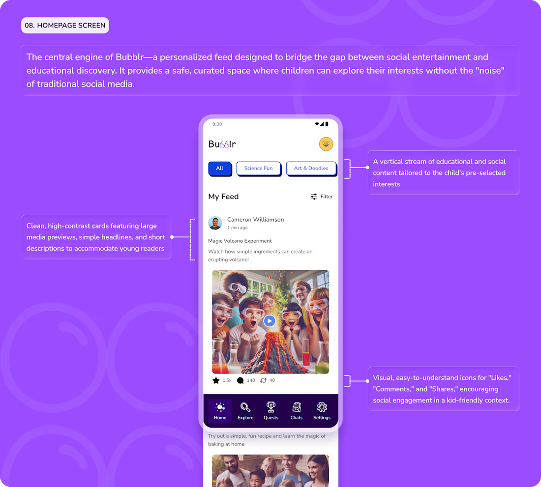
An educational social platform for kids.

What are your thoughts?
The network for creativity
Join 1.25M professional creatives like you
Connect with clients, get discovered, and run your business 100% commission-free
Creatives on Contra have earned over $150M and we are just getting started





Related posts

More casual or stylized photography?
20 voted
42%
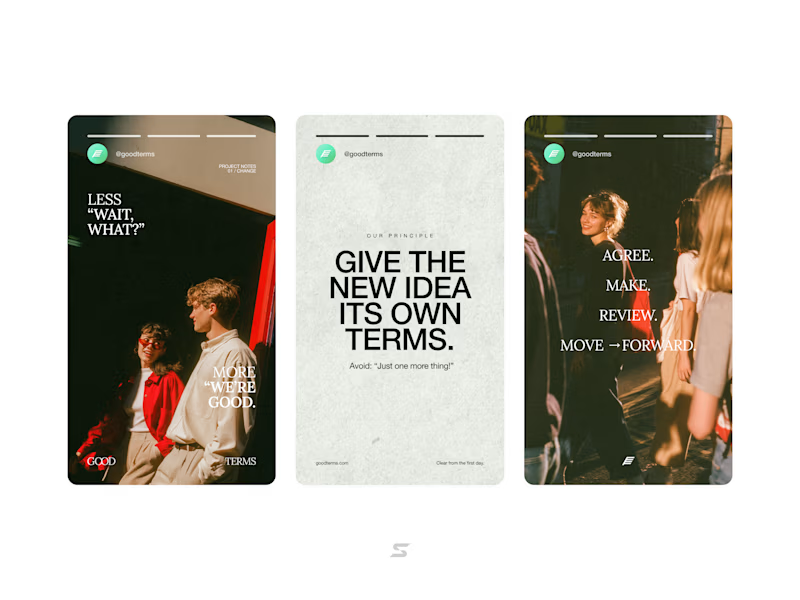
28 voted
58%
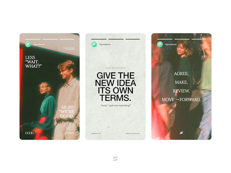
48 votes
Closed

🎬 Need a video that actually grabs attention?
I can help you turn your ideas into engaging, professional-looking content for Instagram, TikTok, and other social media platforms.
For this project, I handled both the filming and video editing, from shooting the footage to the final cuts, transitions, music, and overall look.
📹 Video Shooting
✂️ Video Editing
📱 Reels & Short-Form Content
🎨 Creative Social Media Content
If you have an idea or a project you want to bring to life, feel free to DM me. Let’s create something great! 🚀


Nice work. Combining filming and editing gives the content a strong creative flow.

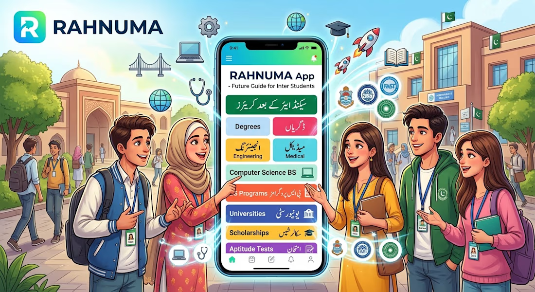
🎓 Raahnama – Your Path After Intermediate
The Problem:
Many Intermediate students are confused about what to study after 12th. They don’t know which degree or career is suitable for their subjects and interests.
The Solution:
Raahnama is a student guidance app that helps Intermediate students explore suitable university degree programs according to their group and subjects.
What is it for?
Students can select their Intermediate group, explore suitable degrees, learn about career opportunities, market demand, and even discover which fields can help them start their own business.
✨ Raahnama — Helping students choose their next step with confidence.
⭐ Key Features of Raahnama
🎓 Group & Subject Selection
🔎 Degree Recommendations
💼 Career Opportunities
📈 Field & Market Scope
💡 Business/Startup Options
⚙️ Admin Update System
🧭 Easy Career Guidance


Don't forget to upload your demo video here!