The network for creativity
Join 1.25M professional creatives like you
Connect with clients, get discovered, and run your business 100% commission-free
Creatives on Contra have earned over $150M and we are just getting started
Back to feedPost

Fern Estate Co., a Tennessee-based company that blends real estate, construction, and design under one roof, needed a visual identity that reflected their dedication to quality craftsmanship and sophisticated design. Our goal was to create a brand that embodies class, value, and design, mirroring the elevated spaces they create.
The final identity features a sleek wordmark that balances sharp angles with smooth curves, showcasing both strength and sophistication. The accompanying symbol reflects structural elements, representing the company’s expertise in construction and design. The color palette is grounded in deep greens and neutrals, adding warmth and richness that speaks to their connection to the Tennessee landscape. Supporting graphic elements, such as grid patterns and linear forms, reinforce the brand’s emphasis on thoughtful design and lasting value.
The network for creativity
Join 1.25M professional creatives like you
Connect with clients, get discovered, and run your business 100% commission-free
Creatives on Contra have earned over $150M and we are just getting started
Related posts

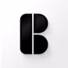
2026 is "the year of the B2B rebrand."
Except most companies are doing it backwards.
They're changing logos, picking new colors, refreshing typography and calling it a rebrand.
Meanwhile, their positioning hasn't changed. Their messaging is still confused. Their website still tells a story from two funding rounds ago.
Here's what I've seen with my work through actual inflection points:
The rebrand that works isn't visual first. It's positioning-first.
You figure out where the company actually operates now, you build a messaging hierarchy that reflects the current product, the current buyer, the current competitive landscape. Then you design a system that communicates all of that.
If your rebrand starts with "who are we now and who needs to know?" you're building something that compounds.

Top work, always 💯🫡

The part of your brand people actually remember isn't the logo.
I've been getting a lot of enquiries lately for logo-only work. Whilst I love designing logos, they're not actually super useful unless they're also supported by the strategy and frameworks of a wider visual identity.
The most valuable thing I deliver to clients are brand guidelines, which provide the blueprint for ensuring a consistent and cohesive look in all platforms and spaces.
I've recently been working on this identity for Forma, and I'm completely falling in love with it 🌀

A few mascotte tests that sadly will never see the light of day. Client decided to stick to "normal" branding. 😭


It is certainly their loss! This would've been such a memorable mark. Love it :D


Trending


Notion
Notion isn’t just where you work, it’s starting to work for you. What agents are you building?
portfolioreview
The best portfolios tell a story, not just show a grid. Share yours for feedback.
brandguidelines
Brand guidelines are becoming living systems, not static documents. What are you building for your clients?
aivideo
AI video tools are moving at warp speed. Which ones are you experimenting with?
freelancerlife
Freelancer life is wins, pivots, and everything in between. What’s yours right now?