The network for creativity
Join 1.25M professional creatives like you
Connect with clients, get discovered, and run your business 100% commission-free
Creatives on Contra have earned over $150M and we are just getting started
Back to feedPost

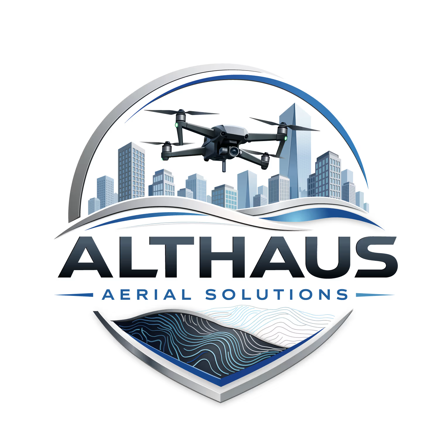
Logo vectorization I did some time ago. All the elements were recreated manually. The challenge was to replicate the drone, the buildings' look and feel, and the extensive number of elements the logo has.

The network for creativity
Join 1.25M professional creatives like you
Connect with clients, get discovered, and run your business 100% commission-free
Creatives on Contra have earned over $150M and we are just getting started





Related posts




That's great it really saturated with joy specially with this cute character in the top and the vibrant colors 🎉🎉🎉🎉

Nike × Champions League Ball Concept
An independent concept exploring what a Champions League ball could look like through Nike’s visual language.
The idea starts with a star containing a Swoosh in the negative space, then extends into a complete ball system using Nike’s existing panel construction.
Designed and animated with Spline, After Effects, and a custom 3D ball tool built for the project.
Unofficial concept. Not affiliated with Nike or UEFA.


This is very well thought of and creative