The network for creativity
Join 1.25M professional creatives like you
Connect with clients, get discovered, and run your business 100% commission-free
Creatives on Contra have earned over $150M and we are just getting started
Back to feedPost
Swipe right on your next meal.
New Framer component: a Tinder-style swipe mechanic but for built for food.
The idea is simple. You're hungry, you don't know what you want, and scrolling a menu feels like homework. So instead — swipe. Like it, skip it, find your next meal in seconds.
Built this as an interactive hero section to stress test the component and honestly, it's one of the most satisfying things I've made. The interaction feels fun, the animation is smooth, and the concept practically sells itself.
No food app yet (if you're also interested hmu 😅).
Framer components are too fun, more experiments to come!


Let me know what you folks think could improve this component (Give me real feedback rather than AI glazing comments 😅)

Nice swip component. Really love it😍
Thanks Tuaha, really appreciate it 🤝
The network for creativity
Join 1.25M professional creatives like you
Connect with clients, get discovered, and run your business 100% commission-free
Creatives on Contra have earned over $150M and we are just getting started

Challenges
View all


Related posts


Web Design for Contra Labs — an extension of the Brand Identity we created.
Translating the visual language, principles, and character of the identity into a cohesive digital experience.


Same data, two different ways to experience it 🤔
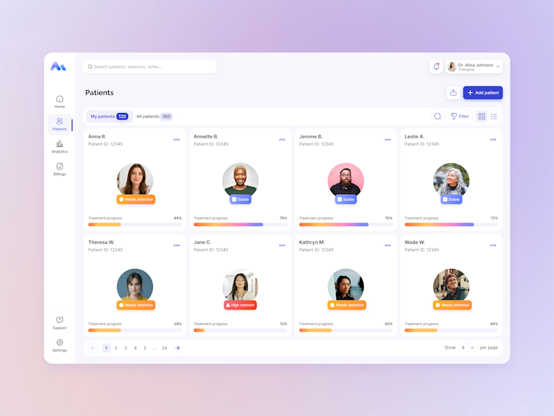
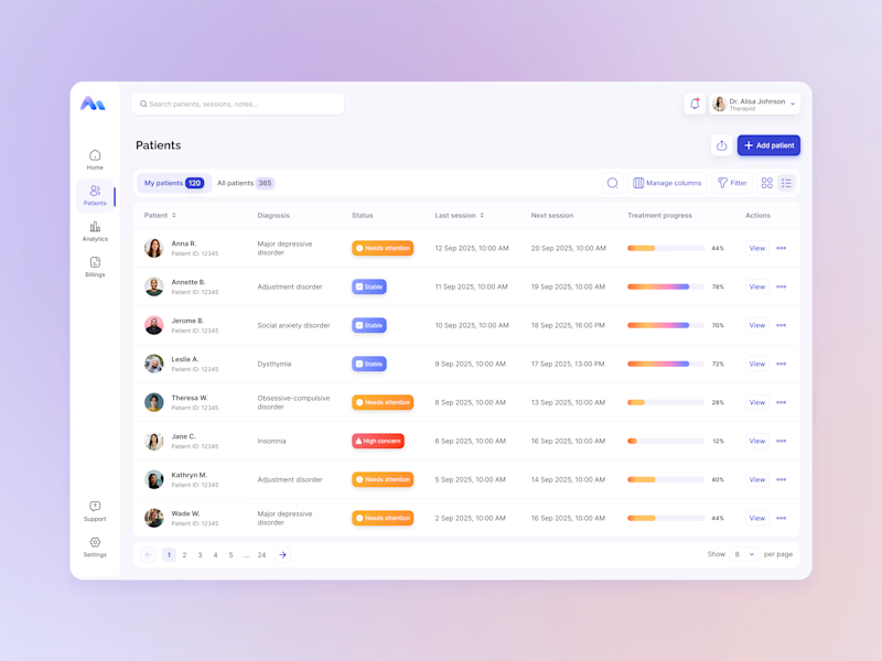
I explored two patient list layouts for a mental health platform: a card view and a table view.
Cards feel more visual and personal, but space is limited and adding more information can quickly make them crowded. For complex enterprise products, I often find tables more practical — they’re easier to scan, compare, sort, and can support more columns when users need greater visibility.
For this kind of workflow, I’m leaning toward the table view. Which would you choose — cards or table?
11 voted
55%
9 voted
45%
20 votes
Closed

For a mental-health patient list the choice isn't really card vs table — it's scan-speed vs context. The card wins the first meeting because the photo and name set the clinician's mental model before they touch the row, but the table is what holds up under the daily rhythm of...


