The network for creativity
Join 1.25M professional creatives like you
Connect with clients, get discovered, and run your business 100% commission-free
Creatives on Contra have earned over $150M and we are just getting started
Back to feedPost

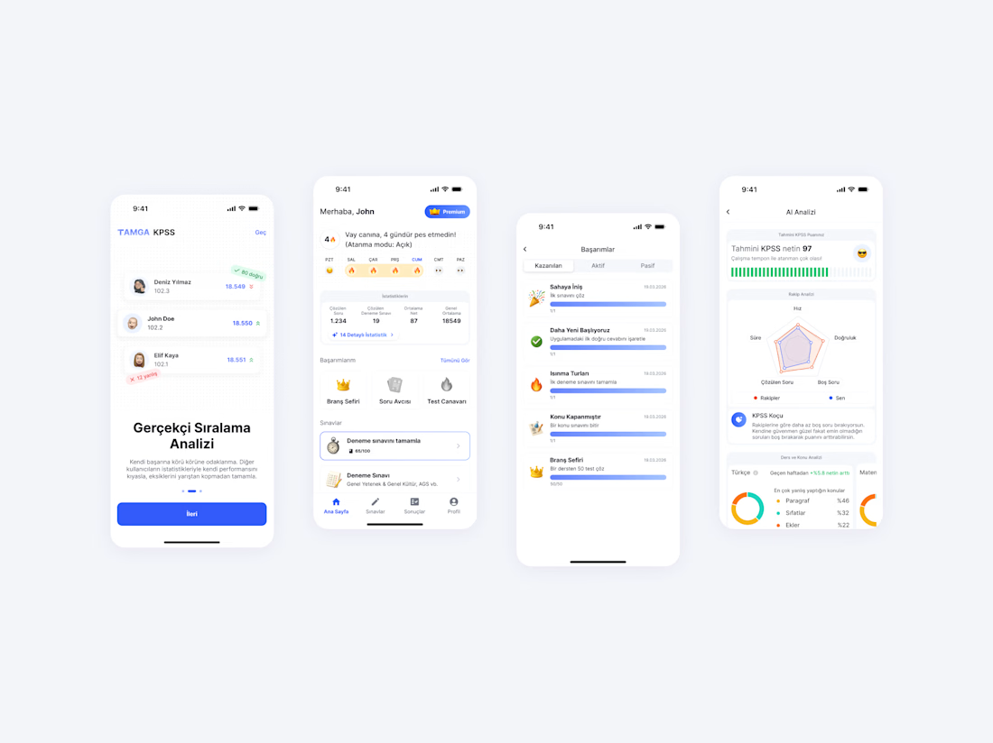
I’m excited to showcase Tamga AI, an AI-powered exam preparation app that I built completely from scratch. My goal was to create a smart, fast, and user-friendly educational tool to help students study more effectively.
My Role & Tech Stack
I handled the entire product lifecycle, from the initial design concepts to the final technical architecture. Here is what I delivered:
Mobile Development: Built smooth, high-performance applications for both iOS and Android.
Back-end Architecture: Developed a robust and scalable backend to handle AI processing, user progress, and secure data.
UI/UX Design: Crafted a clean, focus-driven interface so students can study without distractions.
Tech Stack: SwiftUI, Compose, fal.ai, Supabase & Figma.

The network for creativity
Join 1.25M professional creatives like you
Connect with clients, get discovered, and run your business 100% commission-free
Creatives on Contra have earned over $150M and we are just getting started






Related posts

My kids loves Block Blast, so I decided to try making my own version for them.
It's not perfect but it was a fun experiment. My kids weren't impressed. Tough crowd.

Kids are the harshest QA you can hand a puzzle game to, and they reject on feel long before they reject on difficulty. Most homemade Block Blast clones get the rules right and still feel wrong, because the piece follows the finger instead of the grid and the snap lands late....

Light or refined - which E-Bike product breakdown section design would you choose?
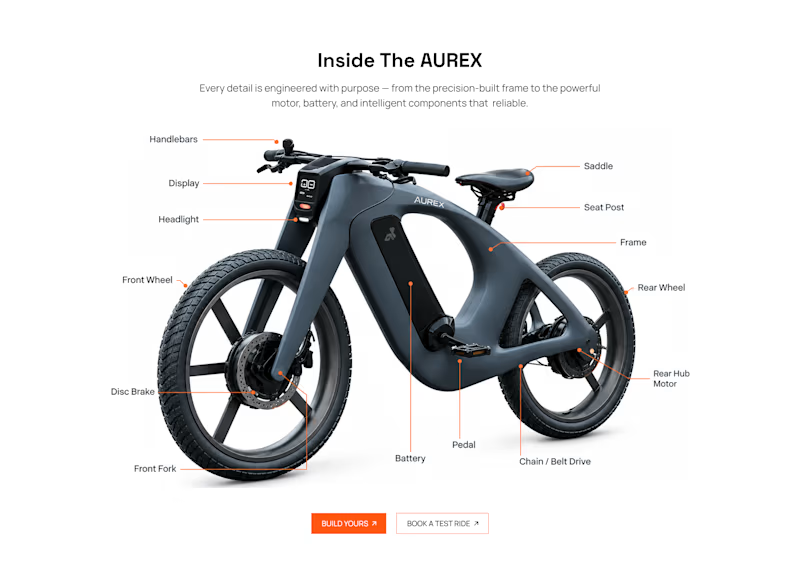
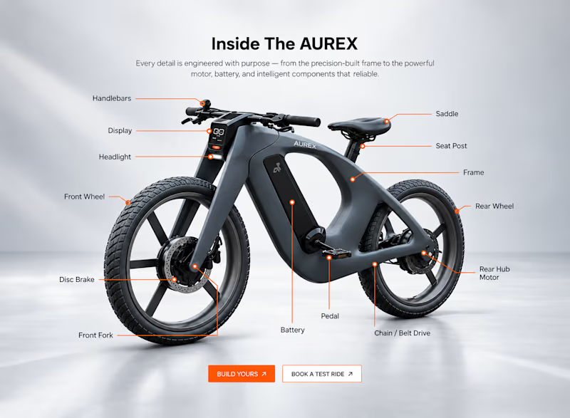
Two concepts for the same AUREX e-bike. Same product, same components, two different presentation styles:
A - Soft Studio: subtle gray depth, larger product focus, and a more premium visual feel.
B - Clean Minimal: bright white background, tighter spacing, and a more technical editorial layout.
Which direction feels stronger for a premium e-bike brand and why?

5 voted
31%
11 voted
69%
16 votes
Closed

A feels more premium to me. The soft gray depth and bigger product focus make the bike feel like something special. B is great for specs, but A sells the feeling

XNOMAD — Brand Identity Design!
XNOMAD is a premium modular camper brand based in Scandinavia, offering both rental experiences and ownership of off-road pickup campers.
The goal was to create an identity that could sit naturally between two worlds:
Scandinavian minimalism + rugged outdoor capability.
Rather than following the typical loud adventure aesthetic, we kept the system clean, modern, and confident, reflecting XNOMAD's idea of quiet luxury and freedom.
The identity was built around a distinctive X, supported by a minimal wordmark, bold blue palette, typography, graphic patterns, and applications across digital and physical touchpoints.
Wake Up Anywhere.
One of those projects where simplicity did most of the talking.


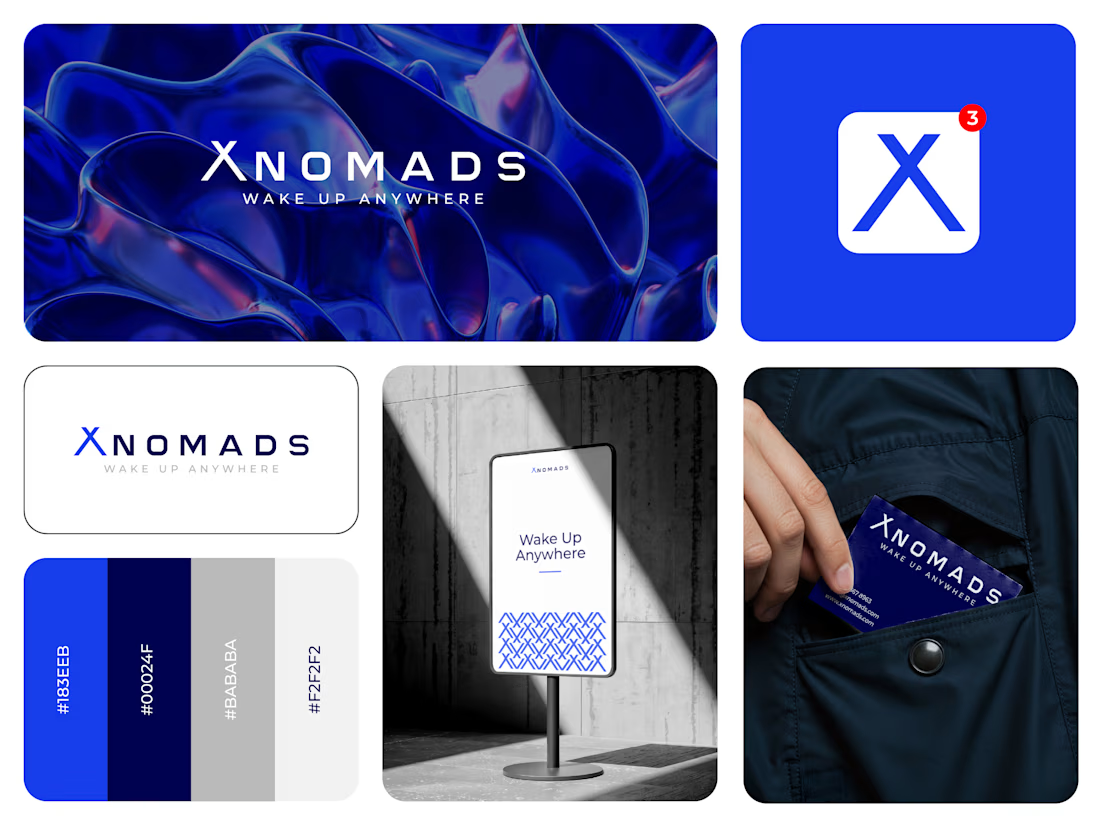

The blue visual system and mockup presentation work so well together.