The network for creativity
Join 1.25M professional creatives like you
Connect with clients, get discovered, and run your business 100% commission-free
Creatives on Contra have earned over $150M and we are just getting started
Back to feedPost
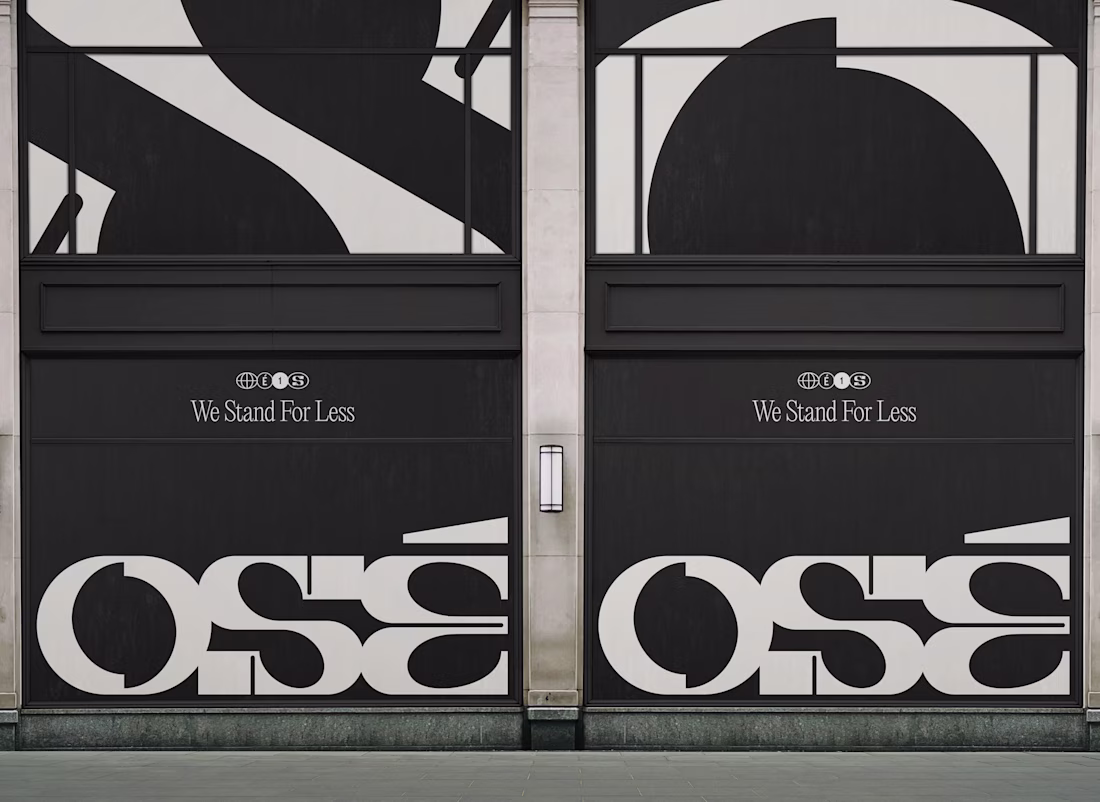
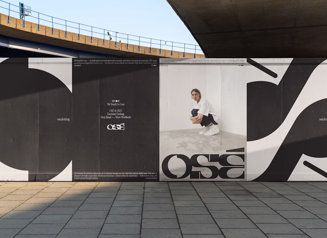
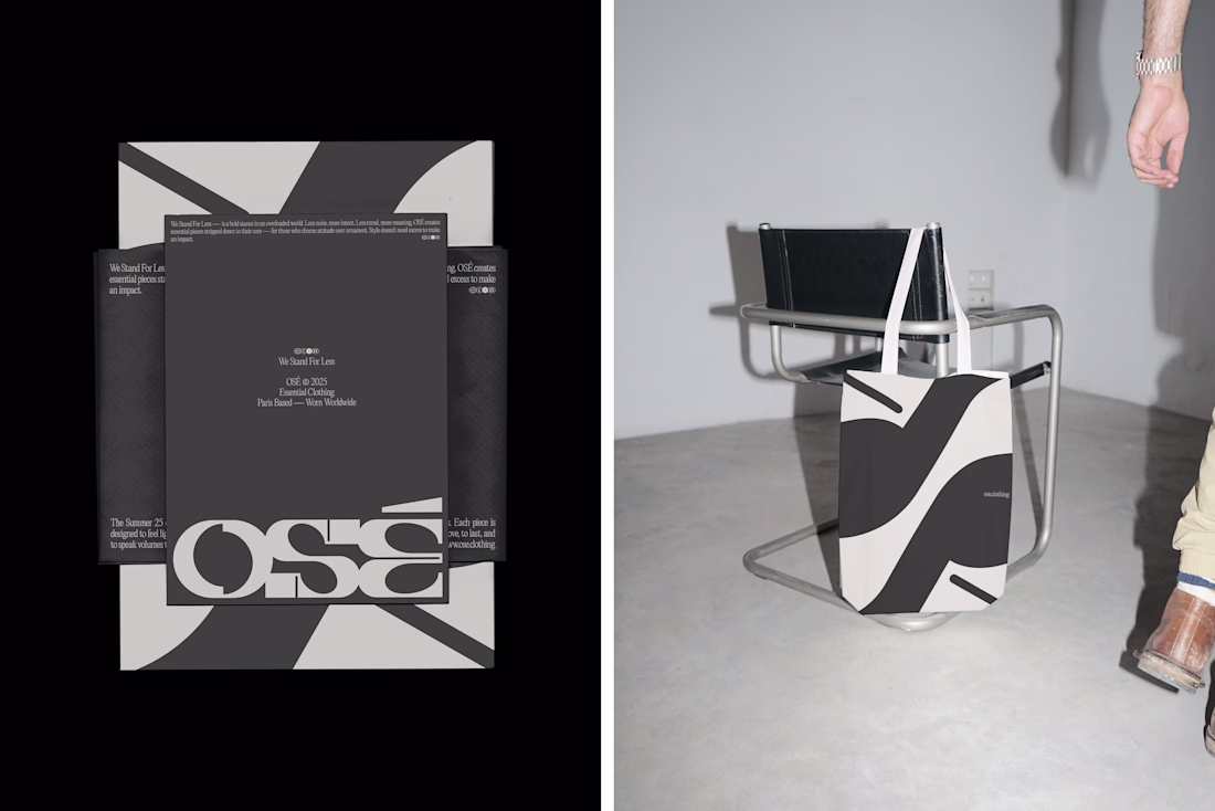
Minimalism doesn’t have to be quiet.
When I designed the visual identity for OSÉ, I wanted to show that less can also be bold.
OSÉ stands for a slow, lasting vision of fashion. Its manifesto, We Stand For Less, challenges fast fashion and calls for intention.
To translate that into visuals, I worked with strong typographic contrasts: letters with sharp breaks and subtle curves, a structure that feels balanced.
The visual system continues this dialogue: a reduced palette of black, beige and wide white spaces, where the typography itself becomes pattern and texture.
This project reflects my own practice:
Creating identities where minimal design carries a strong voice, and where simplicity is never bland but a stance.
—
Cynthia Jego
Independent Designer
Crafting Visual Identities for Brands & Websites
@Cynthia Jego this is so neat, the logo is fire, the typography super clean, fr amazing work
The network for creativity
Join 1.25M professional creatives like you
Connect with clients, get discovered, and run your business 100% commission-free
Creatives on Contra have earned over $150M and we are just getting started
Trending
Claude
Claude has entered the design space. How are you using Claude Design?
Contra University
Learn from expert creatives how to earn more using next-gen AI tools.
fifaworldcup2026
The World Cup is here and the whole world's watching. How are you designing for the world stage?
creativeaiflow
Creative AI workflows are evolving. What tools do you use, and what are their strengths and weaknesses?
freelancerlife
Freelancer life is wins, pivots, and everything in between. What’s yours right now?