The network for creativity
Join 1.25M professional creatives like you
Connect with clients, get discovered, and run your business 100% commission-free
Creatives on Contra have earned over $150M and we are just getting started
Back to feedPost


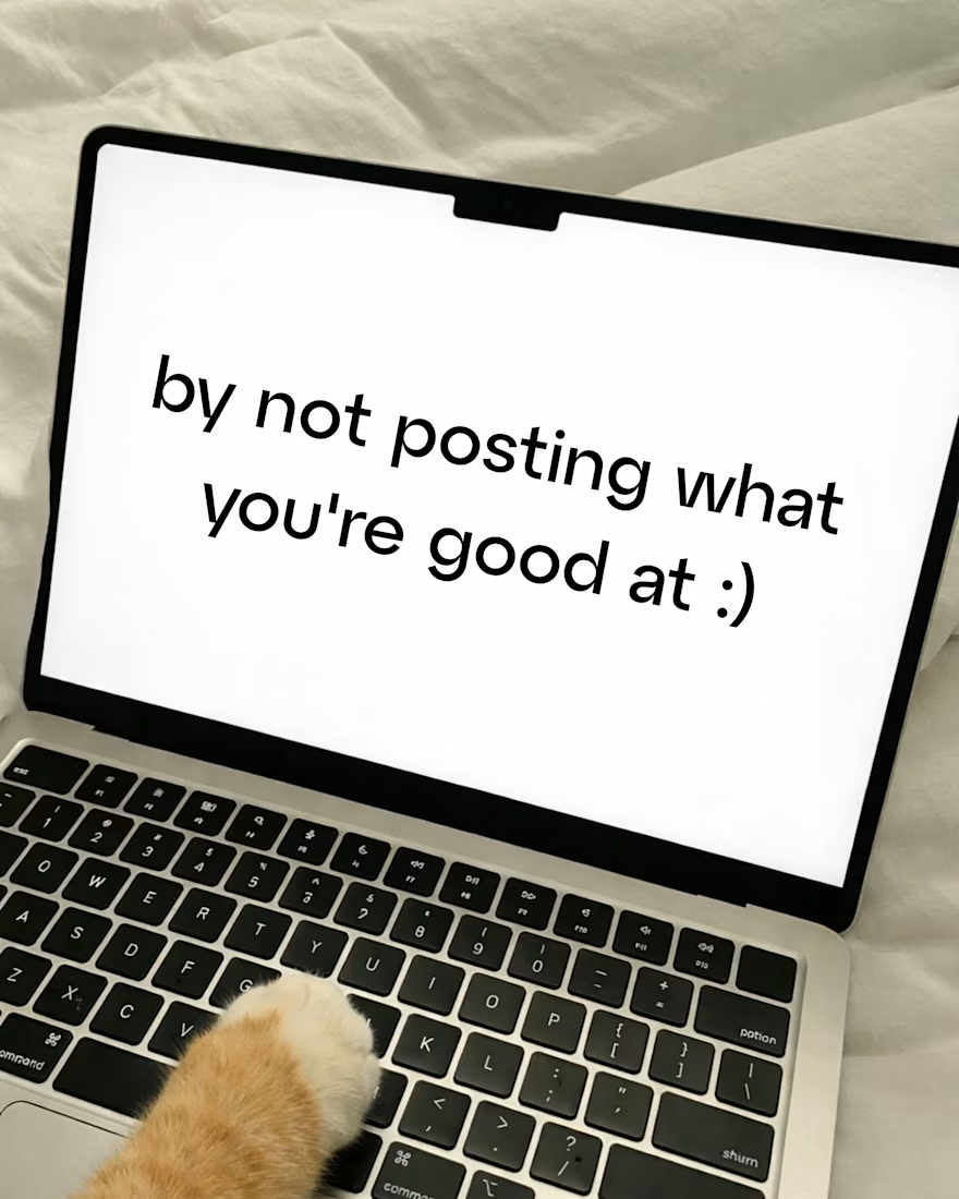
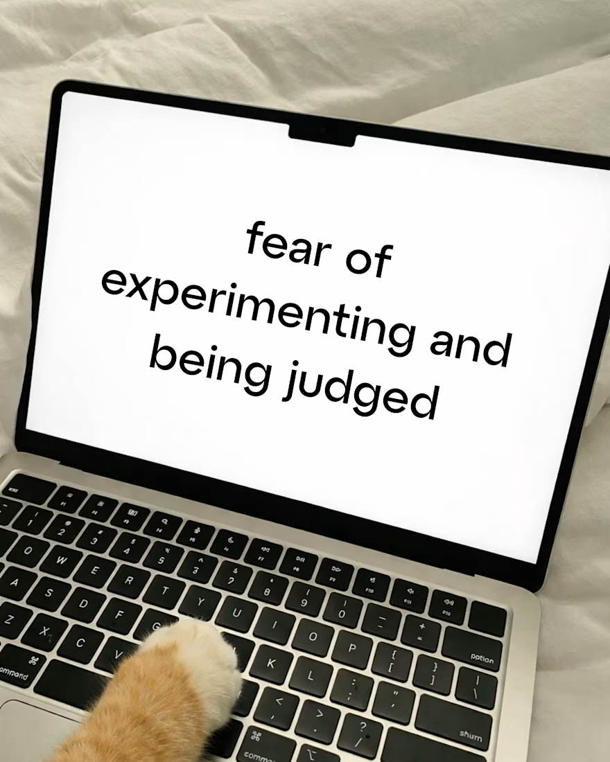
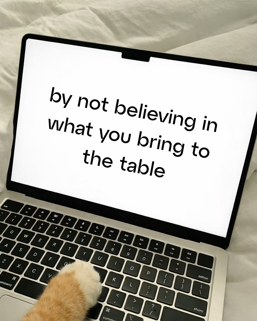
Playing small doesn’t protect your brand. It keeps it forgettable. 😉

The network for creativity
Join 1.25M professional creatives like you
Connect with clients, get discovered, and run your business 100% commission-free
Creatives on Contra have earned over $150M and we are just getting started





Related posts

A useful way to evaluate a brand identity: place the business card, packaging, and social posts side by side.
Do they feel like they belong to the same business—even when the logo isn’t prominent?
That’s what I look for in a visual system. Typography creates hierarchy. Color builds recognition. Patterns and layout give the brand a character that can carry across different formats.
For business owners reviewing a new identity, ask your designer to show how it works in the places your customers will actually encounter it. Those applications can reveal more than a logo presentation alone.
Which touchpoint is hardest to keep consistent in your brand?

That's great visuals and motion graphics Great job Mohammed

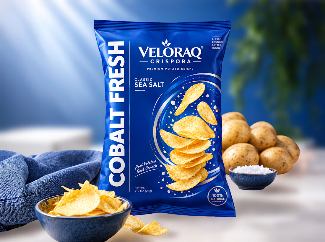
Is your snack packaging failing to convert on Amazon and retail shelves? Boost your sales with vibrant, trust-building pouch designs! 🥔✨
Food brand founders often struggle to stand out in the crowded CPG market. Generic designs make premium snacks look cheap, costing you retail placements. As a specialized packaging designer, I solve this by blending deep consumer psychology with striking, FDA-compliant visuals. Partnering with me ensures your product commands premium pricing and builds instant buyer trust.
Curious to see how this Cobalt Fresh concept comes to life? I've shared the complete visual breakdown and 3D mockups in the first comment below. Take a look!
Ready to scale your food brand?
#SnackPackaging #FoodPackagingDesign #CPGBranding #FMCGPackaging #PackagingDesigner


With the right financial tools, you can gain better visibility into your spending, create meaningful savings goals, stay organized, and develop habits that move you closer to the things you want to achieve.
For this concept, I explored how MONTRA can position itself as a simple, modern solution that helps people feel more informed and in control of their finances.
A fintech brand concept focused on clarity, confidence, and smarter financial habits.
Am Onyinye Juliet a brand designer......
Let's make your brand unique..