The network for creativity
Join 1.25M professional creatives like you
Connect with clients, get discovered, and run your business 100% commission-free
Creatives on Contra have earned over $150M and we are just getting started
Back to feedPost

YC has funded 6,000+ companies. Finding the one that solves your exact problem should be easy, right?
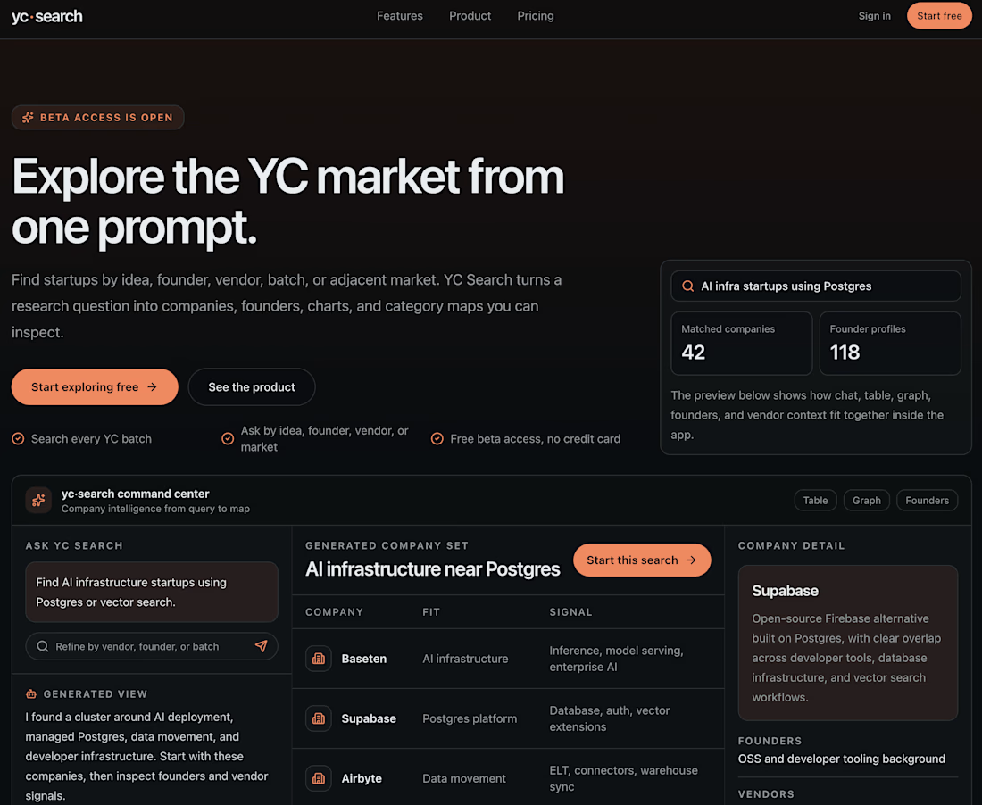
For Day 1 of my 30-day product review challenge, I gave YC Search one real business problem: find a company that could study my audience, recommend how to monetize it, and handle most of the execution.
The product promise is strong. YC Search lets you explore the YC market from one prompt across companies, founders, batches, vendors, and adjacent markets. The command center is polished, fast, and free to try.
My results:
• 1 exact match
• 2 loosely adjacent
• 1 dead website
• 2 basically unrelated
The core issue was intent. The agent compressed my request into “audience monetization + affiliate marketing,” but I was not looking for any tool that helps creators make money. I wanted someone to study my audience, recommend the right monetization path, and handle the execution. Those are very different jobs.
The win was Makrwatch. They find sponsorships, negotiate terms, and handle everything in between. I found them through YC Search and applied for representation the same day.
Verdict: 3/10 for recommendation quality, but not a write-off. It is free, fast, and built on a genuinely useful idea. Stronger intent parsing, reranking, and live-link validation would make it far more useful.
For the next 30 days, I’m testing one product every day to find the tools worth using, the ones overhyped, and the ones still cooking.
Day 1 complete. If you’re building, designing, or bootstrapping, follow along. I’ll keep testing the tools so you don’t have to.
The network for creativity
Join 1.25M professional creatives like you
Connect with clients, get discovered, and run your business 100% commission-free
Creatives on Contra have earned over $150M and we are just getting started
Related posts

A small product detail I noticed yesterday while using Wise
I was on a phone call and opened the app. A notification appeared saying that Wise wasn’t calling me, with a warning to hang up if someone claimed to be calling on behalf of the company.
What caught my attention was that the message remained visible while I navigated through the app.
I found this particularly interesting because it addresses a real-life situation users might encounter, especially in countries like Brazil, where phone scams involving people impersonating companies are common.
It reminded me of an important principle in Product Design: users don't always interact with products the way we design them in Figma.
They may be distracted, multitasking, or dividing their attention between different activities.
Good product decisions take these moments into account too.
Sometimes, the most thoughtful design decisions are the ones users don't even realize someone had to think about.
What do you think? Would you consider implementing something like this in your own product?
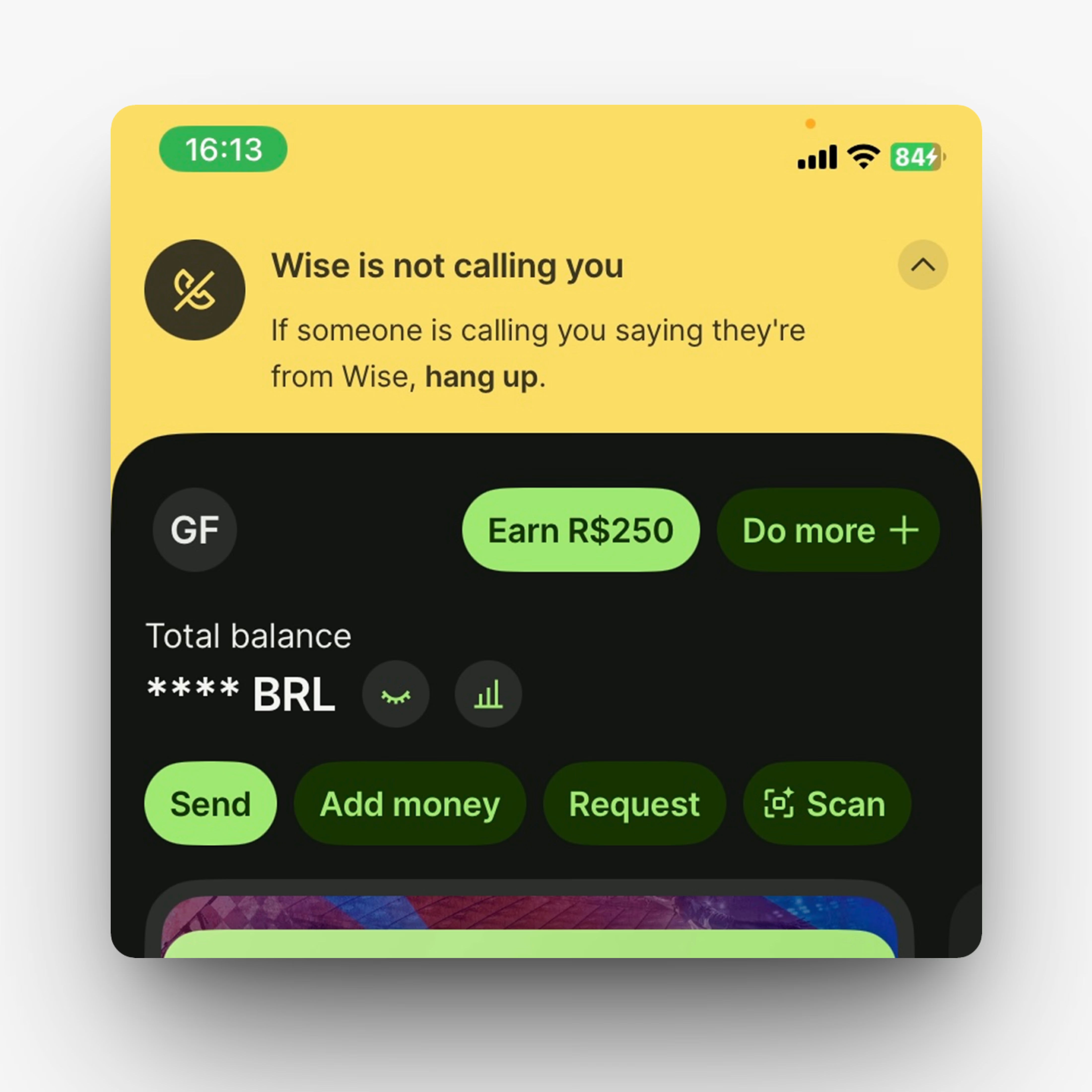

That persistent warning is so thoughtful.

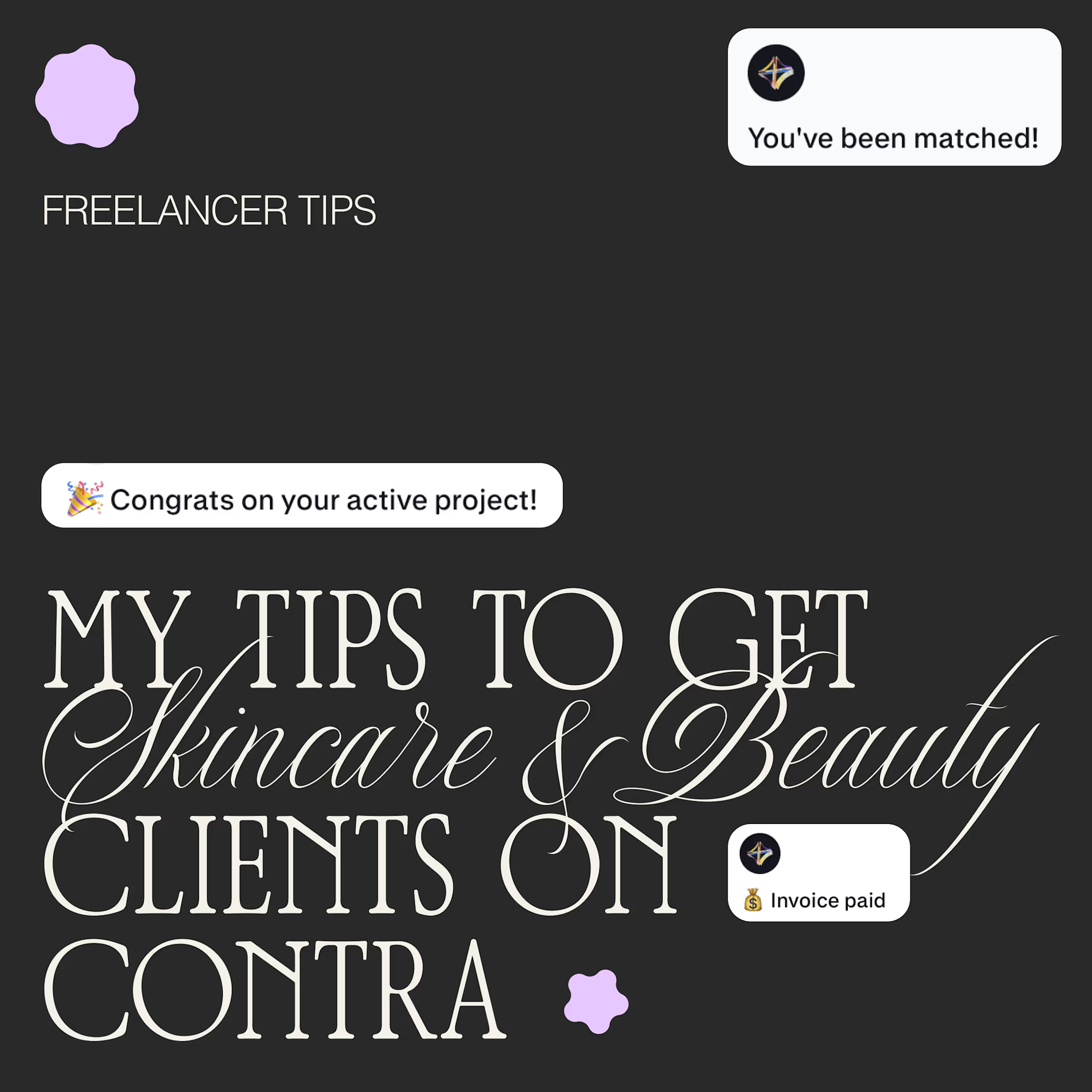
I get asked a lot how I get beauty and skincare clients, so here is what has helped me most:
📚 A portfolio that shows the work you want to get hired for. No real clients yet? Make passion projects for dream brands.
🎯 Apply only when your portfolio matches the job. Clients are very visual, and a product design portfolio won’t win a packaging project.
🔍 Research a lot. Follow the brands, learn how they talk and who they speak to.
💬 Apply to jobs that resonate with your skills and share related projects to potential clients.
🧴 Buy the products and analyze the packaging. Typography, finish, weight, how the label sits. You’ll notice things you can talk about in your pitch ✨
What would you add?

a portfolio that shows the work you want to get hired for is the best advice here. passion projects for dream brands really work

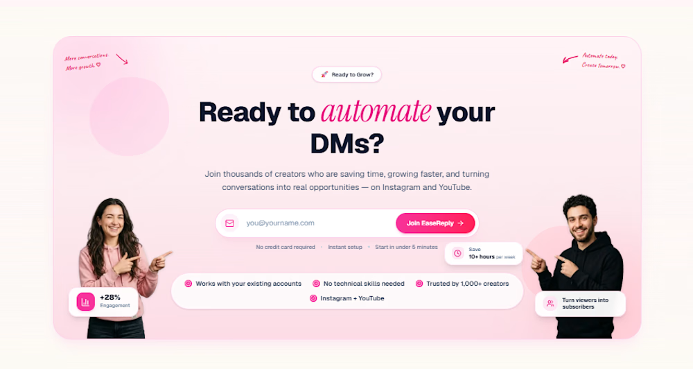
Most SaaS websites explain the product. Few make visitors sign up.
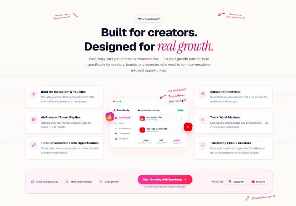
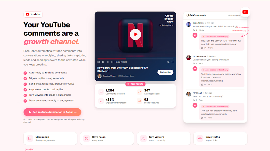
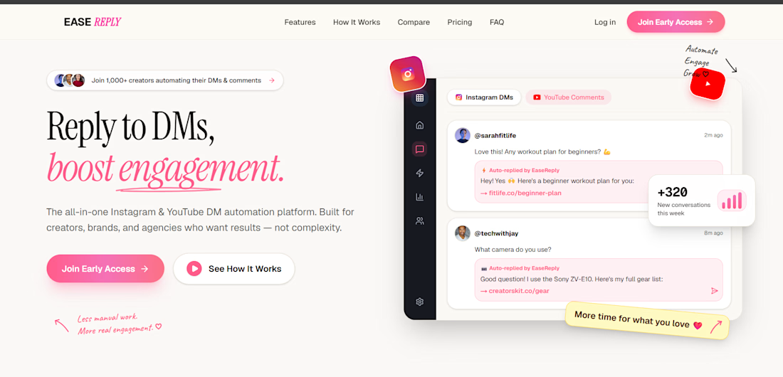
I designed the website for EaseReply, a tool that helps creators.
The goal: a visitor should understand what the tool does in 5 seconds, and know exactly what to do next.
What I focused on:
A headline that says the benefit, not the feature
One main action (start free or book a demo) repeated at the right moments
A product preview near the top, so people see it working before they read anything
Simple sections that go from problem, to how it works, to pricing
Clean, consistent UI that feels trustworthy
Mobile-first screens and fast loading
I use AI tools to move faster, and I make the layout, copy and design decisions myself, so it fits the product and the goal.
Building a SaaS or tool and want a site that gets signups? Send me your current page or idea and who it's for. I'll reply with 3 things I'd change first.