The network for creativity
Join 1.25M professional creatives like you
Connect with clients, get discovered, and run your business 100% commission-free
Creatives on Contra have earned over $150M and we are just getting started
Back to feedPost

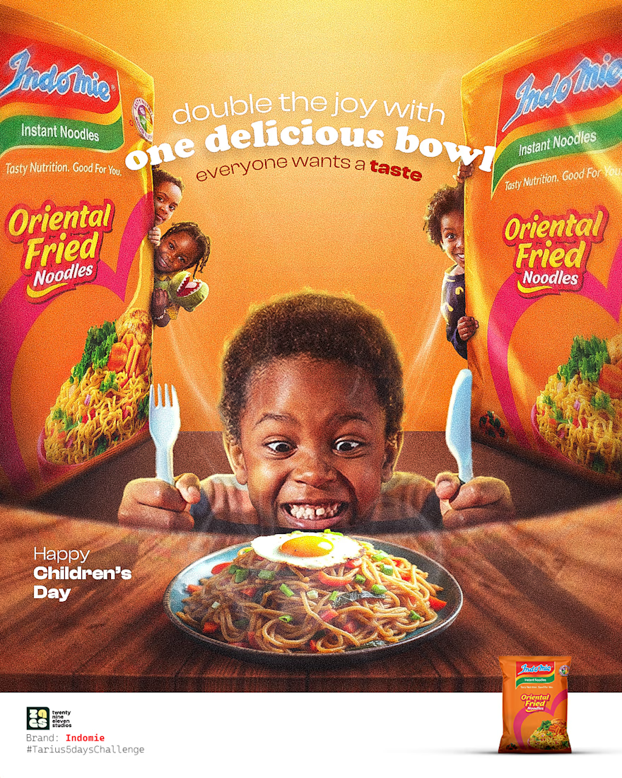
Day 3 of creating tailored made ad posters for brands.. For today we picked: Indomie
Fun, excitement and love...one thing indomie brings to the heart of every little child and that's what we tried to express with this design
Let's know what you think
Need visuals that draw your audience in? send us a dm
#creativedesigner #designer #graphics #creativeads #indomie
The network for creativity
Join 1.25M professional creatives like you
Connect with clients, get discovered, and run your business 100% commission-free
Creatives on Contra have earned over $150M and we are just getting started







Related posts


If you're still figuring out what to build for the challenge, look at this one 💜
One line of copy does all the work. Retype the emergency, drop a new product behind the glass and it's a whole new ad. That's a template people will actually use.
Love it!

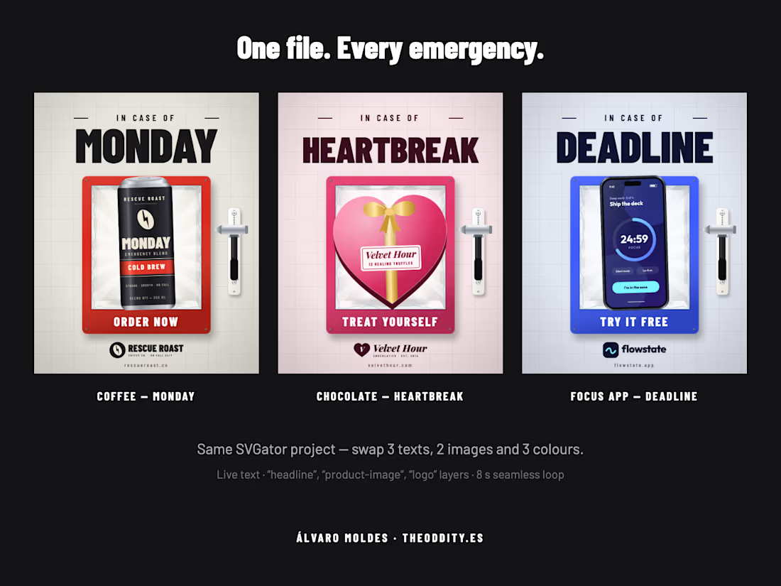
BREAK GLASS — an "In case of ___" ad template. Every product is somebody's emergency.
Retype the emergency (IN CASE OF MONDAY, HEARTBREAK, DEADLINE), drop a product PNG and a logo behind the glass, pick three colours and ship an 8-second 4:5 loop. Best for problem-to-solution...
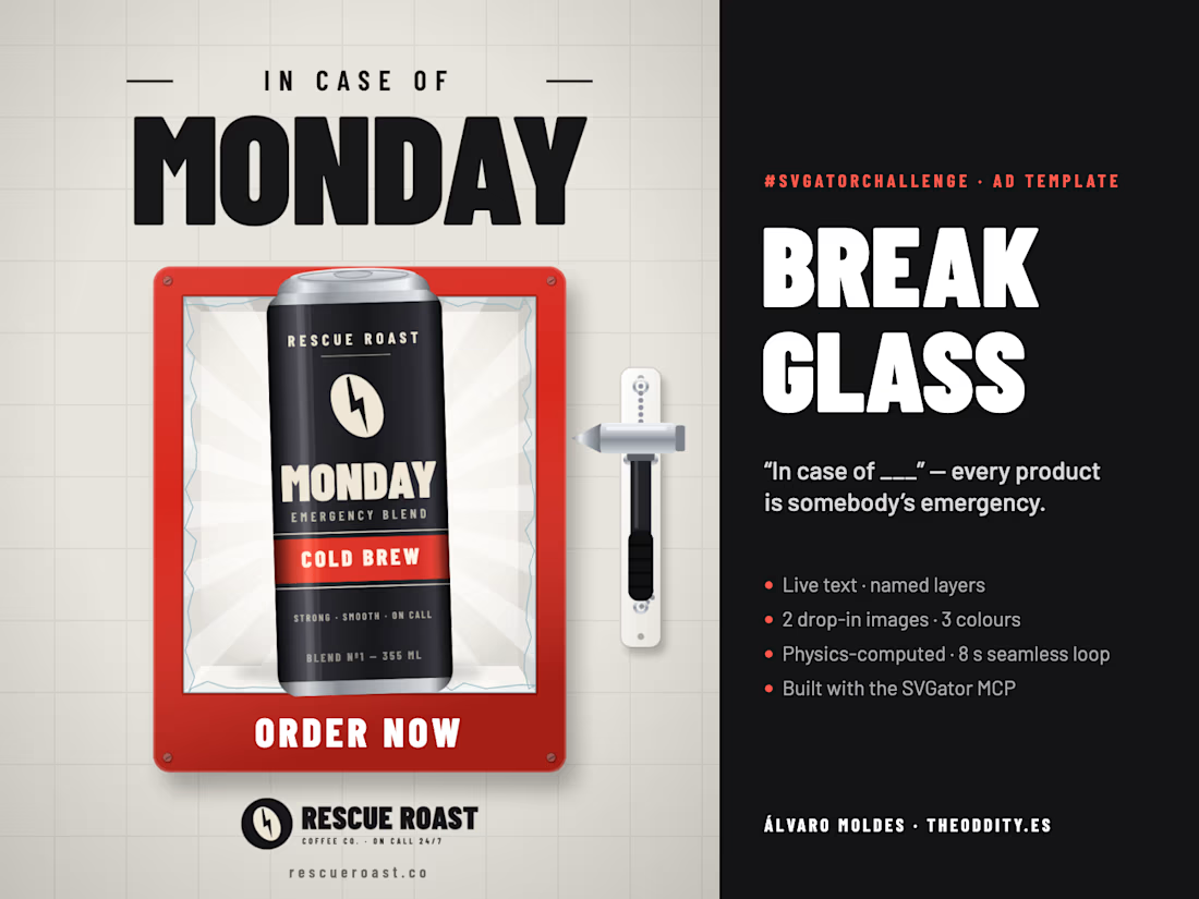


BREAK GLASS — an "In case of ___" ad template. Every product is somebody's emergency.
Retype the emergency (IN CASE OF MONDAY, HEARTBREAK, DEADLINE), drop a product PNG and a logo behind the glass, pick three colours and ship an 8-second 4:5 loop. Best for problem-to-solution social ads: launches, seasonal promos and "we've got you" campaigns for any brand. The same file also works as a click-to-break web widget.
Built end-to-end with the SVGator MCP: the glass fracture, ballistic shards with slow motion, ball-chain physics and the magnetic rewind that makes the loop seamless are computed in Python and authored straight into SVGator as 2,382 editable keyframes, verified frame by frame against SVGator's own export. Everything stays a real layer: live text, named elements (headline, product-image, logo, cta, tagline) and three colour fills (brand-color, interior-color, wall-color).
Project link (the form only accepts /editor/, which 404s, so here is the working one): https://app.svgator.com/editor#/46fd9b26049d4e929f81eb3404da8896 · Portfolio: theoddity.es
Okay, "In case of heartbreak" with chocolate behind the glass got me. Easily my favourite so far 💜 Such a simple idea and it works for literally any product. Thanks for joining, good luck!

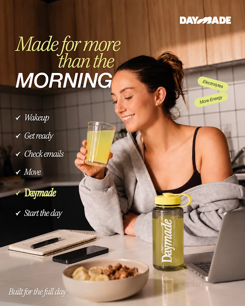
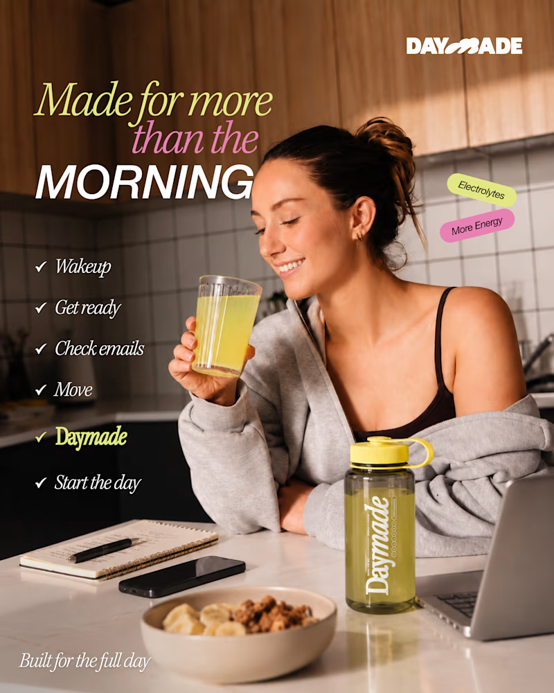
✨ Two styles. One campaign. Which Daymade design hits differently?
I explored two creative directions for Daymade, combining lifestyle storytelling with bold typography and fresh, energetic colors. ☀️🥤
💛 Option 1: Fresh & Minimal 💗 Option 2: Bold & Playful
Which one grabs your attention? 👀
Cast your vote! 🗳️👇
25 voted
26%
73 voted
74%
98 votes
Closed

Option 2 looks better