The network for creativity
Join 1.25M professional creatives like you
Connect with clients, get discovered, and run your business 100% commission-free
Creatives on Contra have earned over $150M and we are just getting started
Back to feedPost

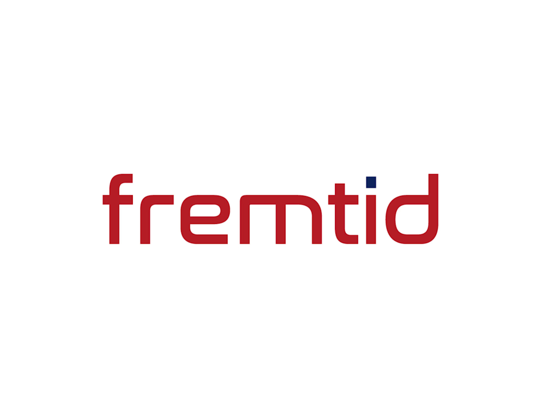
This project was developed as part of my self-employed work. With a new name, the client, who has Norwegian roots, aimed to take a new direction. The company name “fremtid” means “future” in Norwegian. This meaning is reflected in a wordmark designed to communicate the company’s vision and progress within the industrial sector. The color palette, inspired by the Norwegian flag, references the company’s heritage while also symbolizing strength, purity, and passion.

The network for creativity
Join 1.25M professional creatives like you
Connect with clients, get discovered, and run your business 100% commission-free
Creatives on Contra have earned over $150M and we are just getting started

Challenges
View all


Related posts

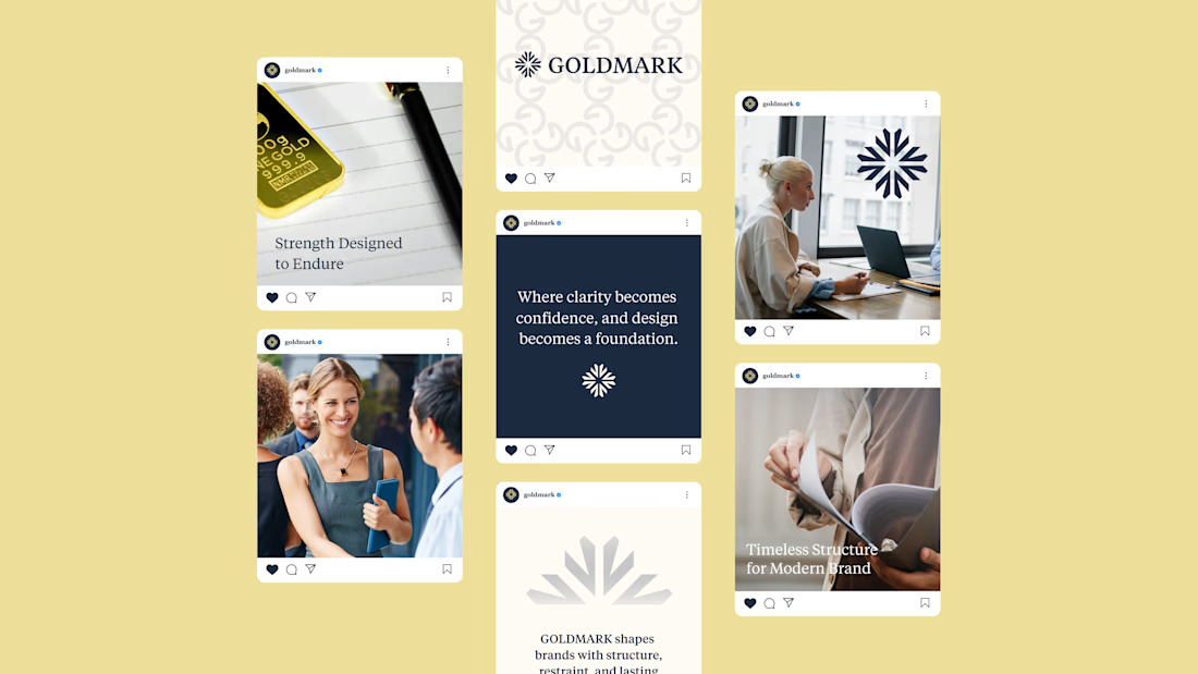
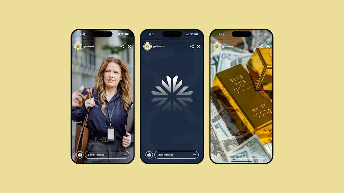
GOLDMARK - A refined identity for modern legal expertise. ✦
A complete branding exploration focused on building a visual language that feels premium, trustworthy, timeless, and confident.
The identity combines a distinctive symbol, elegant typography, and a deep navy + warm gold palette to create a sophisticated presence across digital and print applications.
Services: Brand Identity • Logo Design • Art Direction • Visual System
#BrandIdentity #BrandDesign #LogoDesign #VisualIdentity #Branding #GraphicDesign #ContraPortfolio


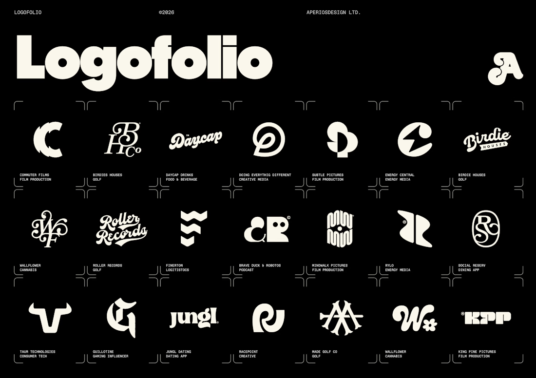
I’ve been slowly updating all of our project imagery across a new website update and and our internal decks.
Logos are only a small fraction of what we do for clients now, but I still love starting there. They often set the tone for the wider identity, the visual language, and the story we’re trying to tell.
Also, pretty satisfying seeing some of my favourites all together on one page.

Nice


A look at the identity we designed for Vetti, a dog health monitoring brand.
There’s a lot of data behind a product like this but the person using it just wants to know their dog is okay.
That’s the balance in the design with a connected dot system that feels precise and warm colors and photography that keep it close to what people care about.
Also, an excellent excuse to spend far too long choosing dog photos.

