The network for creativity
Join 1.25M professional creatives like you
Connect with clients, get discovered, and run your business 100% commission-free
Creatives on Contra have earned over $150M and we are just getting started
Back to feedPost

Wondering if I should add color..?
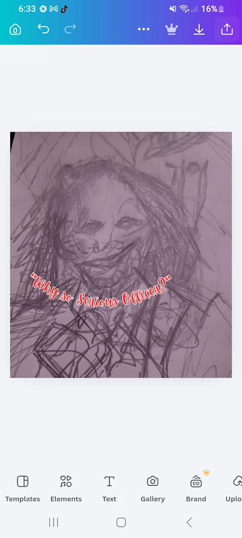


😂😂😂
The network for creativity
Join 1.25M professional creatives like you
Connect with clients, get discovered, and run your business 100% commission-free
Creatives on Contra have earned over $150M and we are just getting started











Related posts


Something About Colour
Visual Storytelling · Creative Direction · Short Form Video
Overview
A three part video series exploring the colours blue, yellow, and red through visual details and everyday moments in Sicily and Lisbon.
My Approach
Developed the concept, hunted for colours, filmed, and edited each video into a cohesive visual storytelling series designed to capture attention on social media.
Results
Over 1.1 million views across the colour hunting series.
Services
Creative Concept · Creative Direction · Visual Research · Filming · Video Editing · Social Media Storytelling

OG Hair Extensions came with a vision that took a little exploring to bring to life. I started by creating different logo concepts, then had a conversation with the client to better understand the look she wanted. That helped me move towards something bolder, with glitter, rich colors, and a touch of royalty.
Once we settled on a direction, I developed the logo and created packaging mockups and short transition videos to help the client picture how the identity could look beyond the logo itself.

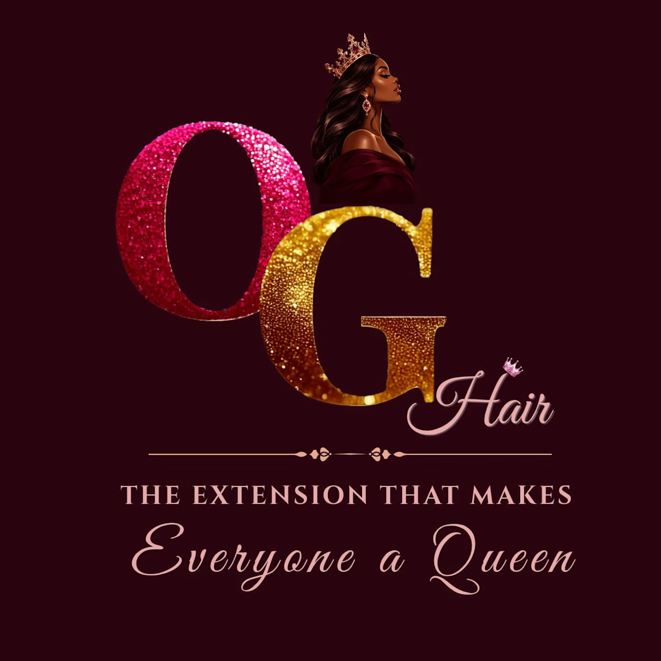

The glitter texture on the O and G is the whole personality here, and Everyone a Queen is a line a client can repeat. Honest question: the glitter will fight you on a business card or a tiny social avatar. Do you have a flat one-color version that still feels like OG Hair?
