The network for creativity
Join 1.25M professional creatives like you
Connect with clients, get discovered, and run your business 100% commission-free
Creatives on Contra have earned over $150M and we are just getting started
Back to feedPost
I'm honestly amazed by the response on the Still Blooming A/B test you all showed so much love and gave such thoughtful feedback on the two hero directions 🙏🔥
Because of that, I wanted to bring you the full website video, showing how the winning direction comes together across the entire homepage. From the hero section to the imagery, colors, and overall flow, this is the final output shaped by your votes and feedback.
Take a look and let me know what you think! Would really love to hear if the final result lives up to what you all voted for 👇


The editorial framing and warm orange palette make MoneyCheck feel both approachable and considered. Love how the source-code angle is presented as part of the product story rather than an afterthought.

Taking the winning hero direction into a full website is a useful follow-up to the A/B test. Did any of the feedback change how you approached motion or pacing across the rest of the page?

Thanks so much! 🙏 Honestly yes, the feedback made me pay a lot more attention to pacing beyond just the hero. A few people mentioned how the centered layout felt calmer, so I carried that same slow, breathing rhythm into the scroll animations and section transitions instead of...
That breathing room makes the motion feel considered.
The network for creativity
Join 1.25M professional creatives like you
Connect with clients, get discovered, and run your business 100% commission-free
Creatives on Contra have earned over $150M and we are just getting started





Related posts

AI Sales Agent SaaS Landing Page
A modern AI Sales Agent & Sales Intelligence SaaS website designed for startups and growing businesses looking to automate sales workflows, streamline lead management, and boost revenue through intelligent automation and real-time insights. The design combines a premium SaaS aesthetic with a conversion-focused user experience, featuring clear product messaging, interactive sections, and a scalable interface built to support modern sales teams.

Amazing design

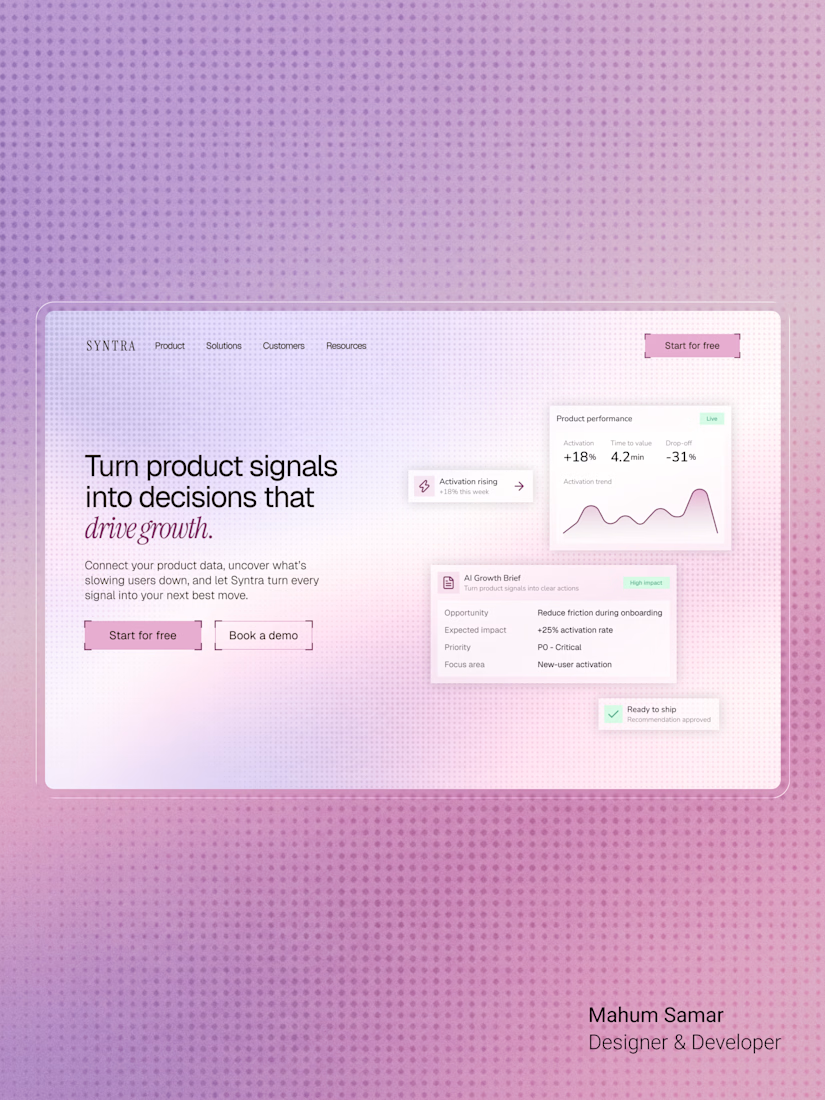

The italic accent on "drive growth" ties the headline together nicely. Soft gradient keeps the cards readable.

Brand identity work for WesoftAI

