The network for creativity
Join 1.25M professional creatives like you
Connect with clients, get discovered, and run your business 100% commission-free
Creatives on Contra have earned over $150M and we are just getting started
Back to feedPost

Aesthetic Skincare Product Video
Project Overview
A 10-second vertical product video created for ISNTREE’s Yam Root Vegan pH-Balancing Cleanser.
The goal was to create a clean, premium skincare aesthetic while clearly showcasing the product, packaging, texture, application, and final skin finish in a short-form format designed for social media.
Creative Direction
Format: 9:16 vertical
Duration: 10 seconds
Visual style: Minimal, soft, clean, and editorial
Color palette: Neutral beige, white, and warm brown tones
Lighting: Soft natural daylight
Audio: Soft lo-fi aesthetic music
Voiceover: None
Video Structure
01 — What I Do
The first section focuses on the product experience:
Product packaging and label reveal
Opening the beige flip cap
Close-up of the cleanser texture
Product being squeezed onto damp skin
02 — What You See
The second section shifts into polished product beauty shots:
Extreme close-up of the product label
Macro cap-opening shot
Creamy cleanser transforming into soft foam
Gentle application onto damp skin
Final beauty shot featuring fresh, hydrated-looking skin alongside the product
Visual Approach
The video combines macro product shots, subtle zooms, texture-focused close-ups, and soft natural lighting to create a premium skincare feel while keeping the pacing engaging within the 10-second runtime.
The overall direction was intentionally minimal, allowing the product and its texture to remain the focus.


The network for creativity
Join 1.25M professional creatives like you
Connect with clients, get discovered, and run your business 100% commission-free
Creatives on Contra have earned over $150M and we are just getting started



Related posts

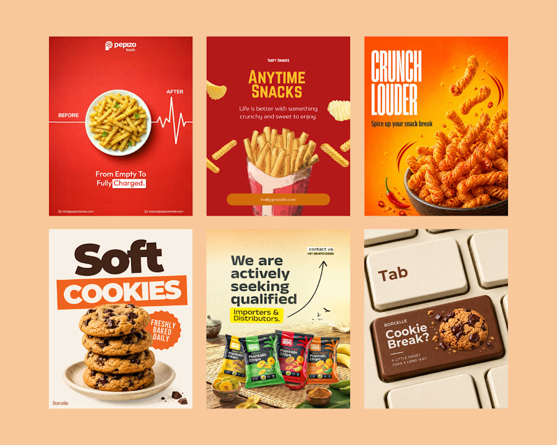
Created eye-catching social media creatives for a snack brand, focusing on mouth-watering visuals, bold typography, and engaging layouts.
The designs highlight product appeal, grab audience attention, and help the brand promote its snacks, offers, and new launches effectively across social media.
Social Content DesignphotoshopposterdesignSocial Media MarketingTypographyAdobe PhotoshopCanvaChatGPT


great job🙌

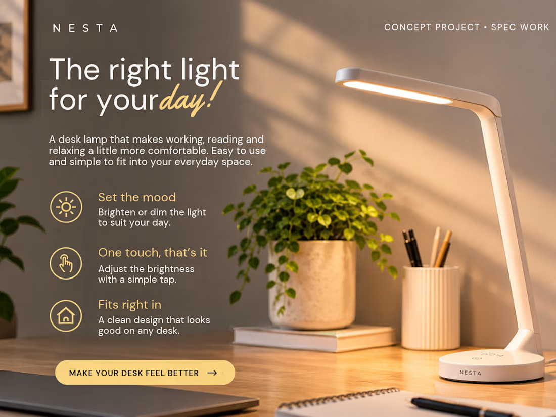
This is a concept project for NESTA, a fictional home-tech brand.
I wanted the copy to feel simple and natural, showing how a desk lamp can make everyday things like working, reading, or relaxing a little more comfortable.
It includes the product headline, description, key benefits, and CTA.
CONCEPT PROJECT · SPEC WORK


Looks great!
Did you do the graphics?

One skincare brand. Two different hero experiences.
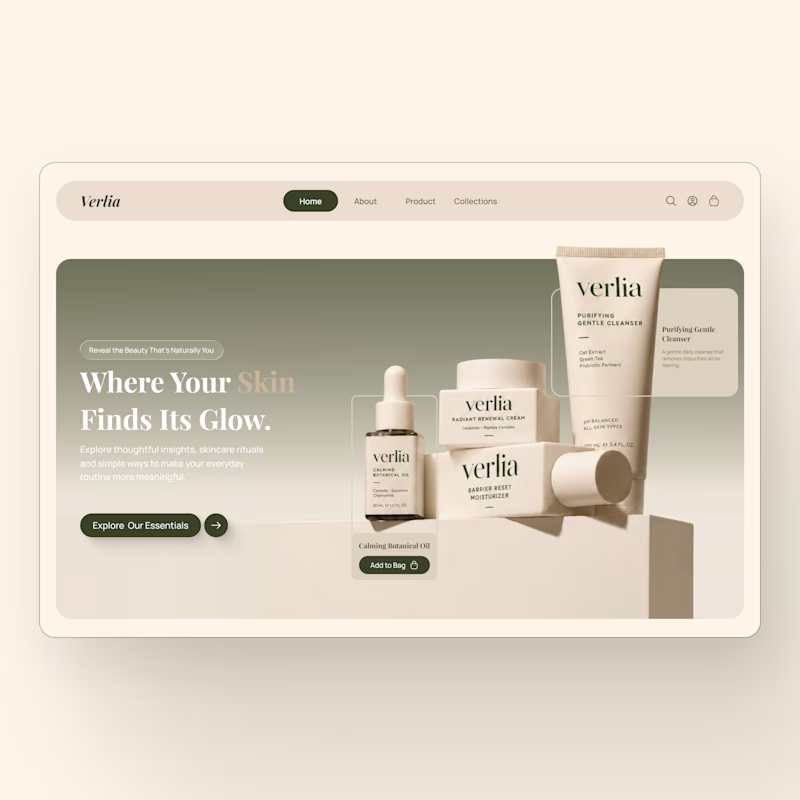
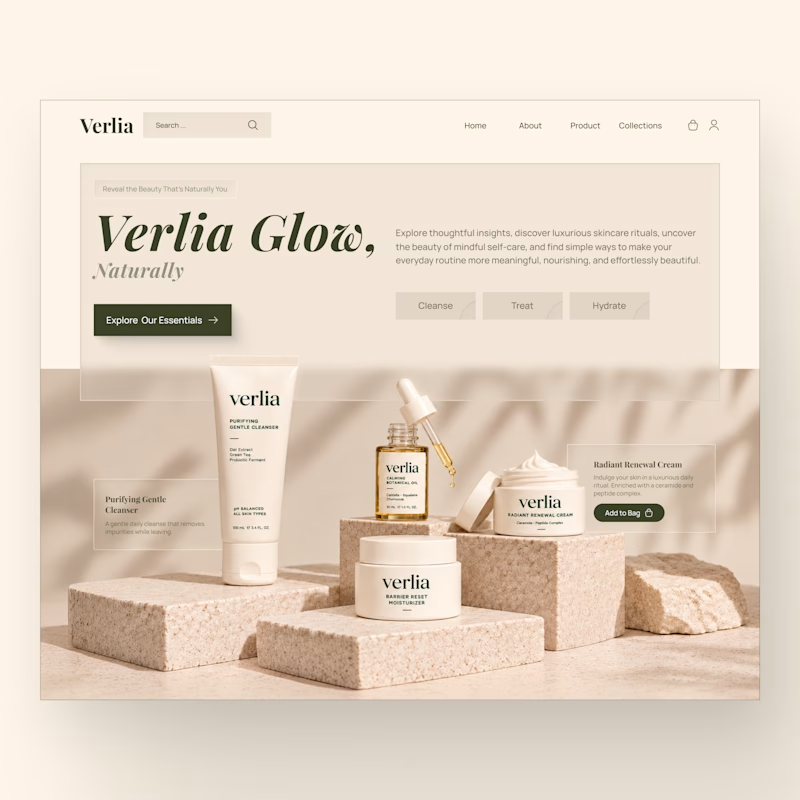
I designed two homepage hero concepts for **Verlia**, a premium skincare brand, exploring how visual storytelling can shape a brand's first impression.
Both concepts use a warm, neutral palette and minimal luxury aesthetic, but each has its own personality.
Option 1 — Minimal & Product-Focused. A clean, framed layout that puts the products and shopping experience in the spotlight.
Option 2 — Editorial & Immersive. A bold brand introduction paired with rich product photography and a more expressive visual composition.
Which hero design would you choose for a luxury skincare website?
Vote for Opt. 1 or Opt. 2, and share what made you choose it in the comments.


3 voted
43%
4 voted
57%
7 votes
Closed
