The network for creativity
Join 1.25M professional creatives like you
Connect with clients, get discovered, and run your business 100% commission-free
Creatives on Contra have earned over $150M and we are just getting started
Back to feedPost
Retro Risograph & Lo-Fi Brand Illustrations
Stand out from the sea of corporate stock art with custom, nostalgia-driven illustrations.
I specialize in creating Risograph-style assets that bring warmth, texture, and a "human touch" to your digital brand. Perfect for:
Newsletter headers that pop.
Podcast cover art with personality.
Social media assets that stop the scroll.
My Process:
I utilize advanced AI workflows combined with post-processing texture overlays to create the authentic look of 90s screen printing, without the mess of ink.
Deliverables:
High-Res PNG/TIFF files.
Custom color palette matching your brand.
Commercial usage rights included.


Thank you, Ciro! It actually looks really good, it's true 😂
The network for creativity
Join 1.25M professional creatives like you
Connect with clients, get discovered, and run your business 100% commission-free
Creatives on Contra have earned over $150M and we are just getting started









Related posts

Title: Proper Form — Brand Identity & Visual Language
A brand identity for Proper Form built around a more modern, movement-driven take on recovery and healthcare.
The visual system extends the logo into a complete language through color, typography, imagery and layout, creating a consistent identity across different brand touchpoints.
Created by Lepisov Branding in collaboration with @Creative Mints
Logo design: Ilya Gorchanyuk
Creative direction: Dmitry Lepisov
Brand identity: Lepisov Branding × Creative Mints


Using the logo mark as the big graphic across the layouts is smart. The purple to pink gradient gives recovery a more energetic feel.


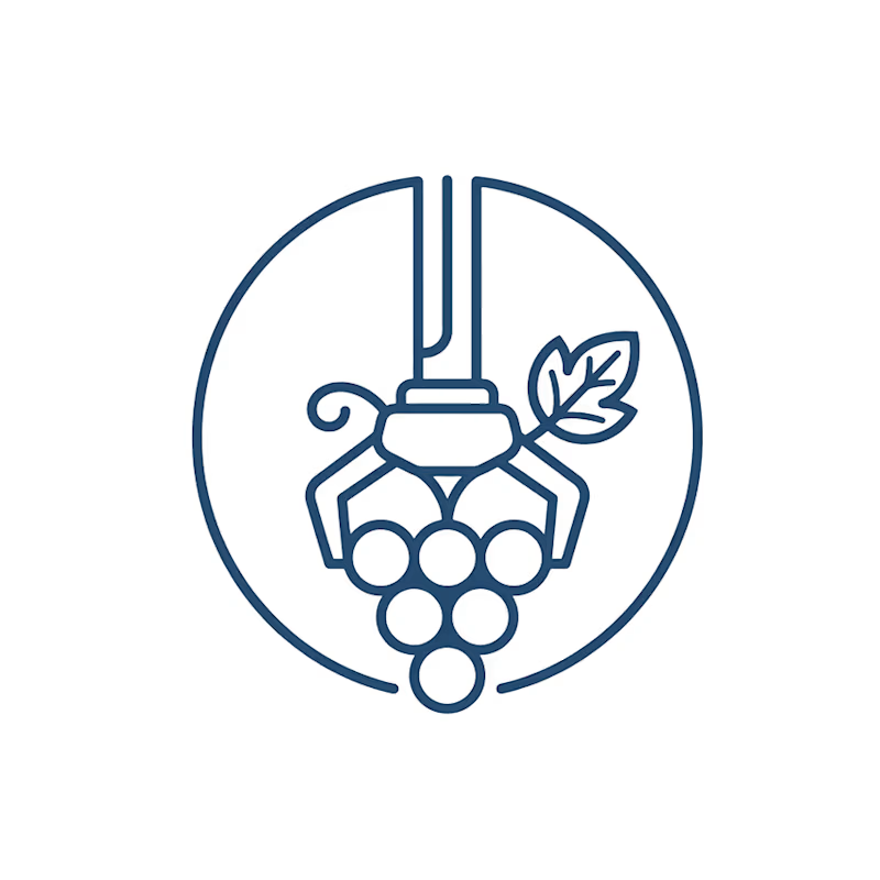
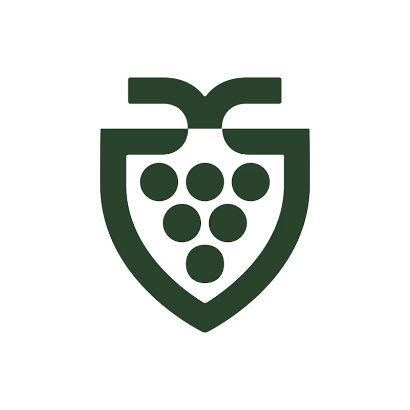
Which feels more established to you?
22 voted
30%
52 voted
70%
74 votes
Closed


Which stage takes you the longest?
✏️ Sketch: too many options, and all of them look good
🎨 Color: cracking a safe, looking for the combination that clicks
✨ Final: nothing left to decide, just do it well and listen to the client
I’m team color 🙋
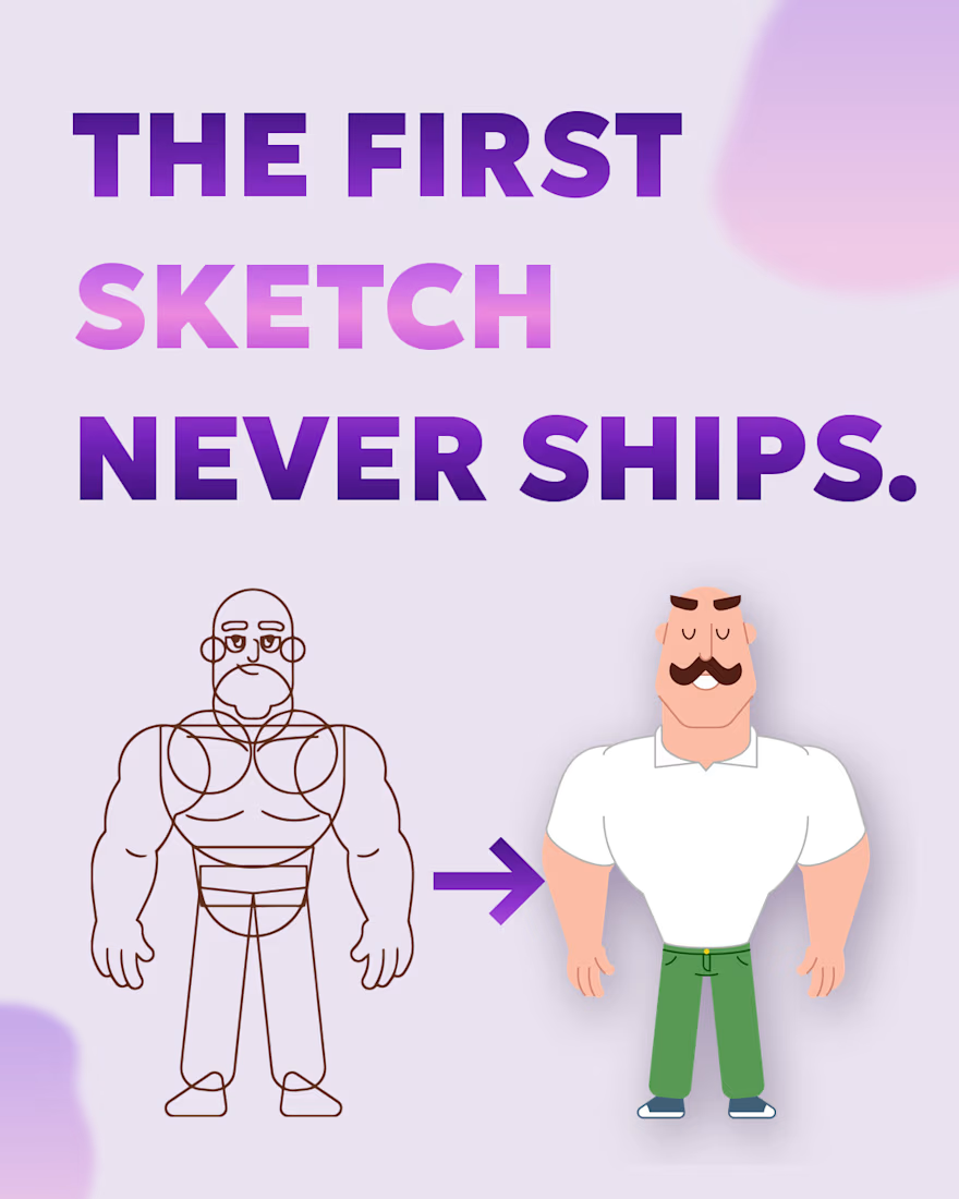
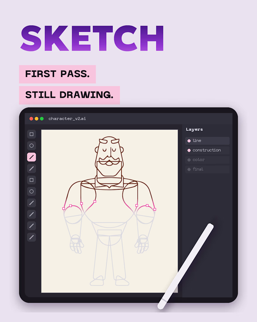
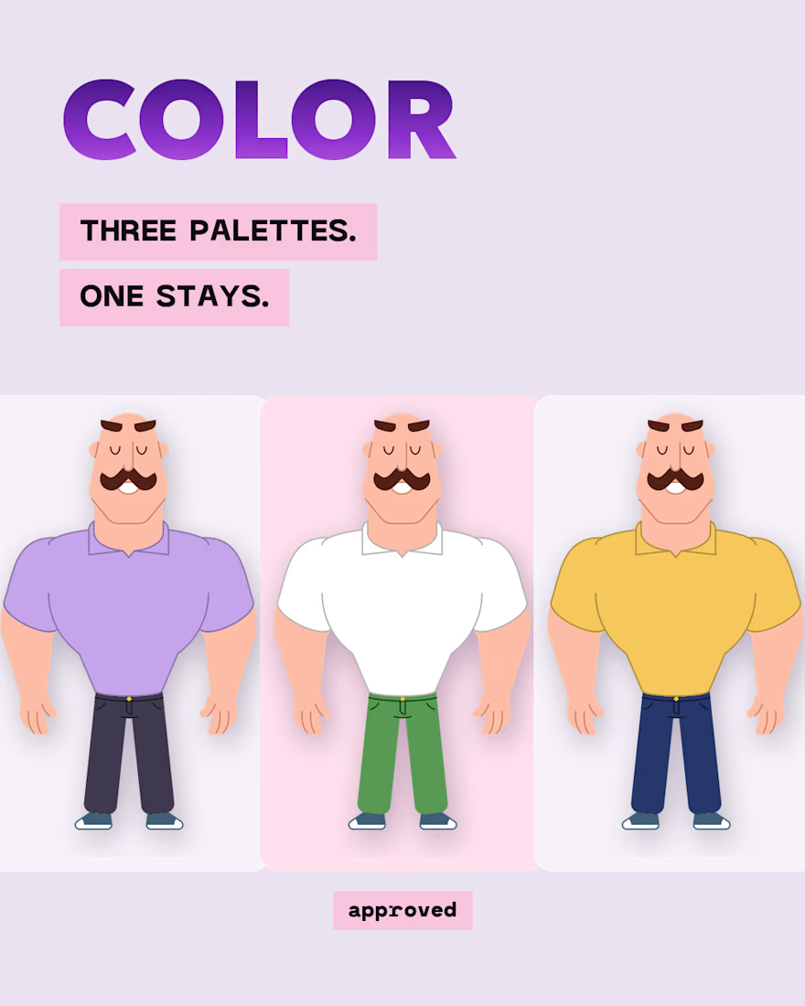
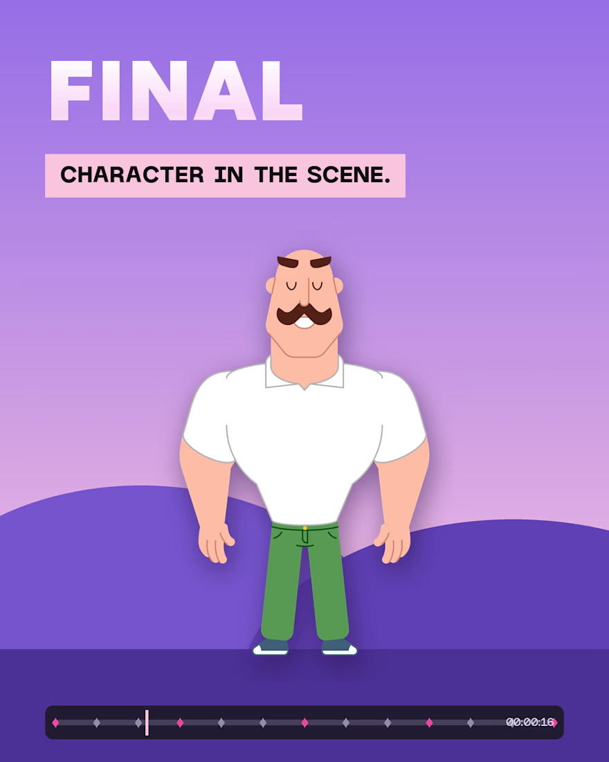

Team color here too. Cracking a safe is the perfect metaphor, finding the combination that clicks is where all the hours quietly go. The three color variants prove how much one palette changes a character's whole personality.