The network for creativity
Join 1.25M professional creatives like you
Connect with clients, get discovered, and run your business 100% commission-free
Creatives on Contra have earned over $150M and we are just getting started
Back to feedPost


Proud to be part of the launch of Contra Labs 🚀
Together with my partner @Stacy · Heed Collective — was entrusted to shape the brand identity and web design for Contra Labs.
Congratulations to the entire team on this launch — such an important and inspiring step ✨

The question was never "can you make it?"
It's always been "is it worth making?"
@Charlota Blunárová and @Dann Petty nailed this perspective.
Excited to finally share Contra Labs with the world.
Huge shoutout to incredible collaborators @Anna Gudvin · Heed Collective on the branding, @Alex Karpodinis on the site build, and @Mark Vassilevskiy @Michael Ugwuzor + team on the video.
It's live → contralabs.com

contralabs.com
Contra Labs - Powered by Contra
The frontier human data and evaluation lab for creative AI. 1.5M+ verified creative experts setting the benchmark for style, tone, and taste with next-gen creative tools.


Omg I was literally just thinking how much I LOVED the branding, I was about to message Contra to say it’s a masterpiece. So so good. Congrats @Anna Gudvin · Heed Collective and the whole team
Sabrina, wow — thank you 🤍Hearing this really means a lot ✨
The network for creativity
Join 1.25M professional creatives like you
Connect with clients, get discovered, and run your business 100% commission-free
Creatives on Contra have earned over $150M and we are just getting started





Related posts


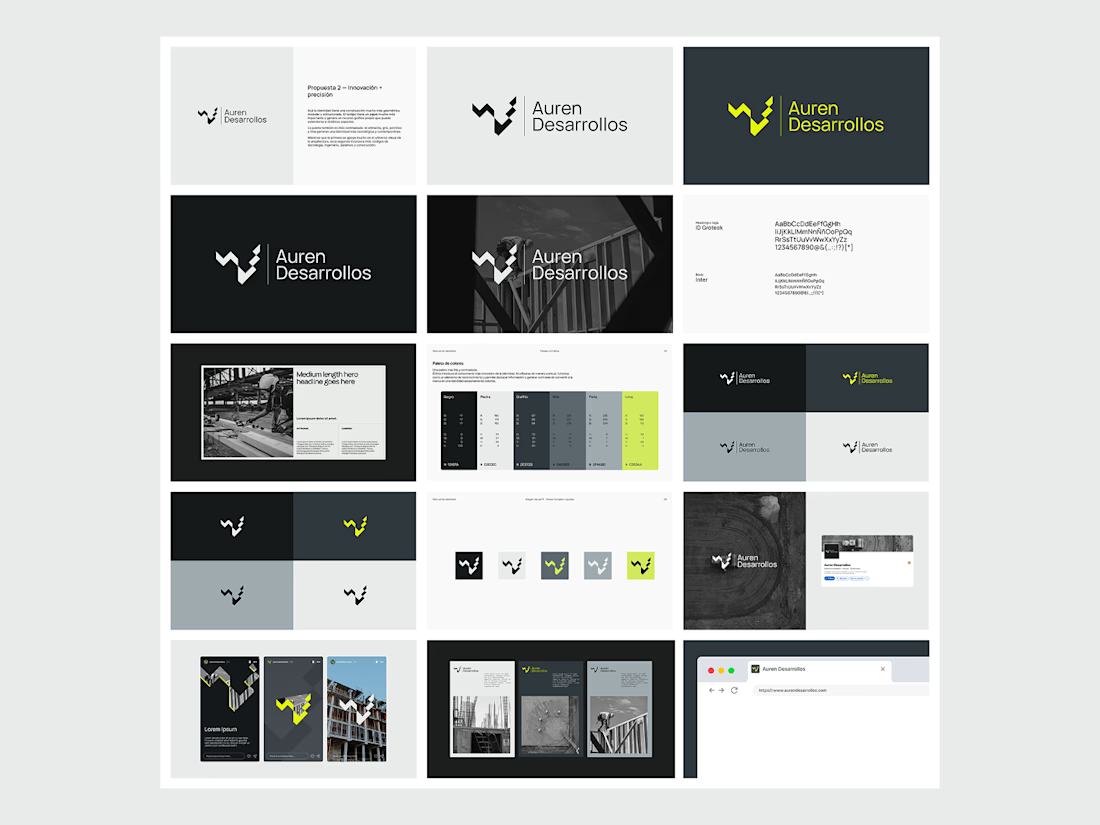
Not every direction makes it to the final brand.. this was one of the directions we explored for Auren Desarrollos, a new construction and development company we’re currently working with on its branding and website.
I’ll be sharing the final result soon, and I think the difference will be interesting to see.
What do you think?



Great!

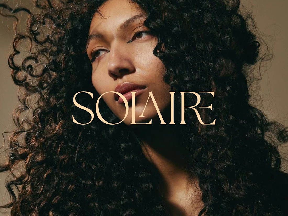
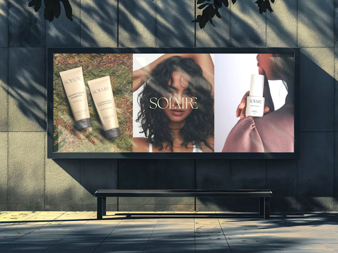
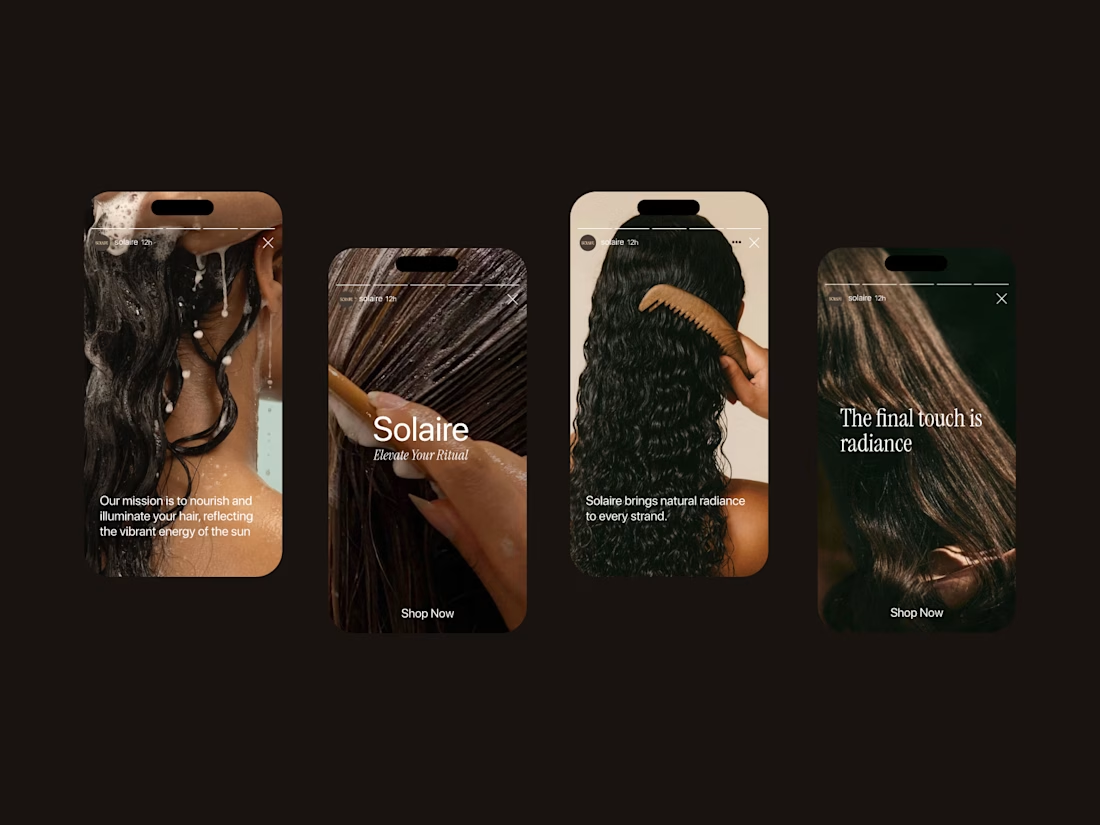
Solaire: a haircare brand identity rooted in warmth, texture, and light.
For this project, I wanted the brand to feel as dimensional as the hair it celebrates. The custom serif wordmark has elegant, ligature-style details where the letters overlap and intertwine, echoing the movement of a curl. The warm champagne tone against rich, golden-hour photography keeps everything feeling sun-kissed and confident rather than clinical.
The goal: a brand that feels luxurious but never precious, made for people who wear their texture proudly.
Brand identity • Logo design • Art direction

nice work


For Vetti, a pet-health startup, our team made orange the signature colour and kept it out of the product’s data states.
Orange could carry the brand in a campaign. Inside the product, the colour attached to a score needed its own meaning. Using the same colour for recognition and an alert would ask someone to work out which job it was doing.
So the guidelines gave the data palette a separate role. Scores came with plain-language states, and the alert-copy rule was to state the observation, then give the next step.
Those decisions belong together. A calm sentence can be undermined by a colour treatment that suggests urgency.
If you’re reviewing an identity for a product, put a marketing layout beside a screen that communicates status. Ask what each colour means in each place.

This is beautiful work, and the orange colour choice was a good one, it really ties it all together ♥️