The network for creativity
Join 1.25M professional creatives like you
Connect with clients, get discovered, and run your business 100% commission-free
Creatives on Contra have earned over $150M and we are just getting started
Back to feedPost
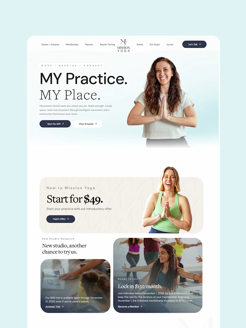
A yoga studio website shouldn’t feel like a fitness website.
I designed Mission Yoga around three things:
A calm, editorial visual experience
Clear paths to classes, memberships, and teacher training
Strong CTAs without making the experience feel overly sales-driven
The lesson: Good wellness design isn’t just about looking calm — it should make people feel comfortable enough to take the next step.
What do you think matters more for a wellness website: visual calm or clear conversion paths?


They aren't opposites visual calm is the conversion path here. If a yoga site feels cluttered or rushed people drop off before they even look at prices.

Exactly, the calm layout acts as the conversion path itself by making the next steps feel completely natural and stress-free.
The network for creativity
Join 1.25M professional creatives like you
Connect with clients, get discovered, and run your business 100% commission-free
Creatives on Contra have earned over $150M and we are just getting started







Related posts



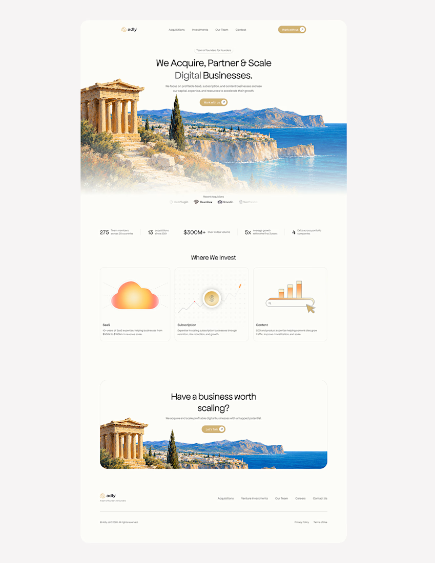
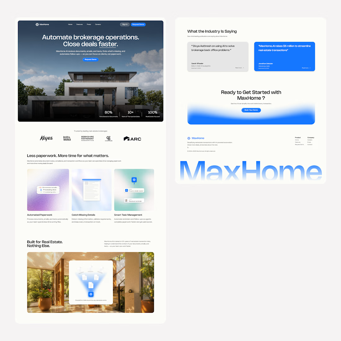
A compelling value proposition can make users want to know more about your product.
Let's take a look at these two examples.
"We help you manage your finances."
"Know where your money goes and take control of your spending."
Which one grabs your attention more?
The second one works better because it focuses on what the customer actually cares about, not just what the product does.
Here are some questions every value proposition should answer:
Why should customers choose you over your competitors?
What makes your product different?
How does it solve your customers' problems?
You can only answer these questions by understanding your customers' pain points and thinking from their perspective.
If you don't understand your customers, no amount of design or advertising will help you build lasting customer relationships.
Instead of constantly adding more features, startups should focus on what makes their product different.
And communicate that value clearly through their landing pages.

Brilliant execution!

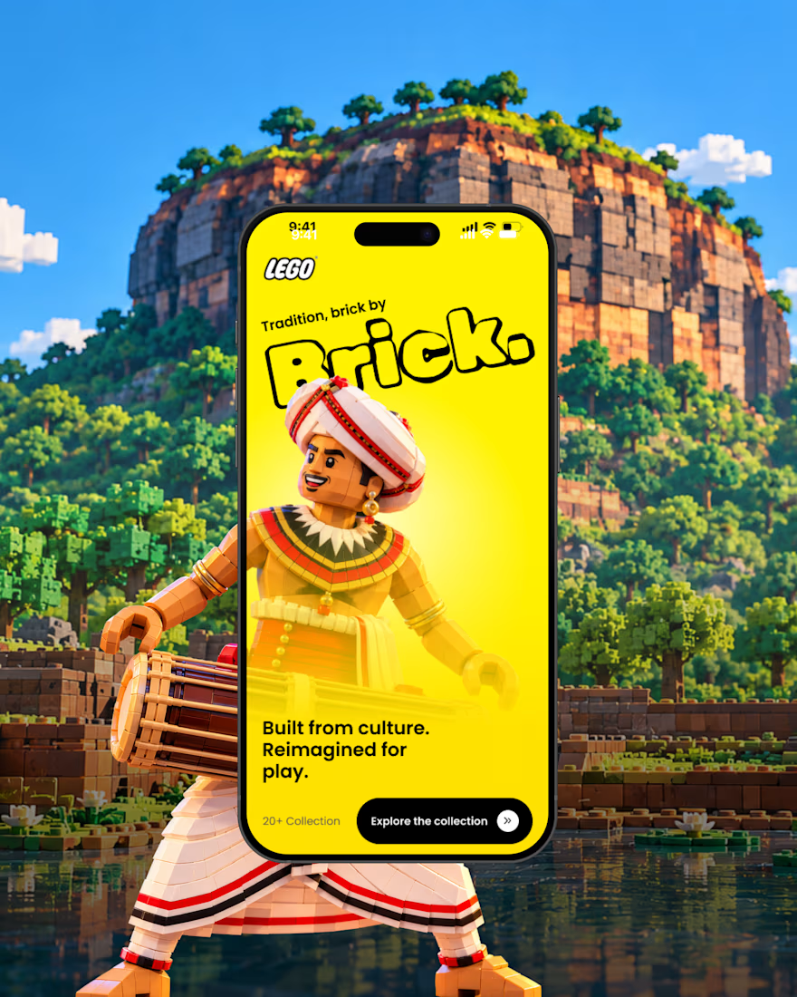
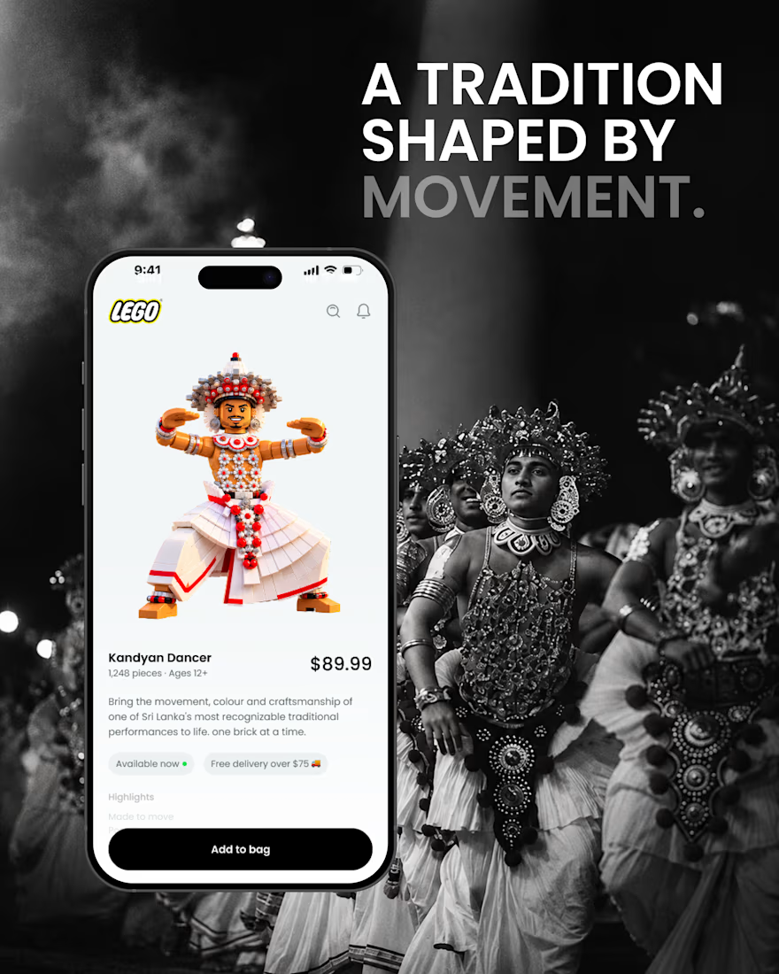
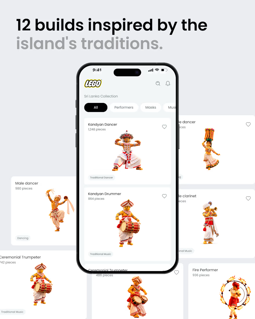
What if Sri Lankan tradition found its way into the LEGO app? 🇱🇰🧱
A small product design exploration.
Had a small idea and decided to visualize it. ✌️
I reimagined a few elements of Sri Lankan culture traditional dancers, masks, musicians, and instruments as brick built characters, then explored how they might live inside a LEGO style mobile experience.
Just a hypothetical design experiment combining culture, product design, and a little AI-assisted exploration.
Not affiliated with or endorsed by LEGO.
#ProductDesign #UIDesign #DesignConcept #DesignExploration #CreativeAI #SriLanka #SriLankanCulture #LEGO

That's awesome great job 🎉🎉