The network for creativity
Join 1.25M professional creatives like you
Connect with clients, get discovered, and run your business 100% commission-free
Creatives on Contra have earned over $150M and we are just getting started
Back to feedPost

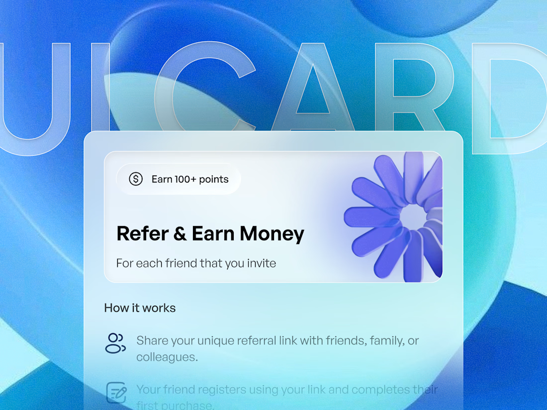
🔥 The first UI Card Design received an amazing response on Dribbble, so I decided to take it a step further.
Introducing Liquid Glass UI Card Design 2.0 — a modern web UI exploration focused on glassmorphism, layered depth, soft gradients, and premium user experiences.
Designed for SaaS, fintech, referral systems, and modern web products where trust, clarity, and visual polish matter.
Would love to hear your feedback! 👇
#UIDesign #WebDesign #Glassmorphism #LiquidGlass #SaaSDesign #FintechDesign #ProductDesign #Dribbble
The network for creativity
Join 1.25M professional creatives like you
Connect with clients, get discovered, and run your business 100% commission-free
Creatives on Contra have earned over $150M and we are just getting started











Related posts

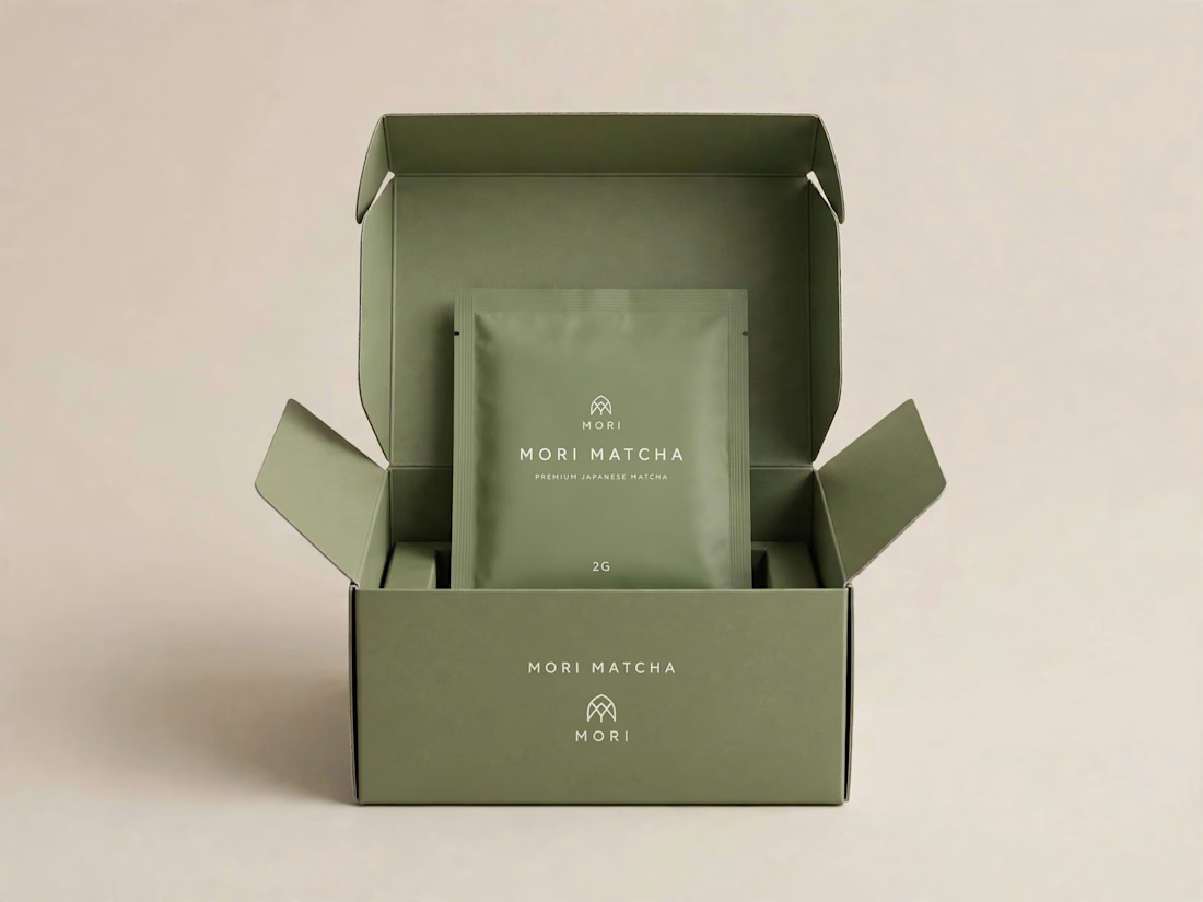
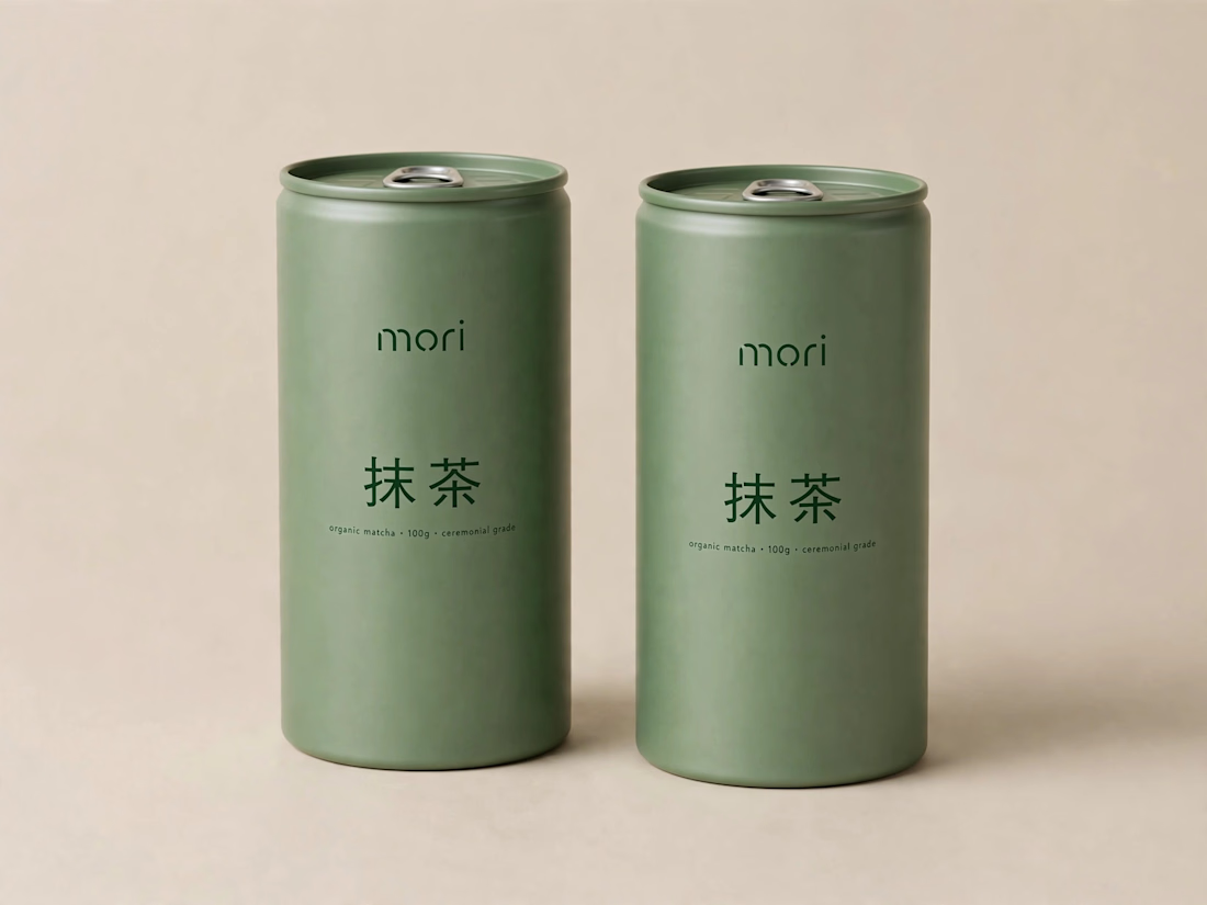
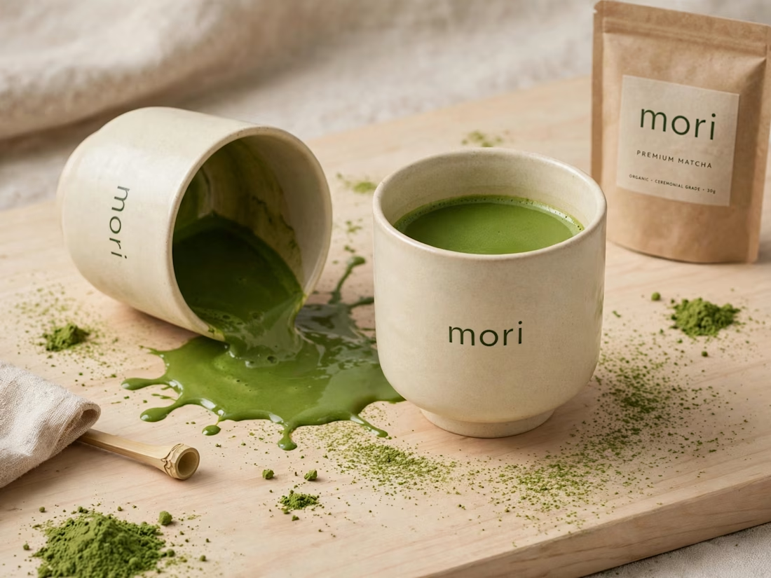
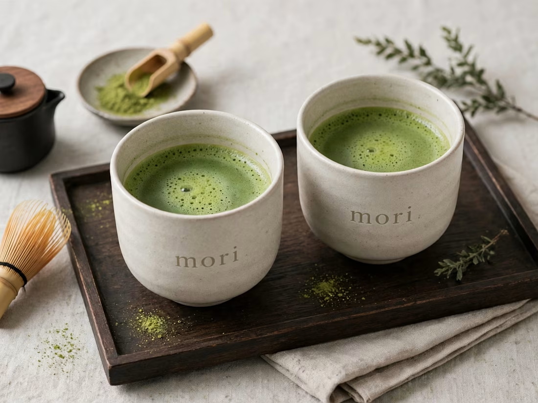
more visuals from my latest project — mori matcha 🍵
explored minimal Japanese packaging with earthy greens and calm typography.
focusing on premium ceramic cups and clean can design.
#branddesign #packagingdesign #visualidentity #brandstrategy #matcha #minimaldesign #japanesedesign #figma #mockup #branding




This UI was really great nice job Piotr🔥🔥🔥