The network for creativity
Join 1.25M professional creatives like you
Connect with clients, get discovered, and run your business 100% commission-free
Creatives on Contra have earned over $150M and we are just getting started
Back to feedPost

it clean o'clock
“Imagine a fashion shopping app that feels premium the moment you open it🚀


Nice work!
thank you🙌
The network for creativity
Join 1.25M professional creatives like you
Connect with clients, get discovered, and run your business 100% commission-free
Creatives on Contra have earned over $150M and we are just getting started











Related posts

Great features make an app work, but a mascot makes you actually open it. In a sea of clean, identical screens, a little personality turns a cold tool into a companion you root for.
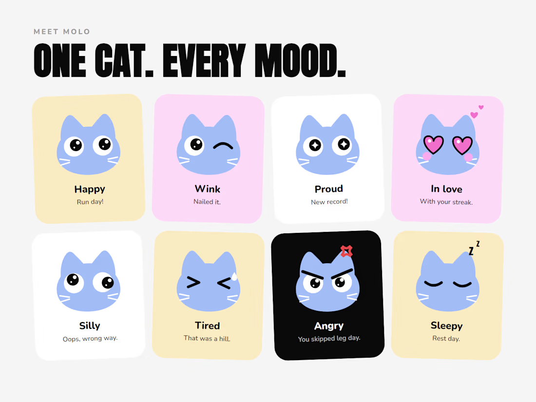

This is so spot on Memouna! 💯 Features make it work, but personality makes people come back. MOLO - ONE CAT. EVERY MOOD. is such a brilliant system. Those 8 moods (Happy, Wink, Proud, In love, Silly, Tired, Angry, Sleepy)

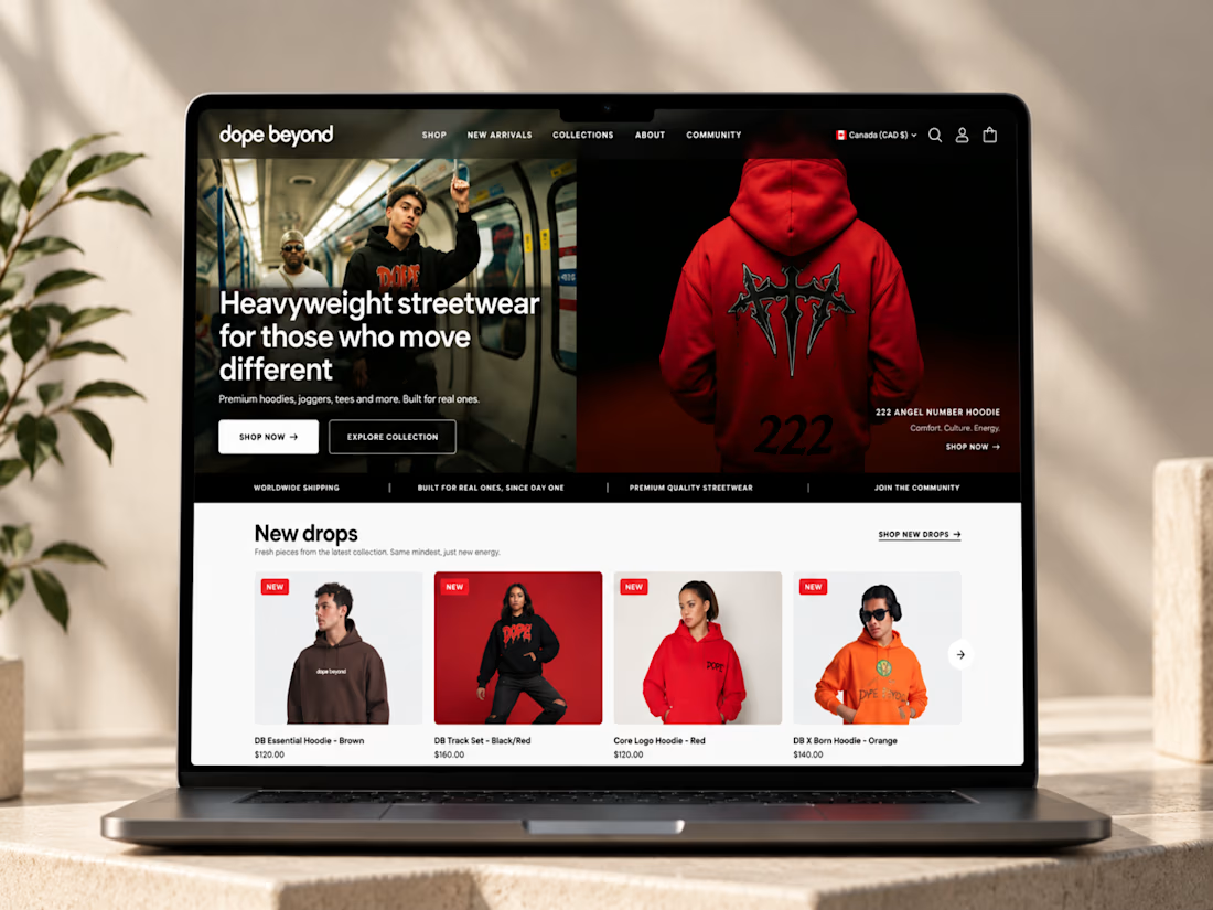
🔥 From streetwear to a standout Shopify experience.
I recently worked on DOPE BEYOND, building a bold e-commerce store for a streetwear brand using Shopify and the Palo Alto theme.
From mega menu navigation to size charts and color swatches, every detail was designed to make shopping easier while keeping the brand’s identity strong.
What do you think matters most in a fashion e-commerce store: design, user experience, or functionality? 👇


Ye le Jani Solomon wali post ke liye copy-ready:
Fire work Solomon! 🔥 DOPE BEYOND looks like a perfect fit for a bold streetwear brand — love how you took Shopify + Palo Alto theme and pushed it beyond the template with mega menu, size charts and color swatches. Those small UX...

Title: Proper Form — Brand Identity & Visual Language
A brand identity for Proper Form built around a more modern, movement-driven take on recovery and healthcare.
The visual system extends the logo into a complete language through color, typography, imagery and layout, creating a consistent identity across different brand touchpoints.
Created by Lepisov Branding in collaboration with @Creative Mints
Logo design: Ilya Gorchanyuk
Creative direction: Dmitry Lepisov
Brand identity: Lepisov Branding × Creative Mints


Using the logo mark as the big graphic across the layouts is smart. The purple to pink gradient gives recovery a more energetic feel.