The network for creativity
Join 1.25M professional creatives like you
Connect with clients, get discovered, and run your business 100% commission-free
Creatives on Contra have earned over $150M and we are just getting started


The network for creativity
Join 1.25M professional creatives like you
Connect with clients, get discovered, and run your business 100% commission-free
Creatives on Contra have earned over $150M and we are just getting started





Related posts

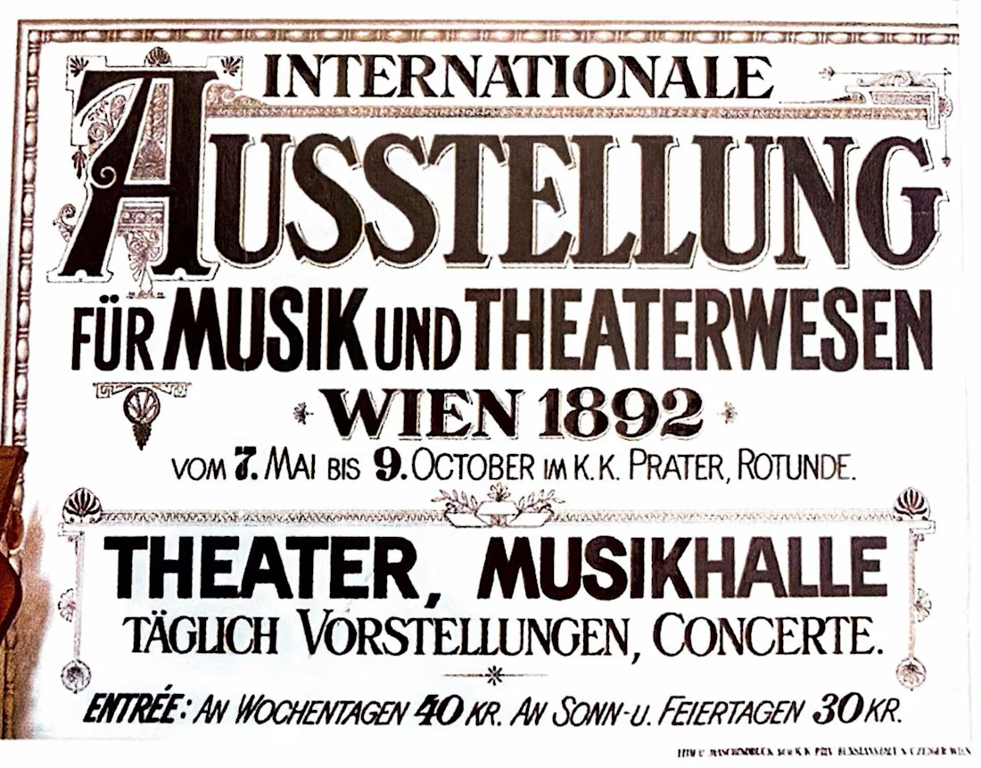
What did ads look like before typograhy was a file you could have in your computer and replicate multiple times?
Another little tour through The History of Design 1890–1959, this time looking specifically at how designers were treating type as an image rather than simply information. Previous post here.
Eugène Grasset, 1893 — beautifully controlled lettering and organic forms.
Toulouse-Lautrec, 1903 — expressive lettering becoming part of the energy of the poster.
Ernst Klimt, 1892 — decorative type working alongside illustration.
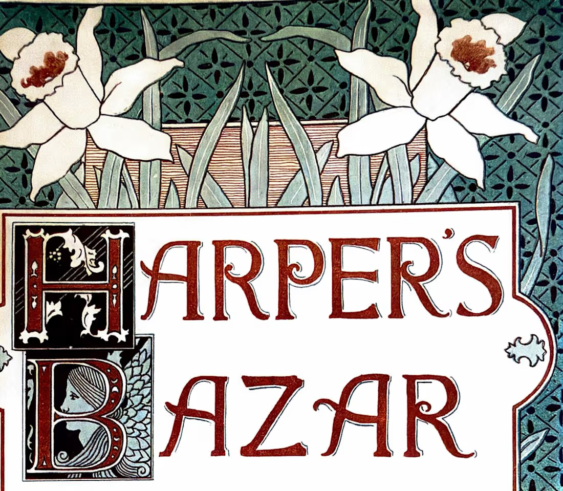
Louis Rhead, Harper's Bazar, 1892 — type, image, and ornament interacting as one visual system.
What I love about these references is that the type is part of the image.
Show me one historical typographic composition you’d steal inspiration from today. 👀
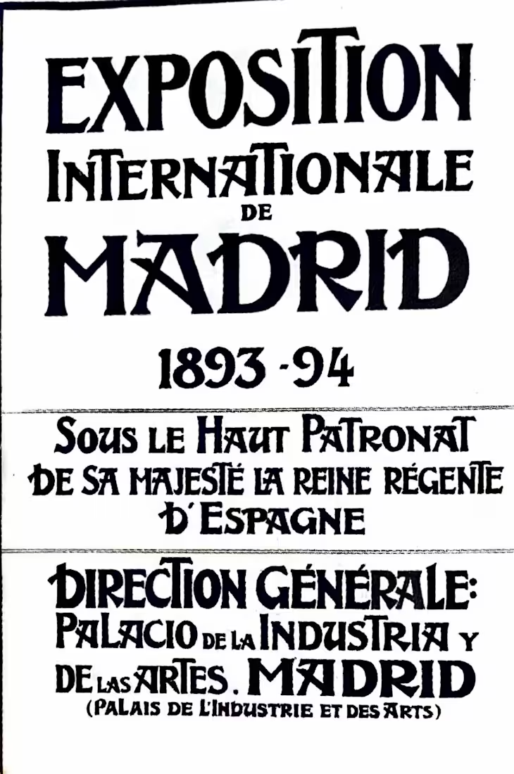
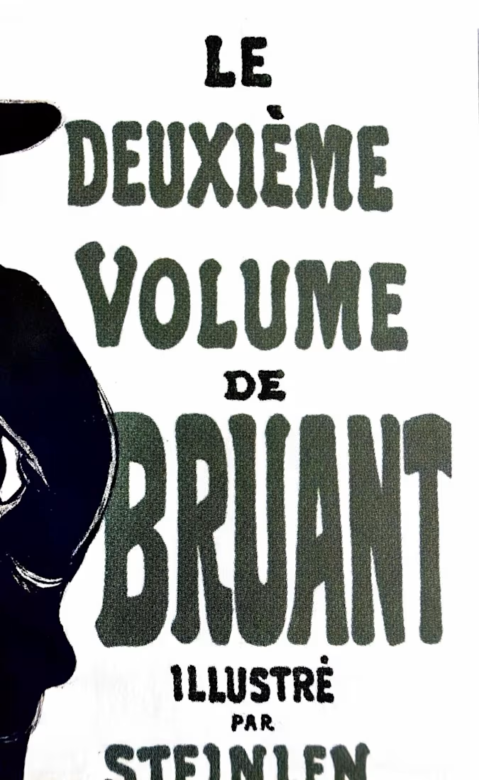

The Beggarstaffs' cut-paper posters from the late 1890s — the lettering sits in the gaps the shapes leave rather than on top of them. I still think about that when a wordmark has to live inside a busy pack layout: let the silhouette decide where the type goes instead of the grid.

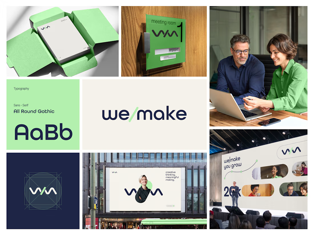
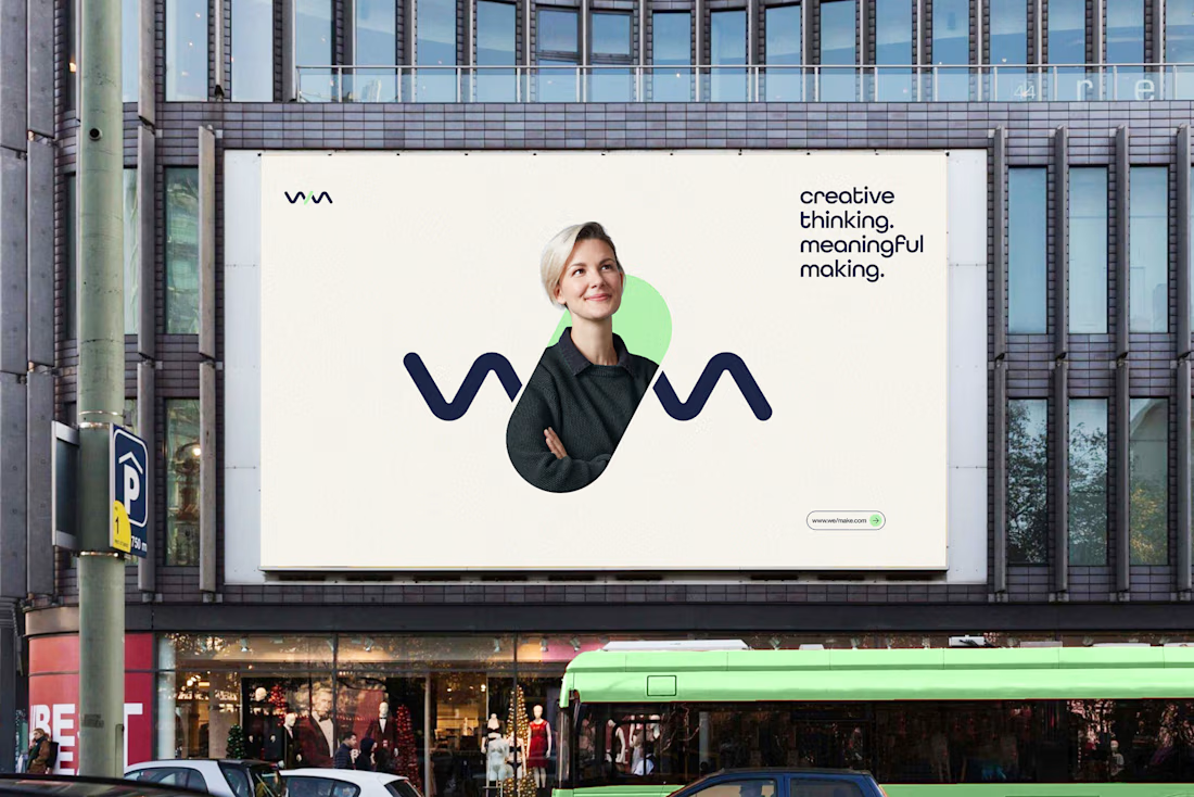
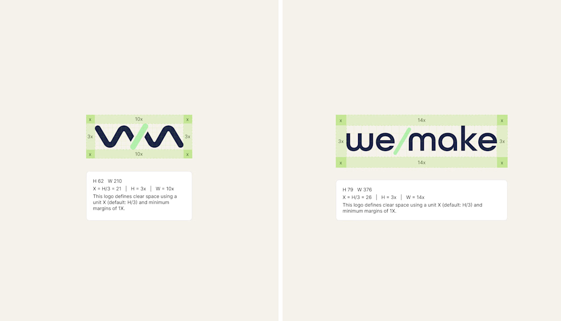
We/Make - Brand Identity Designed for Business Growth
A strategic brand identity for We/Make, built to create a stronger market presence, communicate credibility, and give the business a clear, recognizable visual position.
Rather than creating a logo in isolation, we developed a scalable identity system that helps the brand communicate consistently across digital touchpoints and build stronger recognition as the business grows.
The focus:
→ Clearer brand positioning
→ Stronger visual recognition
→ More credible & professional presence
→ Consistent communication across touchpoints
→ A flexible identity system built for long-term growth
Deliverables: Logo Identity · Visual System · Typography · Color Direction · Brand Guidelines · Logo Construction & Clear Space
Brand Strategy | Brand Identity | Logo Design | Visual Identity | Brand Guidelines | Business Branding
#BrandIdentity #BrandStrategy #LogoDesign #VisualIdentity #Branding #BrandGuidelines #BusinessBranding #BrandDesign #ContraDesigner #CreativeStrategy



This is brilliant

Thank you to everyone who voted on the last post. Cyan/Blue came out as the preferred direction, and I've now taken that color system and built out the complete animated flow for the entire app, from the home dashboard through bill payment and confirmation.
Attaching the full video walkthrough below so you can see how the winning direction feels in motion, including real transitions, interactions, and pacing across the entire experience.
Would love to hear your thoughts on how it feels end to end.
