The network for creativity
Join 1.25M professional creatives like you
Connect with clients, get discovered, and run your business 100% commission-free
Creatives on Contra have earned over $150M and we are just getting started
Back to feedPost

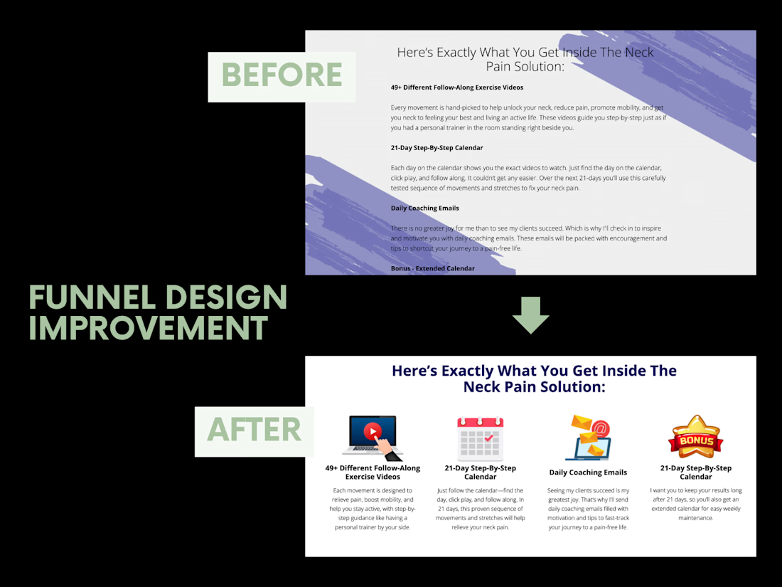
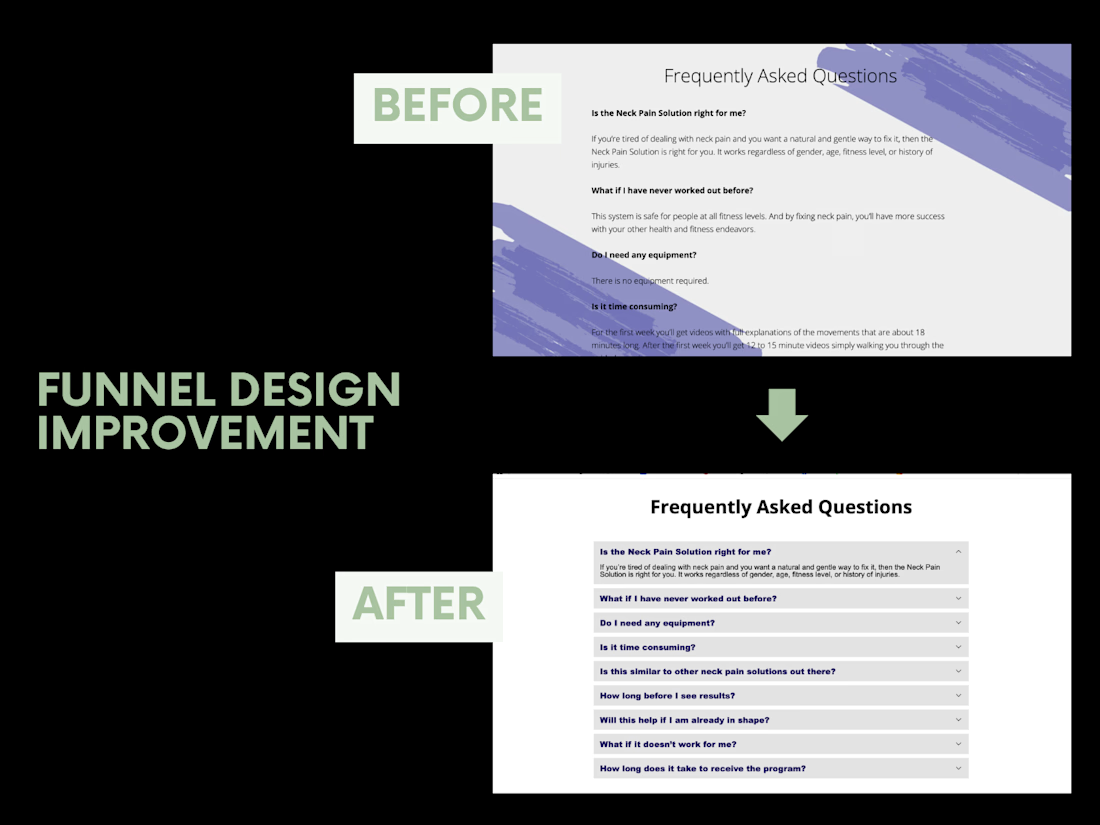
This was a done-for-you program funnel where my client wasn't happy with how certain sections looked, so she asked me to give them a refresh.
I focused on making the content more structured, easier to scan, and visually cleaner.
From turning the program benefits into simple visual cards to organizing the FAQs into an accordion layout, these changes made the sections feel much more polished and user-friendly.
You don't always need to redesign an entire funnel. Sometimes, a few thoughtful changes are all it takes to make it feel right.

The network for creativity
Join 1.25M professional creatives like you
Connect with clients, get discovered, and run your business 100% commission-free
Creatives on Contra have earned over $150M and we are just getting started




Related posts



Going with A-Studio, clear direction and easy to navigate 😊

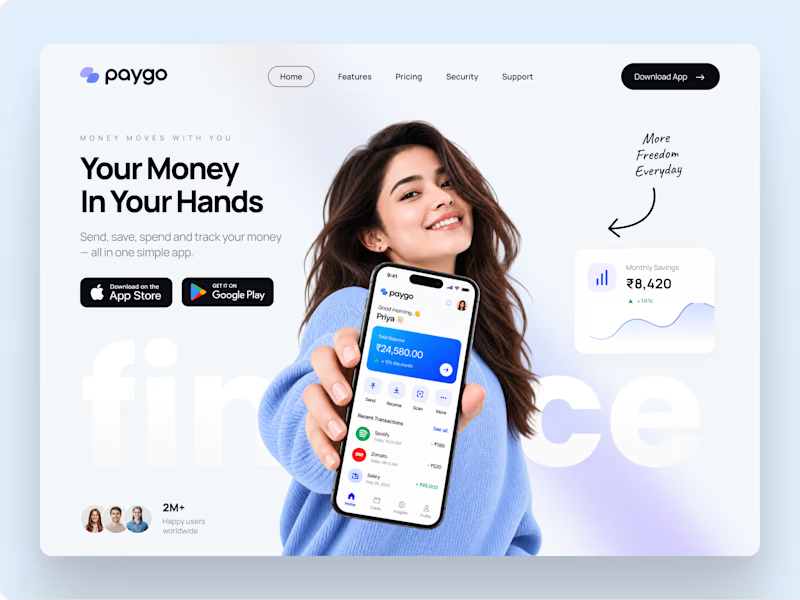
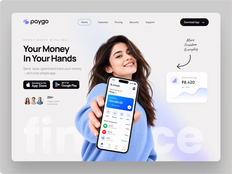
Which landing page looks more premium for a modern fintech app?
14 voted
78%
4 voted
22%
18 votes
Closed


Meriot Netherlands-based product designer portfolio
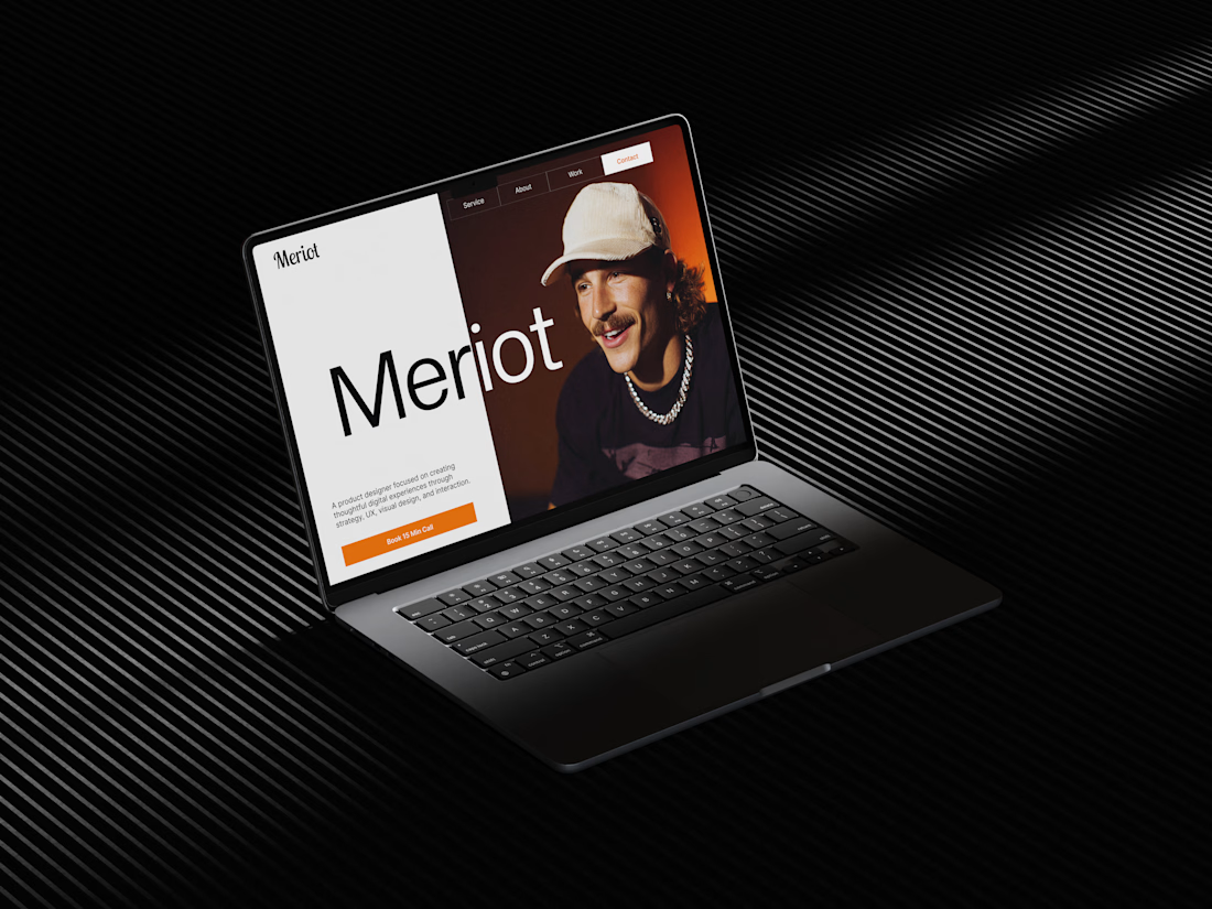
I explored a portfolio website for Meriot, a product designer based in the Netherlands who wanted a digital presence that felt more personal, editorial, and design-focused.
The challenge was to avoid the typical portfolio formula and create something that communicates personality within the first few seconds.
The direction
→ Bold editorial typography
→ Strong personal photography
→ Minimal black-and-white foundation
→ Warm orange accent for CTAs
→ Simple, structured navigation
→ Clear positioning as a product designer
→ A portfolio experience that feels like a personal brand
The idea was to make the website feel confident without being complicated.
Rather than leading with a long introduction, the hero immediately communicates who Meriot is, what he does, and where the visitor should go next.



Nice design broooo