The network for creativity
Join 1.25M professional creatives like you
Connect with clients, get discovered, and run your business 100% commission-free
Creatives on Contra have earned over $150M and we are just getting started
Back to feedPost

I redesigned the homepage for a DTC golf hat brand
Before: a product catalog.
After: a page that sells.
What changed:
Bundles moved to the top, with savings shown upfront. Higher order value starts above the fold.
Features explained, not just shown. People don’t buy hats, they buy reasons.
Bold social proof, a comparison table and an FAQ to handle objections before checkout.
Same products. Same traffic. Built to convert.
I’m a Shopify landing page designer and developer. If your store needs a redesign, DM me “PAGE”
The network for creativity
Join 1.25M professional creatives like you
Connect with clients, get discovered, and run your business 100% commission-free
Creatives on Contra have earned over $150M and we are just getting started








Related posts


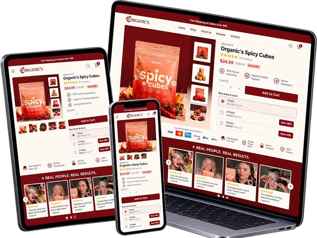
A conversion-focused Shopify product page featuring a clean, modern layout and an intuitive shopping experience.
The page brings together an engaging product gallery, bundle selection, clear Add to Cart actions, customer testimonials, product education, comparison tables, and FAQs.
The design emphasizes visual hierarchy, product discovery, purchase clarity, and trust-building elements to help shoppers make informed decisions.
Focus: Shopify UI/UX, product page design, and conversion rate optimization.


Clean layout. Keeping the bundle options, comparison table and FAQs on the same page really helps buyers decide without extra clicks. Great work on the product page structure.


Clean work Daniel! ⚡️ Love the hero section - "Turn small orders into bigger ones" is super clear value prop. The layout feels crisp and conversion-focused. Nice use of Jitter + Figma!

𝗜𝘁'𝘀 𝗗𝗮𝘆 𝟭𝟬 𝗼𝗳 𝟯𝟬𝗱𝗮𝘆𝘀
𝗦𝗵𝗼𝗽𝗶𝗳𝘆 𝗦𝗽𝗲𝗲𝗱 𝗢𝗽𝘁𝗶𝗺𝗶𝘇𝗮𝘁𝗶𝗼𝗻: How to Score 95+ on Google PageSpeed Insights
Is your Shopify store slow on mobile? Slow load times directly hurt your conversion rate.
𝗧𝗼-𝗱𝗼 𝗟𝗶𝘀𝘁:
1. Compress banners to WebP format.
2. Remove unused tracking app scripts.
3. Preload critical brand fonts.
4. Defer non-essential JavaScript.
𝗧𝗼𝗼𝗹𝘀 𝘁𝗼 𝘁𝗲𝘀𝘁 𝗼𝘂𝘁 𝘆𝗼𝘂𝗿 𝘀𝗶𝘁𝗲 𝘀𝗽𝗲𝗲𝗱:
𝗦𝗵𝗼𝗽𝗶𝗳𝘆 𝗦𝗽𝗲𝗲𝗱 𝗧𝗲𝘀𝘁: https://www.shopify.com/ng/compare/sitespeed
𝗦𝗵𝗼𝗽𝗦𝗰𝗮𝗻 𝗔𝗽𝗽: https://www.shopscan.app/tool/shopify-speed-checker
𝗧𝗵𝘂𝗻𝗱𝗲𝗿𝗽𝗮𝗴𝗲𝗦𝗽𝗲𝗲𝗱: https://www.thunderpagespeed.com/tools/speed-test/
𝗪𝗮𝘁𝗰𝗵 𝗼𝘂𝘁 𝗳𝗼𝗿 𝗺𝗼𝗿𝗲 𝘁𝗶𝗽𝘀 & 𝗵𝗮𝗰𝗸𝘀

Day 10 of 30 and you are unstoppable, Abdullahi. Removing unused tracking scripts is the one most stores ignore and the one that hurts most. Preloading critical fonts plus deferring non-essential JavaScript is the real speed formula. Sharing the testing tools makes this genuinely actionable.