The network for creativity
Join 1.25M professional creatives like you
Connect with clients, get discovered, and run your business 100% commission-free
Creatives on Contra have earned over $150M and we are just getting started
Back to feedPost
Taste Test
Exploring a few funky yet minimal logo directions for the Contra theme.
I wanted to experiment with different shapes, personalities, and visual styles while keeping things clean, simple, and memorable.
Some playful, some minimal, and some right in between.
Which one do you think works best?

1 voted
33%
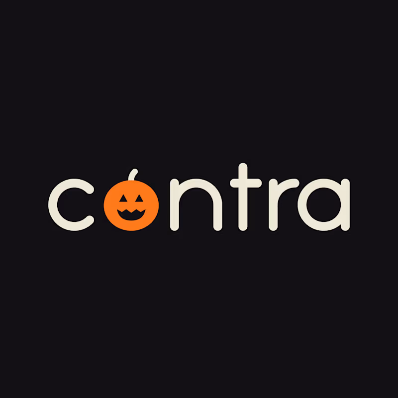
2 voted
67%
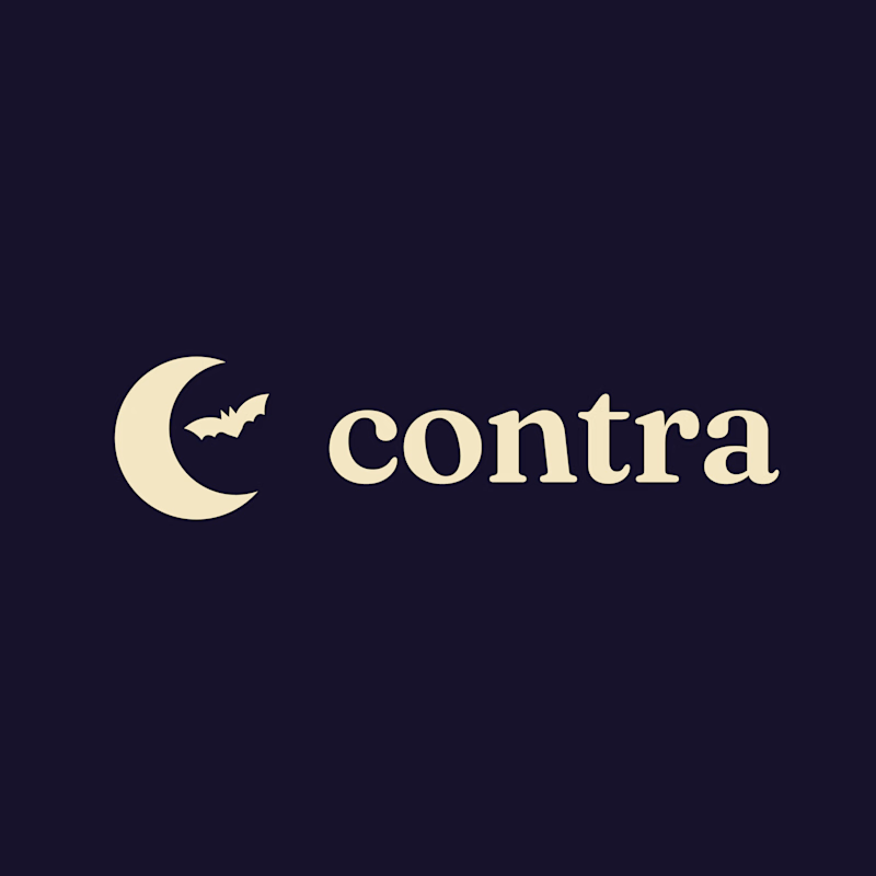
3 votes
Closed

Love this exploration! That moon + bat mark for Contra is so clever, funky yet minimal at same time! Keeping it clean simple memorable while playing with personalities is tough but you nailed it! This Option 2 has such strong character!

Thank you so much! Really glad you liked Option 2! I wanted to keep it minimal while still giving it a fun personality.
The network for creativity
Join 1.25M professional creatives like you
Connect with clients, get discovered, and run your business 100% commission-free
Creatives on Contra have earned over $150M and we are just getting started



Related posts

200 years ago, local artists painted the everyday people of the subcontinent: barbers, porters, chai wallas, knife sharpeners. Each one got a portrait, flat colours, a fancy border, total respect.
So I asked: what if those same painters time travelled to Lahore today?
I found their work in the Wellcome Collection’s public domain archive, trained a Recraft Style on it, and sent it to paint the new pesha of my city.
Same old painter, new Lahore. 😄
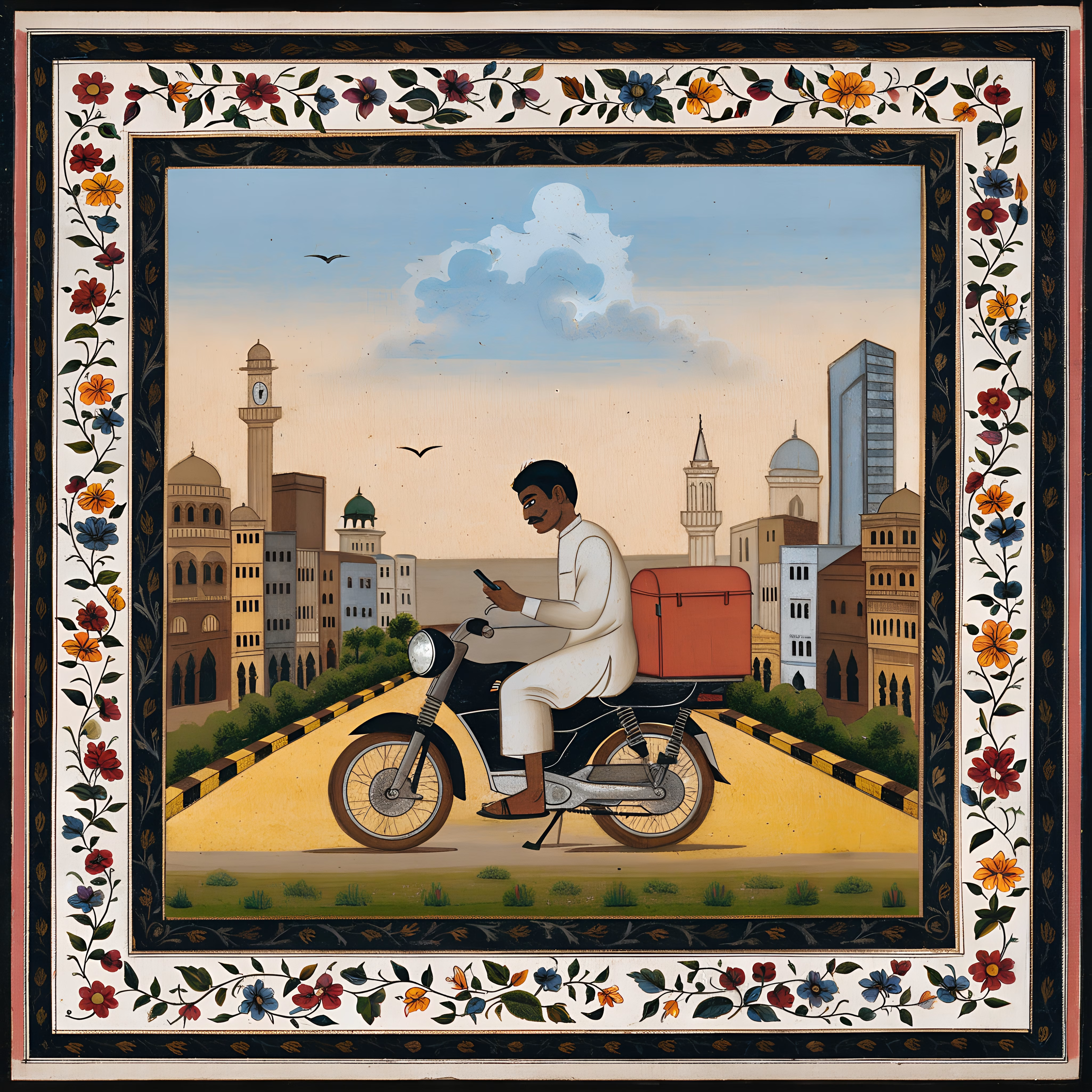
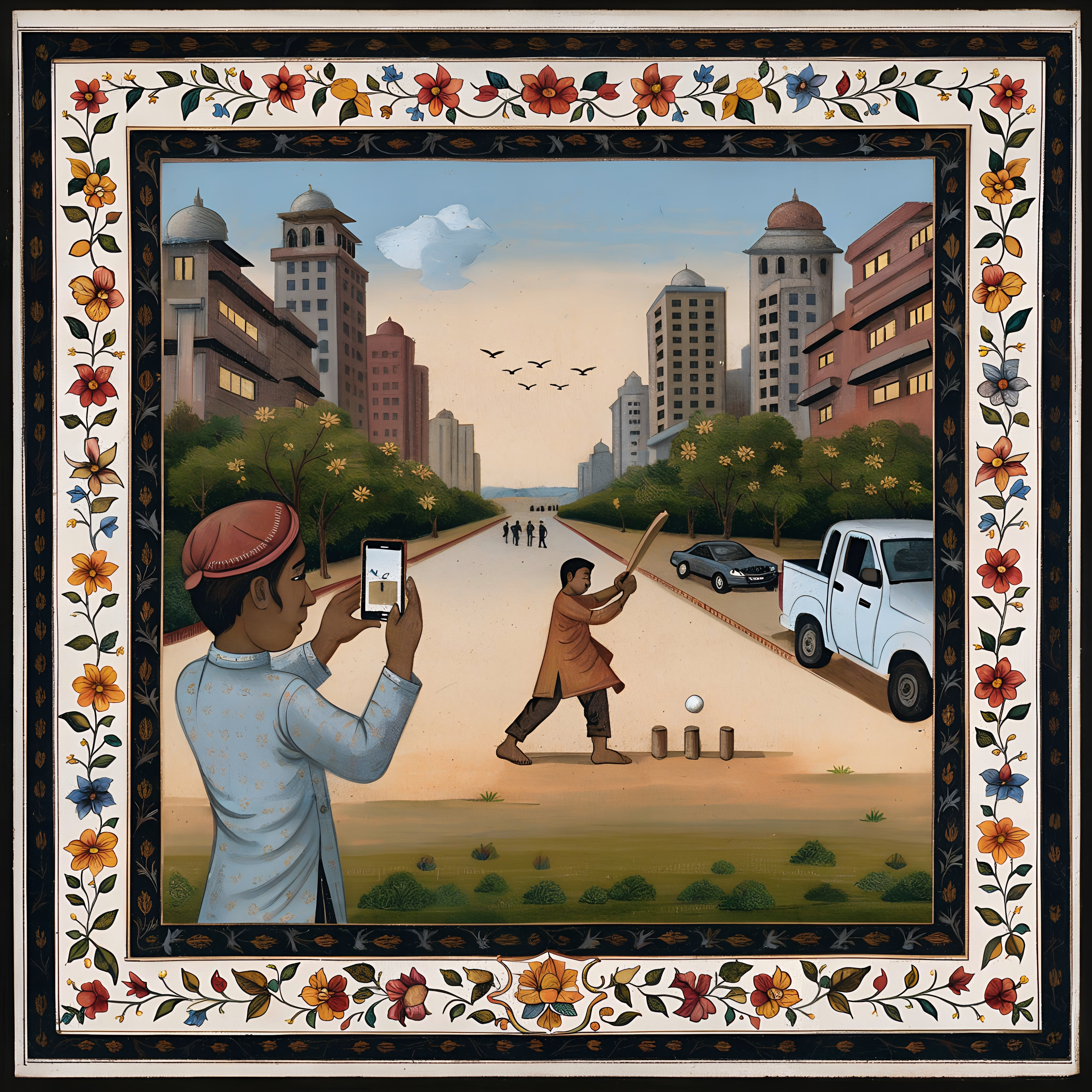
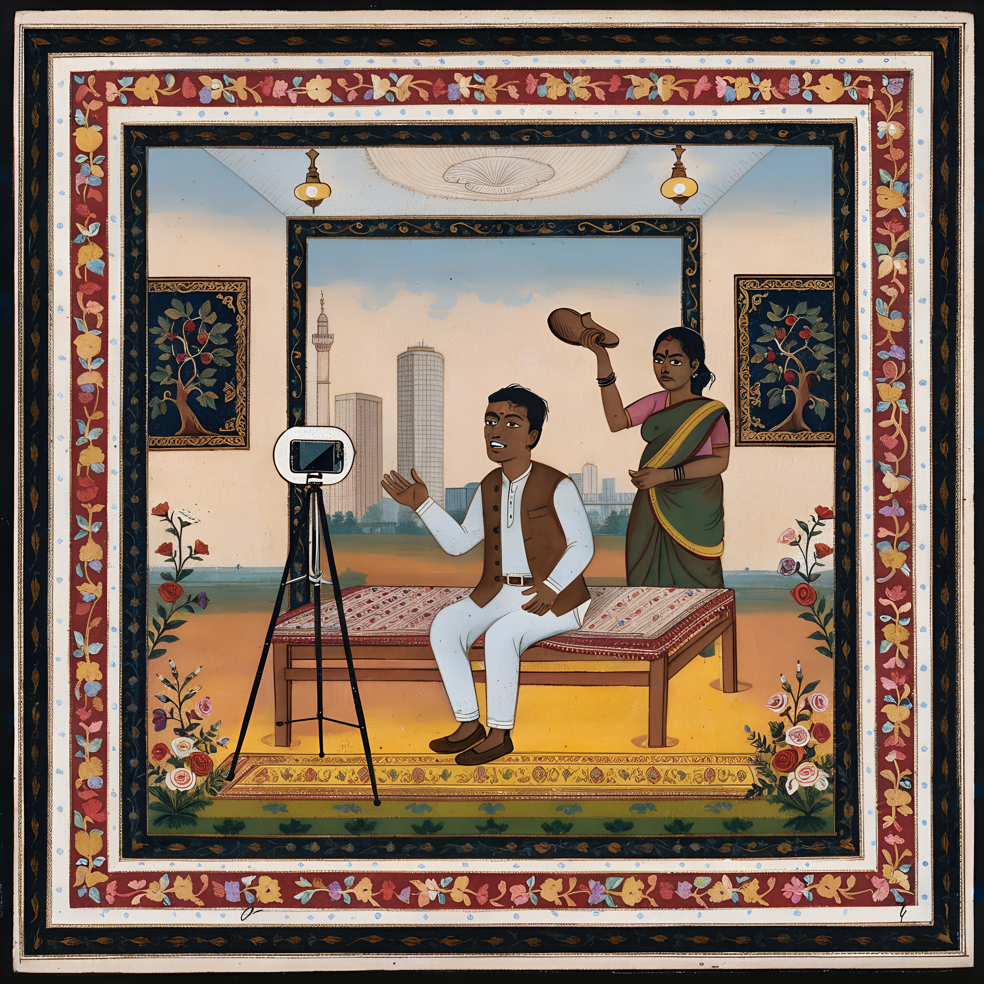
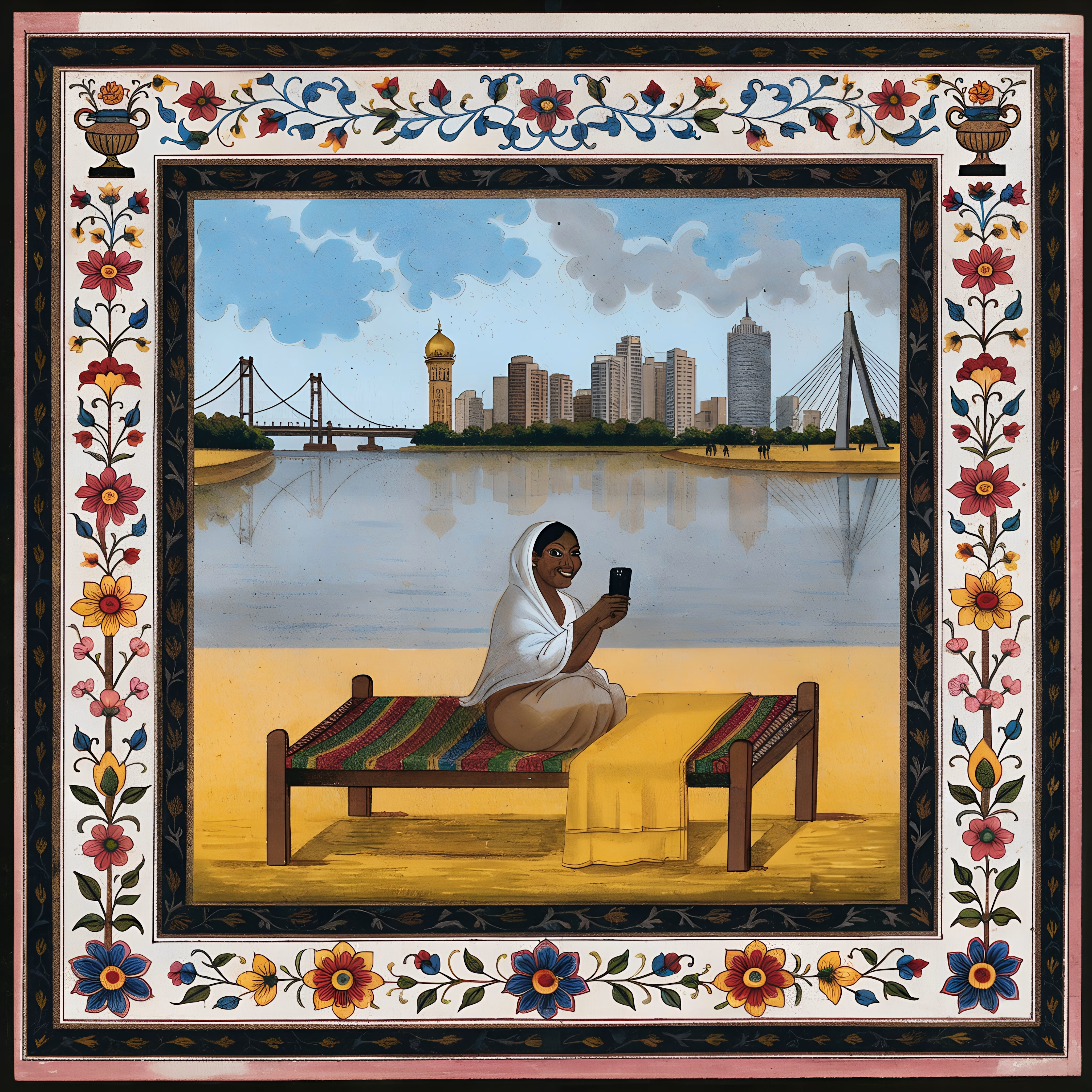

Love this. Giving chai wallas and porters that old portrait treatment again feels really respectful. The borders are beautiful.

The full landing page design is complete.
I designed this website for a web design and development agency, with founders and growing businesses in mind.
Clear services, selected work, straightforward pricing and answers to common questions. Each section helps visitors understand the offer and take the next step.
Visually, I kept it consistent with teal accents, structured grids and corner details throughout.
Good to see all the sections come together.
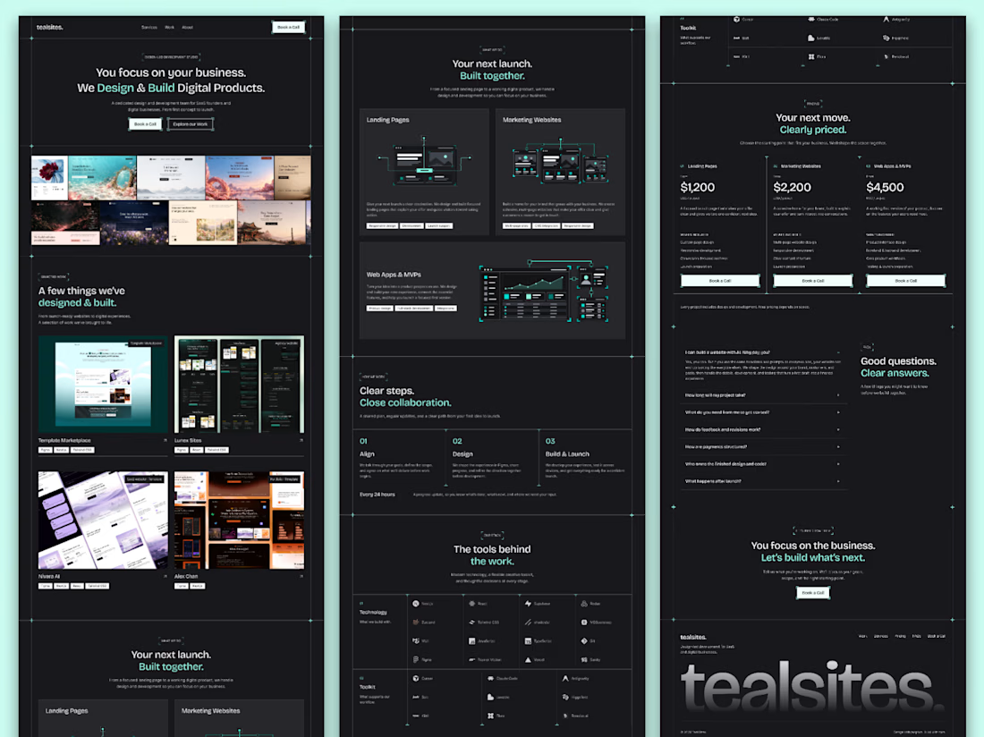

Love how you’ve focused on clarity and consistency! The clear services and pricing make it easier for visitors to understand the offer and take the next step. 👏✨

Light or dark?
3 voted
50%
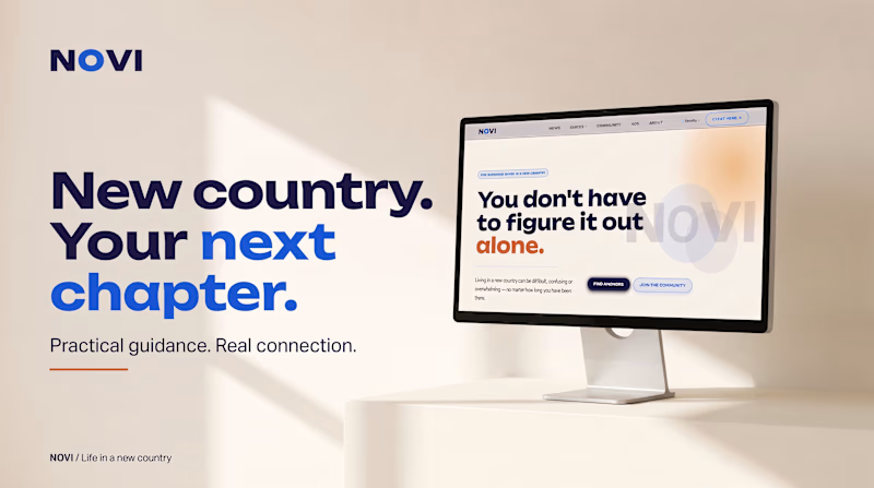
3 voted
50%
6 votes
Closed

light