The network for creativity
Join 1.25M professional creatives like you
Connect with clients, get discovered, and run your business 100% commission-free
Creatives on Contra have earned over $150M and we are just getting started


The network for creativity
Join 1.25M professional creatives like you
Connect with clients, get discovered, and run your business 100% commission-free
Creatives on Contra have earned over $150M and we are just getting started





Related posts

Which hero direction feels right for this founder-focused brand?
While working on the homepage for Sean Parsons, a brand focused on empowering non-technical founders to launch tech startups, I explored two different visual directions for the hero section. Same message, same structure, just a different mood and color system.
Option 1 - Warm Olive. Dark, grounded, and editorial, giving a warm, established, expert feel.
Option 2 - Light Purple. Clean, modern, and vibrant, giving a fresh, SaaS-like, approachable feel.
Would love your honest UX/UI take, which direction feels more trustworthy, engaging, and aligned with a founder-focused brand, and why?
25 voted
69%
11 voted
31%
36 votes
Closed

I like worm Olive most because it has different personality

LumaClean was losing hours to manual quoting, scheduling, confirmations, rescheduling, and follow-up. LumaFlow turns that entire process into one automated booking workflow.
I built LumaFlow for a fictional Chicago cleaning business, LumaClean.
The problem was simple: too much back-and-forth just to turn a customer inquiry into a confirmed booking.
So I built a workflow that handles the journey:
→ Instant quote
→ Smart availability
→ $40 deposit
→ Booking confirmation
→ Reminders
→ Rescheduling
→ Booking recovery
The goal wasn't to build another pretty booking page.
It was to give the owner less work to do.


Vert nice

Light or refined - which E-Bike product breakdown section design would you choose?
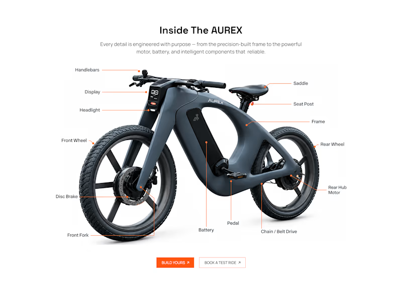
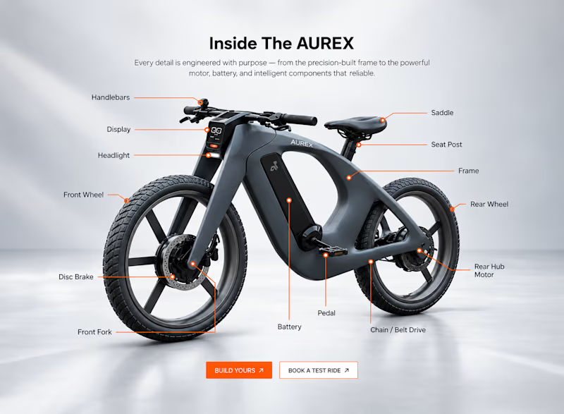
Two concepts for the same AUREX e-bike. Same product, same components, two different presentation styles:
A - Soft Studio: subtle gray depth, larger product focus, and a more premium visual feel.
B - Clean Minimal: bright white background, tighter spacing, and a more technical editorial layout.
Which direction feels stronger for a premium e-bike brand and why?


5 voted
31%
11 voted
69%
16 votes
Closed

A feels more premium to me. The soft gray depth and bigger product focus make the bike feel like something special. B is great for specs, but A sells the feeling