The network for creativity
Join 1.25M professional creatives like you
Connect with clients, get discovered, and run your business 100% commission-free
Creatives on Contra have earned over $150M and we are just getting started
Back to feedPost
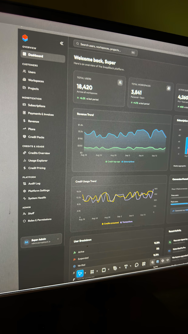
If you’ve ever worked on a dashboard as a founder or designer, you’ve probably made this mistake without realizing it.
Trying to make every feature visible because you want users to know it’s there.
Analytics here. Workflows there. Integrations, billing, team management, and other things fighting for attention.
But imagine someone opening that dashboard for the first time. All they want is to create their first project, yet they don’t even know where to start.
Most times I wonder if we design dashboards to help users or to show them everything we’ve worked so hard to build.
Someone using a product for the first time and someone who’s been using it for six months don’t necessarily need the same experience.
📍There’s a UX principle called progressive disclosure.
It’s about showing users what they need now and introducing complexity when it becomes relevant.
Not hiding features actually, but making the next action obvious.
A dashboard can show users everything your product can do and still leave them wondering what they’re supposed to do next. Think on these things….
Good morning Friends❤️
————
PS: I am Gloria Ojo and I design solutions through digital products (apps and websites)



Progressive disclosure is underrated for dashboards. Good reminder.

Very much underrated and that is why we have much buggy feature guides nowadays
The network for creativity
Join 1.25M professional creatives like you
Connect with clients, get discovered, and run your business 100% commission-free
Creatives on Contra have earned over $150M and we are just getting started











Related posts


Hiring: UX / Product Designer (remote, ongoing)
I run Novatur Design, a product design studio based in Malta. We work with startups through to enterprise clients such as The Daily Mail, across a range of industries from EV to Crypto, Fintech to IoT.
I’m looking for an all-round UX / product designer who can take a problem from user flows through to polished hi-fi UI. Figma, auto layout and design systems should be second nature.
This is ongoing contractor work on a monthly basis, not a one-off project. If it works well on both sides, there’s potential for it to go full time.
Remote, so you don’t need to be in Malta. Individual designers only, no agencies please.
If you’re interested, the application takes about 6 minutes:
https://tally.so/r/yXZ2dB
Ralph

Love the variety of industries you work with. Sounds like an amazing opportunity for the right designer.



Your web sections always have such strong art direction. Great to see the brand carried right into the layout.