The network for creativity
Join 1.25M professional creatives like you
Connect with clients, get discovered, and run your business 100% commission-free
Creatives on Contra have earned over $150M and we are just getting started
Back to feedPost
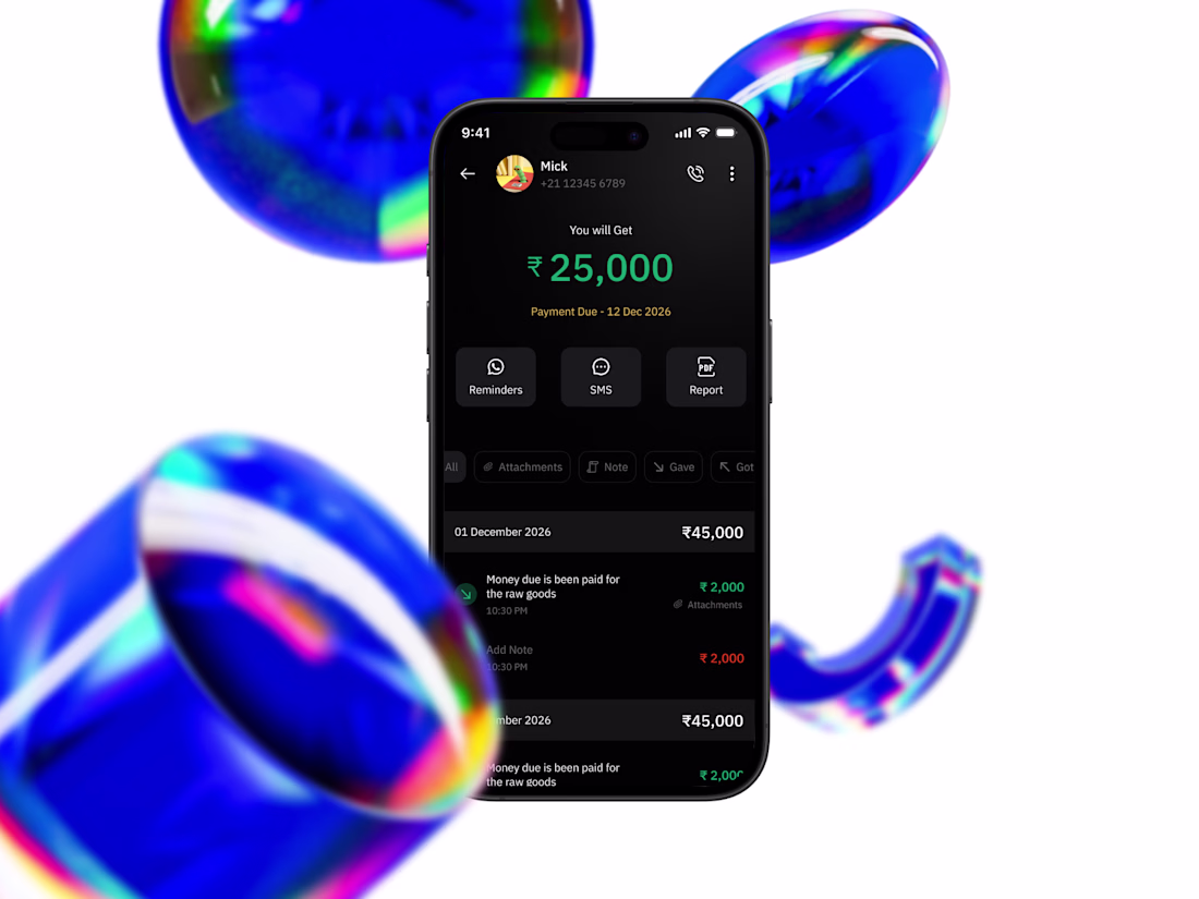
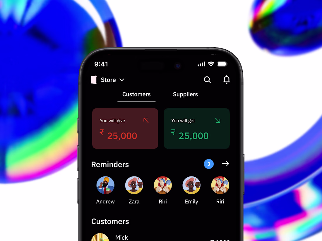
Redesigning Khatabook: When the app is harder than the paper ledger
Khatabook exists to replace the paper ledger small merchants have used for decades. But talk to actual users, and you'll find the daily-use stuff reminders, adding a contact, checking today's entries are buried under screens the paper version never had.
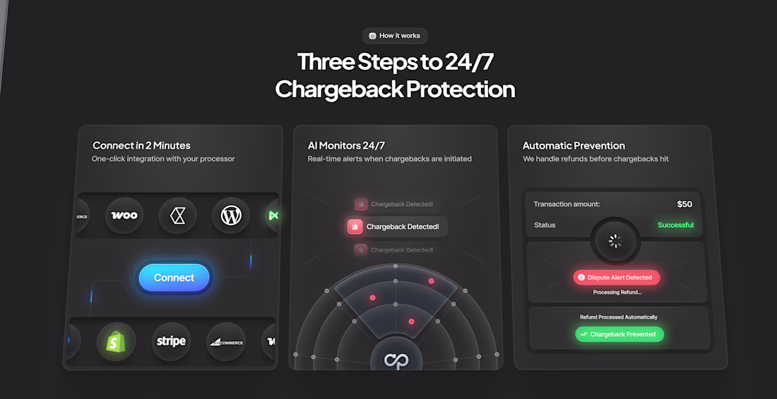
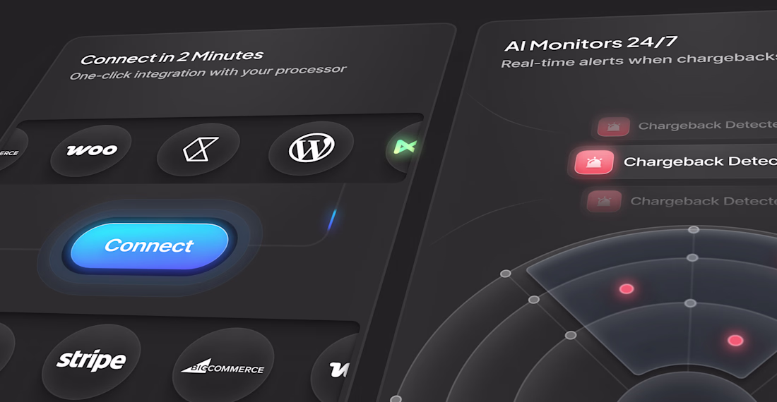
I picked this up as a self-initiated redesign, focused just on the customer-facing ledger experience. Three moves:
→ Reminders surfaced to the home screen as a horizontal carousel, no more digging
→ Bulk contact import, so onboarding doesn't mean adding 50 customers one by one
→ Cashbook reorganized by date, so "what happened today" is the default view, not a filter
No internal data, no formal usability testing, just competitive research, and one informal test that told me a lot about where people actually get stuck.
Full case study + Figma walkthrough here → [Khatabook Redesign]
Clean work
The network for creativity
Join 1.25M professional creatives like you
Connect with clients, get discovered, and run your business 100% commission-free
Creatives on Contra have earned over $150M and we are just getting started
Related posts
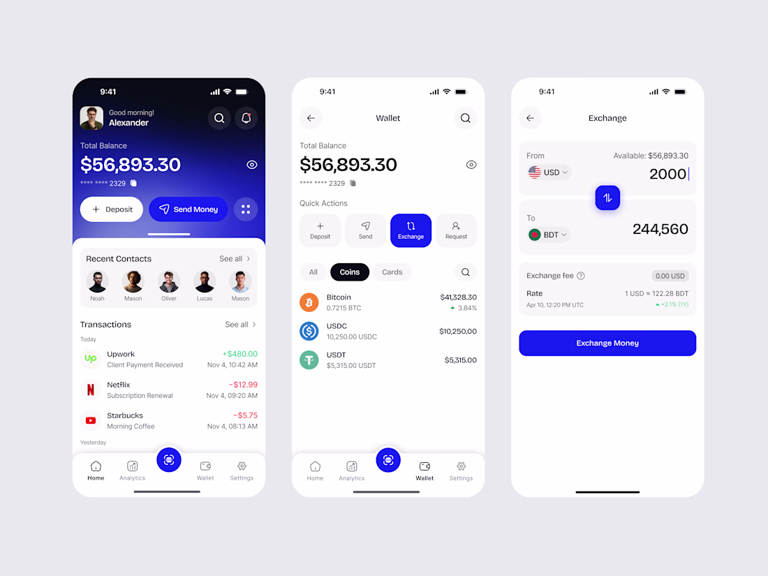
Designed a sleek modern finance & crypto mobile app.
Beautiful dark/light UI with wallet overview, quick actions (Deposit, Send, Exchange), multi-currency & crypto balance tracking, recent transactions, and smooth exchange flow.
Outstanding design 🔥
3D Key animation exploration for Ayvapay
So clean. That key motion has real weight to it, reads premium without trying too hard. Killer exploration. 🔥
Happy Sunday 🥂
Loving this section 🙂↕️
Dark mode Illustrations that just works >>>>>
Taking new projects
Send a DM or book a call - https://cal.com/daniel-design/15min
I always love depth in the UI 😍
Trending
Claude
Claude has entered the design space. How are you using Claude Design?
Contra University
Learn from expert creatives how to earn more using next-gen AI tools.
MagicPath
The canvas is infinite, and exploration is becoming the workflow. How are you using MagicPath?
creativeaiflow
Creative AI workflows are evolving. What tools do you use, and what are their strengths and weaknesses?
freelancerlife
Freelancer life is wins, pivots, and everything in between. What’s yours right now?