The network for creativity
Join 1.25M professional creatives like you
Connect with clients, get discovered, and run your business 100% commission-free
Creatives on Contra have earned over $150M and we are just getting started
Back to feedPost

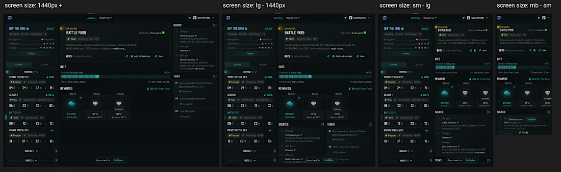
Some more panels on how we tackle the layout being consistent and drilling in the event details while making it still feel like a full connected experience. Essentially the right panel of the Cal3ndar will slide to the left, and then animates in all the elements that have all the information of the selected event. Unique take on navigation that I am very proud of how it came out so far.
First post for more context: https://on.contra.com/6RgcDk

The network for creativity
Join 1.25M professional creatives like you
Connect with clients, get discovered, and run your business 100% commission-free
Creatives on Contra have earned over $150M and we are just getting started








