The network for creativity
Join 1.25M professional creatives like you
Connect with clients, get discovered, and run your business 100% commission-free
Creatives on Contra have earned over $150M and we are just getting started
Back to feedPost

Environmental branding for a corporate kickoff event —included signage, badges, swag, animations, slide decks, on-site activations, etc.


The network for creativity
Join 1.25M professional creatives like you
Connect with clients, get discovered, and run your business 100% commission-free
Creatives on Contra have earned over $150M and we are just getting started
Related posts

New on Contra, not new to design.
I draw logos by hand, then build everything around them: the brand, the website, the store. Lately I also make product films and ads with AI.
Recent work: an RY monogram and site for a Koreatown law firm, a winged W for a defense firm, and my family's golf eyewear brand, from the mascot to Shopify.
Starting a brand, or have one that doesn't feel like you yet? Show me what you're building.

The logo-led system reads tight because the wordmark sits clean in the negative space instead of fighting the emblem — when a brand has that kind of restraint, the Shopify store usually carries the same hierarchy into the product grid and checkout without inventing new rules....

Brand new case study up! Had loads of fun with this one
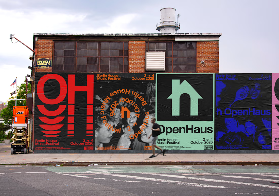
OpenHaus is a vibrant house music festival, made for anyone and everyone. The visual identity leans into bold, saturated color paired with bold typography and structured, grid-based layouts. It feels colorful and inviting on the surface, but stays grounded by a level of restraint that gives it a more considered feel.


Looks nice 👍🏻

What if indigo is just ink that got patient?
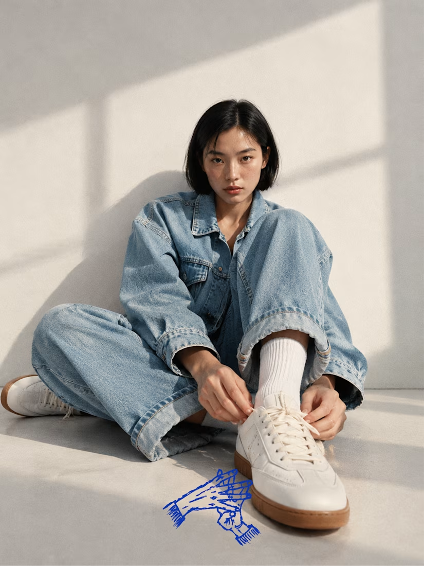
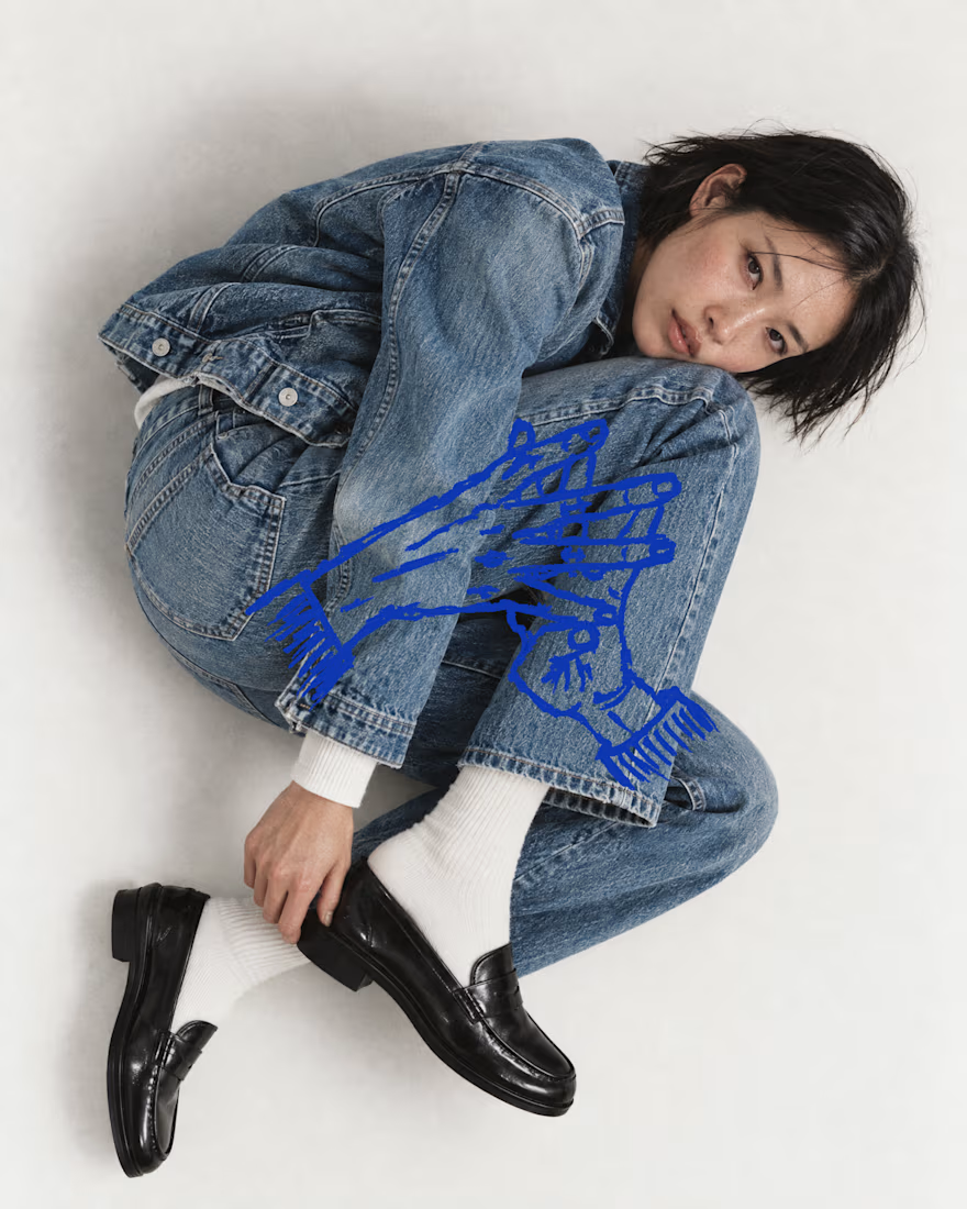
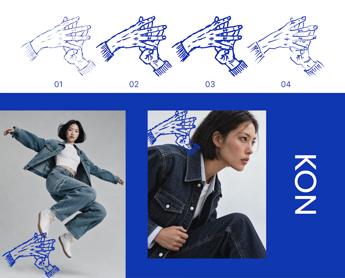
KON is a denim and streetwear label for people who live in hip hop and care how things are made. For Inktober’s final stretch, I took its hand mark through four ink passes, from a fine line to a heavy stroke to a dry brush. Each one sits on the last, the way cloth gets dipped again and again until the color holds.
Swipe to see the passes, then the mark out in the world on denim.
The full KON case study is coming soon.
Which part of your process do you repeat until it hits? Show me yours.

That's really great specially the photography