The network for creativity
Join 1.25M professional creatives like you
Connect with clients, get discovered, and run your business 100% commission-free
Creatives on Contra have earned over $150M and we are just getting started
Back to feedPost


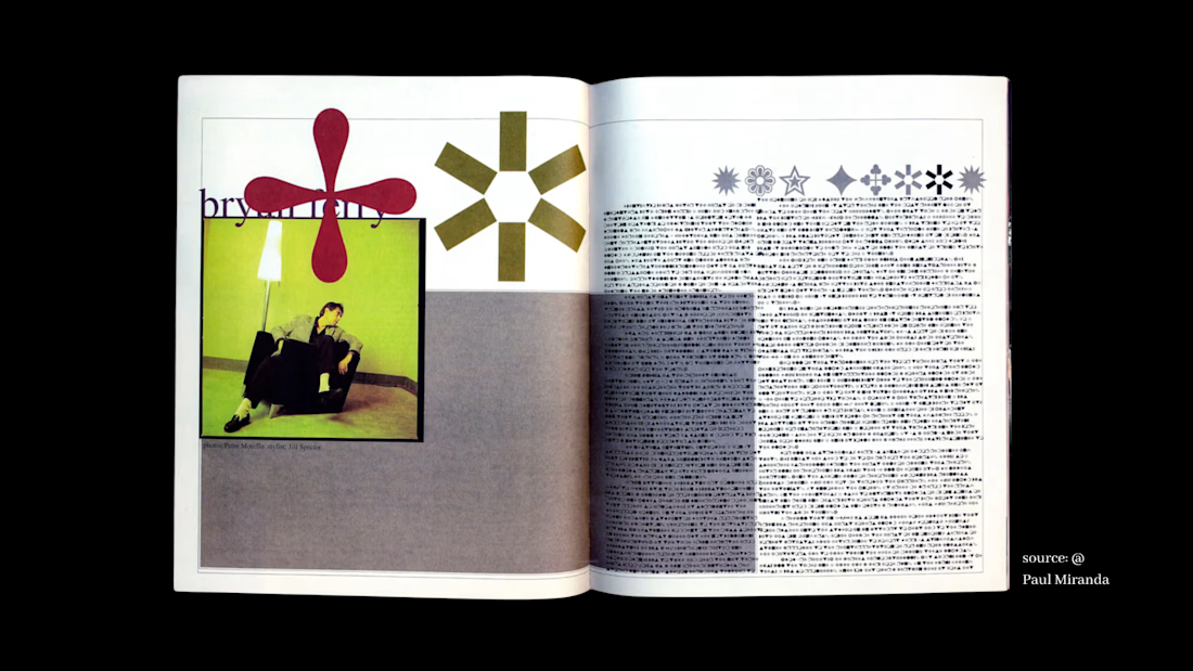
apparently in 1994, David Carson was art directing an issue of Ray Gun magazine. he found one of the interviews he was designing for (with Bryan Ferry) so boring, that he typeset the entire thing in Zapf Dingbats.
if you're not familiar, Zapf Dingbats is an iconographic font with no legible letters.
one of my favourite quotes is from Carson, about this piece: "Don't mistake legibility for communication."
drop your favourite bit of font lore in the comments 👇
Source: David Carson: Surfing the Unconventional Waves of Zapf's Dingbats

great font


typesetting a whole interview in dingbats is unhinged, love it

"Don't mistake legibility for communication" is such a good design mantra, it still holds up decades later. Do you lean into illegible-on-purpose work yourself, or is it more something you admire from a distance?

So amazing 😍

This reminds me of something I read recently in a typography book. Apparently, Baskerville (the typographer) was accused by other colleagues of "blinding all the readers of the nation" because of the use of thinly sculpted and sharp fonts. It seems like friction is an...

Such thoughtful creative work!


My favorite is still Comic Sans being created for a cartoon dog in Microsoft Bob, getting rejected, and then somehow taking over the entire world anyway.

Typesetting a boring interview in Zapf Dingbats out of spite might be the pettiest and most brilliant thing I've read all week. That legibility vs communication line is staying with me.

Nice one

Setting an entire interview in Zapf Dingbats is the most designer response to boring content. That quote hits every time.

Sweeeet

Love it

One of my favorites: Adrian Frutiger designed Univers as a coherent family of 21 styles from the beginning, then used numbers instead of subjective labels to map its weight and width.
Carson used typography to disrupt language; Frutiger used it to organize language. Same medium,...
The network for creativity
Join 1.25M professional creatives like you
Connect with clients, get discovered, and run your business 100% commission-free
Creatives on Contra have earned over $150M and we are just getting started





Related posts


Teams spend weeks choosing a font and zero time defining the system around it. Scale, weight, line height, spacing, pairing rules. The font is 10% of the work. The system is what makes it usable.

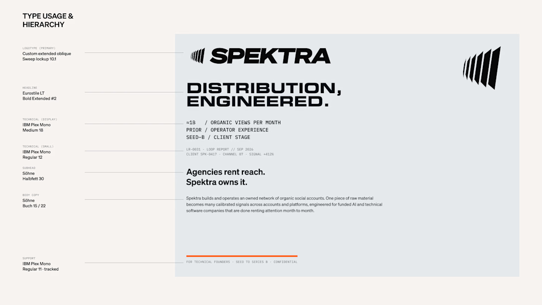

The system is what makes it usable!

> this hit me. never thought about it like that - art that was made to make everyone same, now used to talk about finding yourself. super clever work.

What happens when propaganda designed to erase the self gets pointed at the self instead?
Soviet propaganda spent 70 years trying to erase the individual soul in favour of the collective machine. I pointed that exact visual language at the thing it was built to suppress.
I kept...
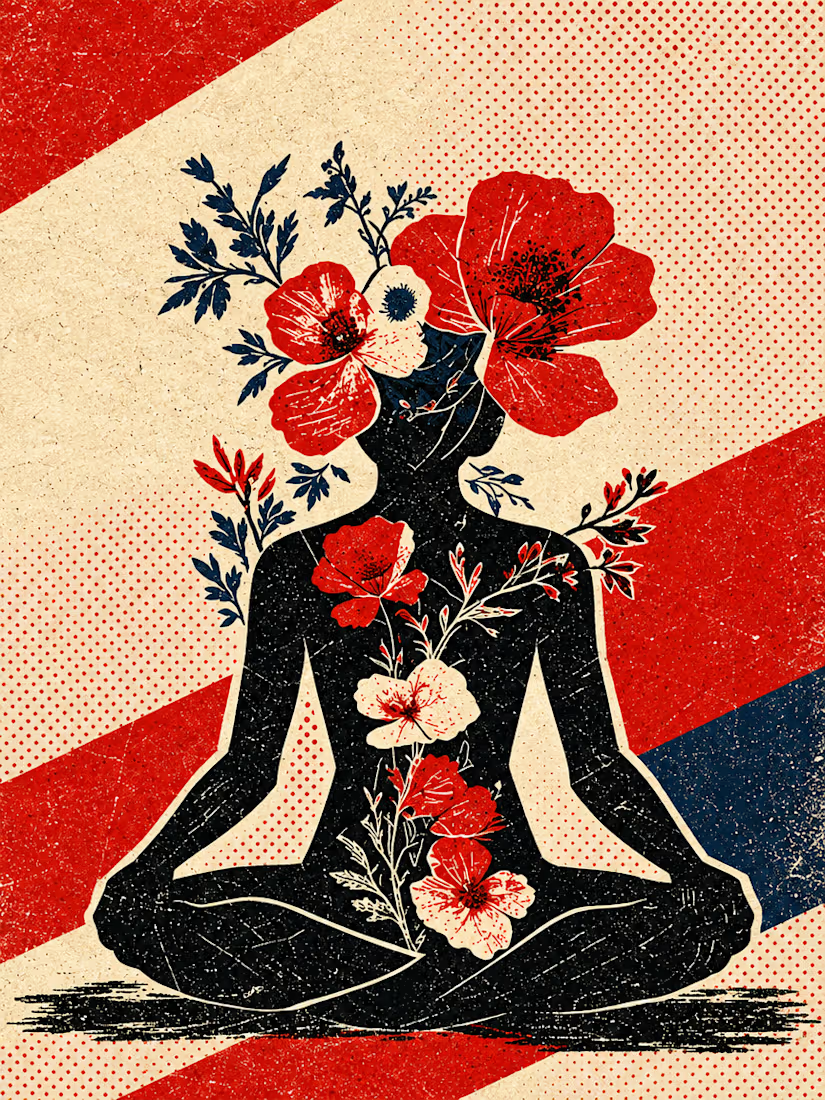
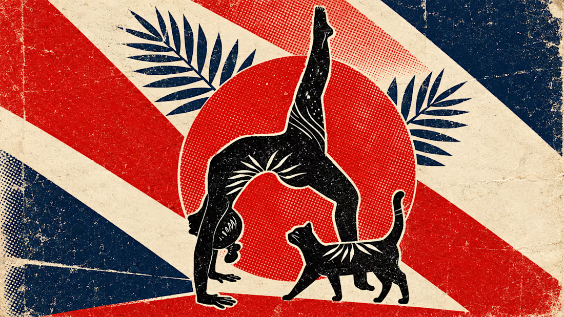
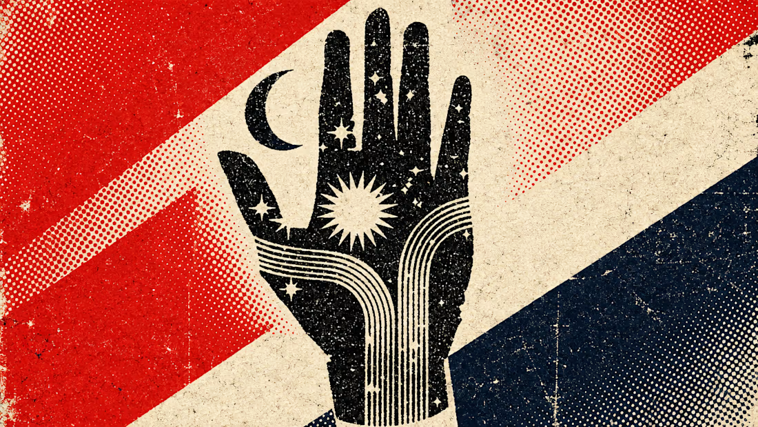

Art built to make everyone the same, now used to talk about finding yourself, is a brilliant flip and you described it better than the caption did. The halftone grain and that limited red, navy and cream palette carry the whole message. Sharp eye for sharing this.


