The network for creativity
Join 1.25M professional creatives like you
Connect with clients, get discovered, and run your business 100% commission-free
Creatives on Contra have earned over $150M and we are just getting started
Back to feedPost

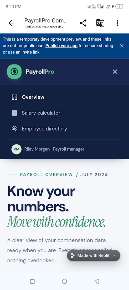
I built "PayrollPro" with Replit AI in 20 minutes 🚀https://payroll-pro-2--ja4220018.replit.app/


The network for creativity
Join 1.25M professional creatives like you
Connect with clients, get discovered, and run your business 100% commission-free
Creatives on Contra have earned over $150M and we are just getting started







Related posts

Night Quota – a Halloween game about my hometown
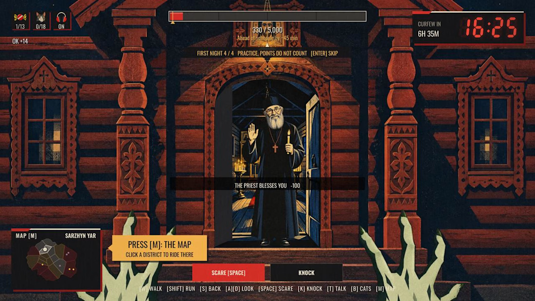
Monsters work one night a year. In Kharkiv, that night ends at 11 p.m. Not because of monsters. Because of the curfew.
Pick one of four monsters, walk the streets, scare people, knock on doors, and hit your quota before dawn. After eleven the streets empty and the job gets harder.
I’m from Kharkiv and I miss it, so I rebuilt it as a game. 18 districts, each started from my own photo of a real street and drawn as a constructivist poster, the style the city is known for. Every district has a local with a story about Kharkiv. The passers-by are people I love: my friends, my daughter as a little witch, and my cat Lisa, who hides in every district.
Features used: Rive CLI + GPU Canvas (both), Scripting, Data Binding, State Machines.
How it’s made
• Rive CLI + Claude Code: I’m a designer, not a game developer. I described the game, the agent wrote it, I watched the live preview and corrected it.
• RML for the scenes, Luau scripting for the logic: the night clock, the districts, the scares, the dialogues.
• GPU Canvas: one WGSL shader over the whole game. Curfew frame, searchlights, air-raid flash, a camera shutter for cat photos, the dawn report developing out of a halftone raster.
• Data Binding drives the HUD, State Machines run the buttons.
• Rive Editor to play it and check every screen.
• Higgsfield for character art, from my own references and photos.
Play it on desktop, with a keyboard and mouse.
Give it about 20 seconds to load, the whole city is in there.


The combination of clawed hands and the friendly priest is awesome! 😂🔥

Designed a clean, modern, and responsive business website concept to showcase services, build trust, and help businesses attract potential customers.
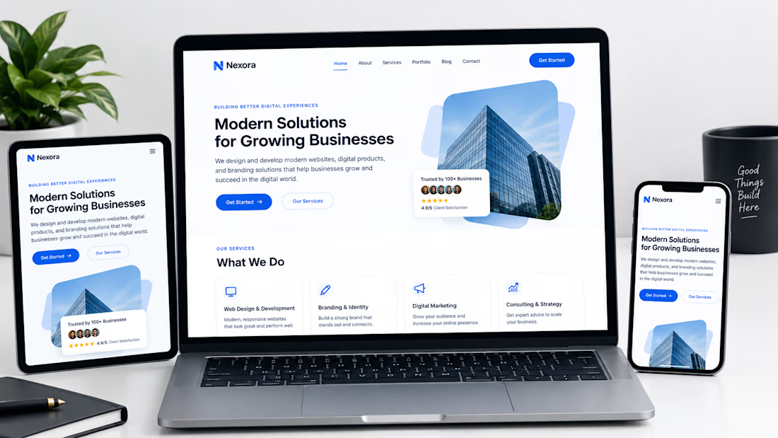

Not only is the design clean, but you also did a great job making sure it works well across different devices with a responsive design.

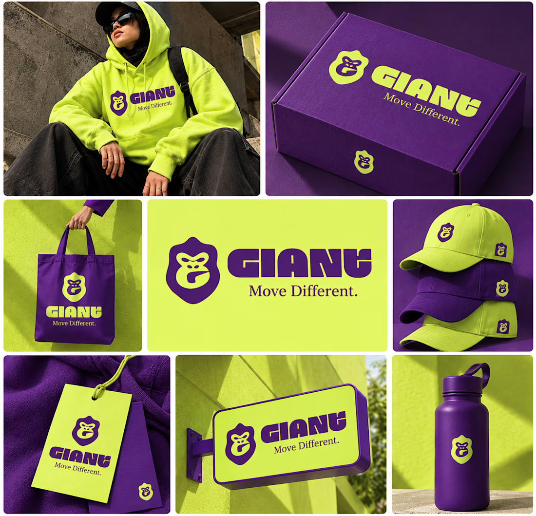
GIANT — Move Different.
Built around a bold gorilla mark, oversized typography, and an electric purple + neon-lime palette.
A streetwear identity designed to feel bold, rebellious, and instantly recognizable — from hoodies and caps to packaging, tags, and everyday brand details.
Concept branding project | Open for custom projects


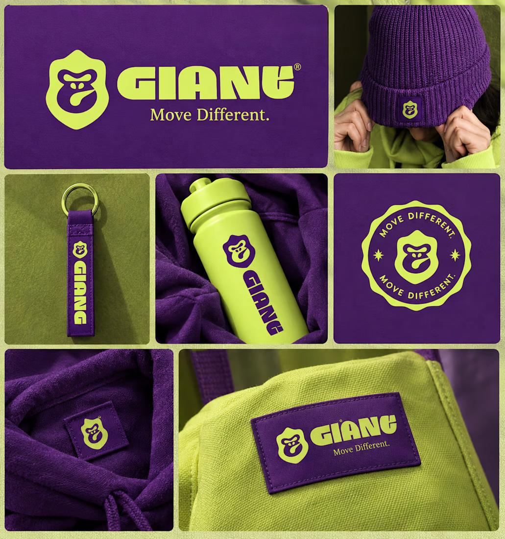

Using electric purple paired with neon lime is a high risk color choice that demands exceptional contrast management. Getting that balance right across different fabrics and lighting conditions is often where streetwear brand identities actually fail.