The network for creativity
Join 1.25M professional creatives like you
Connect with clients, get discovered, and run your business 100% commission-free
Creatives on Contra have earned over $150M and we are just getting started
Back to feedPost


The network for creativity
Join 1.25M professional creatives like you
Connect with clients, get discovered, and run your business 100% commission-free
Creatives on Contra have earned over $150M and we are just getting started

Challenges
View all


Related posts

Designed a clean, modern, and responsive business website concept to showcase services, build trust, and help businesses attract potential customers.

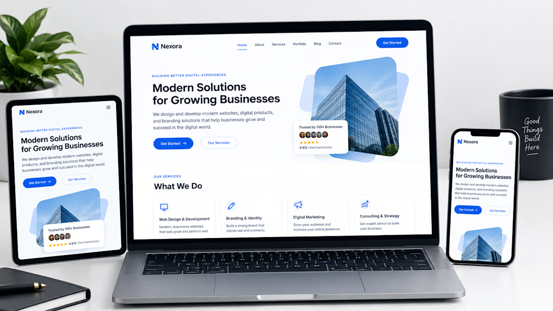

Not only is the design clean, but you also did a great job making sure it works well across different devices with a responsive design.



This is nice 👌

Tiqmo shows how a fintech site can feel fun and not just corporate. The 3D smart cards float and tumble across a bold orange hero, then glide into each section as you scroll. Playful, clean, and easy to follow all the way down to the card comparison.
Big shout-out to lee for building this. The card motion and color choices make a finance product feel exciting.


