The network for creativity
Join 1.25M professional creatives like you
Connect with clients, get discovered, and run your business 100% commission-free
Creatives on Contra have earned over $150M and we are just getting started
Back to feedPost
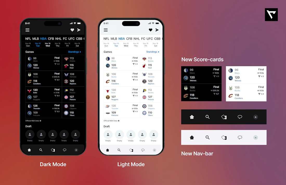
My design considerations on @realapp
1. I reduced the spacing on the individual scorecards.
2. I made sure that the page headers were a bit more visible.
3. I realigned the individual team elements in all the score cards.
4. I realigned the icon positioning on the Navbar
The goal here was to make game scores easily scannable. I achieved this by reducing spacing between elements on the score-card and changing some of the colour schemes. I also tweaked the nav-bar to have a better visual feel
The network for creativity
Join 1.25M professional creatives like you
Connect with clients, get discovered, and run your business 100% commission-free
Creatives on Contra have earned over $150M and we are just getting started
Trending
Runway
AI video generation is exploding. What are you dreaming up in Runway?
Contra University
Learn from expert creatives how to earn more using next-gen AI tools.
creativeaiflow
Creative AI workflows are evolving. What tools do you use, and what are their strengths and weaknesses?
portfolioreview
The best portfolios tell a story, not just show a grid. Share yours for feedback.
freelancerlife
Freelancer life is wins, pivots, and everything in between. What’s yours right now?