The network for creativity
Join 1.25M professional creatives like you
Connect with clients, get discovered, and run your business 100% commission-free
Creatives on Contra have earned over $150M and we are just getting started
Back to feedPost
The network for creativity
Join 1.25M professional creatives like you
Connect with clients, get discovered, and run your business 100% commission-free
Creatives on Contra have earned over $150M and we are just getting started
Related posts
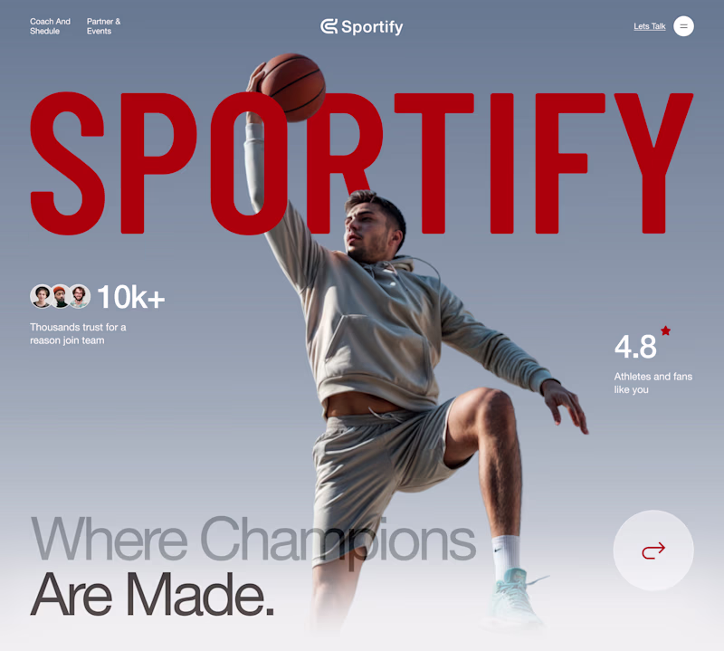
Which landing page wins in the first 3 seconds?
Same product. Same goal. Two different creative directions.
A focuses on energy, motion, and emotional impact.
B prioritizes clarity, structure, and instant readability.
If you landed on this website for the first time, which version would make you stay longer?
Vote A or B and tell me why.
Your feedback helps shape the final design.
12 voted
50%
12 voted
50%

24 votes
Closed
I really appreciate the subtle positioning of the 'Sportify' branding across both versions. Letting the player's head and the basketball layer overlapping the text in Version A gives it such great depth, while keeping it crisp and structural underneath the countdown in Version B...
Everyone says balancing usability, aesthetics, and readability on a data heavy dashboard is just good design. It's not 🙃 it's a constant tug of war: usability wants space, aesthetics wants clean, readability wants density, and on this license management build every extra column (seats, expiry, renewal, cost) buys clarity and steals it from something else in the same breath 📊
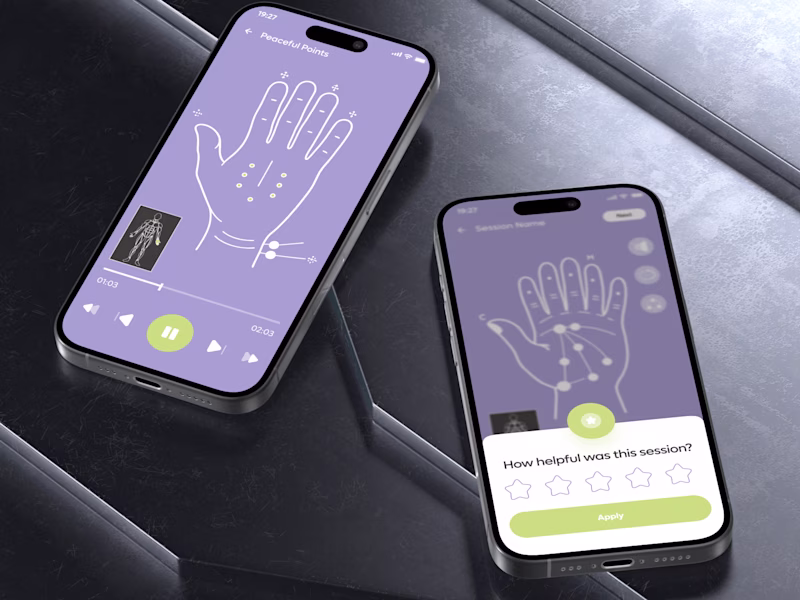
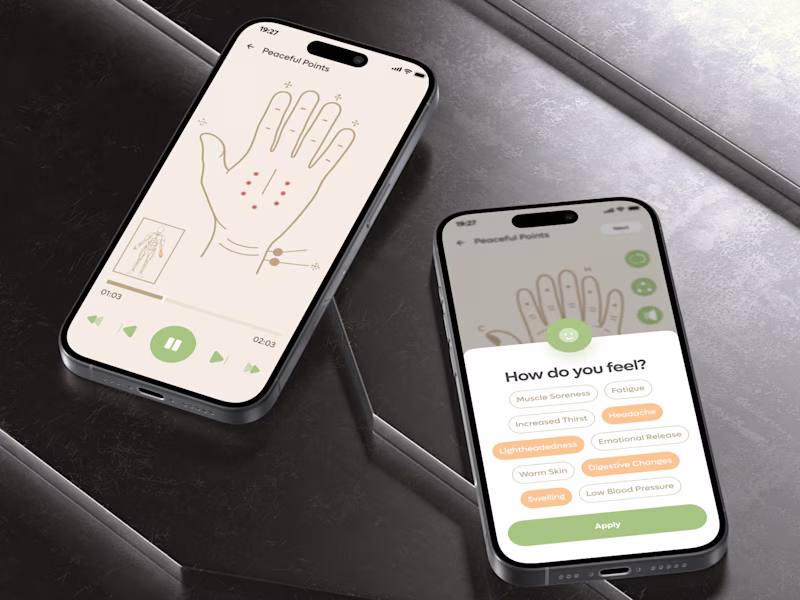
NEW TASTE TEST 🌿
Same acupressure session.
Same functionality.
Different behavioral effect
💜 A feels like a calming ritual.
🌿 B feels like a simple wellness habit
The real question is not which version looks better.
It is which one is more likely to:
increase session completion,
build trust in the treatment,
encourage daily repetition,
and turn one session into a habit.
Because in wellness products, visual design does not only shape perception. It shapes behavior
Which direction would make you return tomorrow - A or B?
Building a mobile product?
I’ll help you find more than a “better UI.” I’ll uncover the weak spots in your business model, first-session, monetization, and growth potential
👉 BOOK A MOBILE APP SESSION
https://calendly.com/asol_design/book-diagnostic-call-linkedin-clone
15 voted
43%
20 voted
57%
35 votes
Closed
Challenges
View allTrending
Claude
Claude has entered the design space. How are you using Claude Design?
Contra University
Learn from expert creatives how to earn more using next-gen AI tools.
fifaworldcup2026
The World Cup is here and the whole world's watching. How are you designing for the world stage?
creativeaiflow
Creative AI workflows are evolving. What tools do you use, and what are their strengths and weaknesses?
freelancerlife
Freelancer life is wins, pivots, and everything in between. What’s yours right now?