The network for creativity
Join 1.25M professional creatives like you
Connect with clients, get discovered, and run your business 100% commission-free
Creatives on Contra have earned over $150M and we are just getting started
Back to feedPost
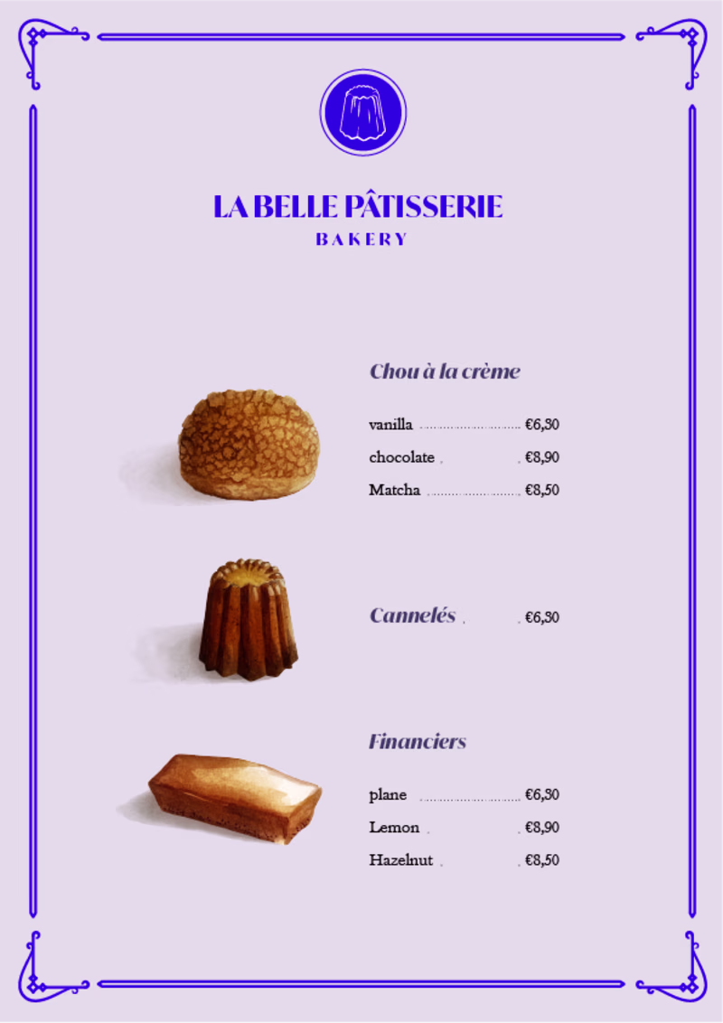
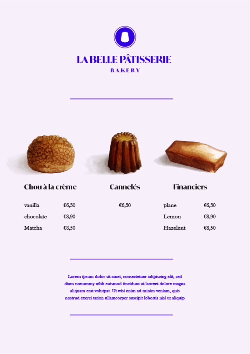
Taste Test
Hi community! I'm new on Contra, happy to be there!
I'm working on a menu with illustrations and I'm hesitating between those 2 versions... What do you think looks the best?
35 voted
58%
25 voted
42%
60 votes
Closed
Practically for a menu vertical layout is best ! The horizontal layout at some point might be a little confusing but it's a great exploration nice work 🙌🏽!
Thank you!
Thank you!
I couldn't choose because both options are good.
Oh thank you!
Old school just feels easier to read for me, cool to explore both! Look rad 🔥
Thanks so much!
Modern row
Old school version is definitely easier on the eyes for scanning through the menu, but the modern one isnt bad either maybe if there a bit more spacing between the items.
Thank you for your advice, really appreciated!
Hi @Christel Morvan, I think the left one works better for reading. I'd stick with that one!
Thank you for your help!
well come to the contra 😍
Thank you!
Modern for me
Thank you for your help!
Amazing design
Thanks a lot, I really appreciate it!
Vertical layout for me. It’s more intuitive, easier to scan, and it matches the more classic patisserie vibe perfectly.
I agree! Thank you for your advice!
Old school looks more sophisticated & elegant to me in this one! Btw blue usually is not used in food related concepts but it surprisingly works here, great work! 👍
Thank you!
Old school is user friendly, but I like the looks of modern row
Love the old school vertical, I also love that you included pictures for each category makes everything scannable!
Old school look, the eyes flow naturally, no clutter. It delivers the message right on the spot while the moderns one feels more chaotic. The flow is smooth in the old school one. Maybe try placing the image on the right since most people read left to right. Not sure i am a...
both are really good but I go with modern tbh. feels new
The network for creativity
Join 1.25M professional creatives like you
Connect with clients, get discovered, and run your business 100% commission-free
Creatives on Contra have earned over $150M and we are just getting started
Trending
Claude
Claude has entered the design space. How are you using Claude Design?
Contra University
Learn from expert creatives how to earn more using next-gen AI tools.
creativeaiflow
Creative AI workflows are evolving. What tools do you use, and what are their strengths and weaknesses?
freelancerlife
Freelancer life is wins, pivots, and everything in between. What’s yours right now?