The network for creativity
Join 1.25M professional creatives like you
Connect with clients, get discovered, and run your business 100% commission-free
Creatives on Contra have earned over $150M and we are just getting started
Back to feedPost

Ok, this became a bit ridiculous...
Is anyone else getting TWO emails with access codes after login?

The network for creativity
Join 1.25M professional creatives like you
Connect with clients, get discovered, and run your business 100% commission-free
Creatives on Contra have earned over $150M and we are just getting started



Related posts

A lot actually, even better they enter the folder 😭

How many concepts die in your drafts folder? 💀
In the spirit of Inktober, a digital sketch that never saw the light.
This was a lettering-inspired brandmark sketch playing with the letter K and the movement of hair. I archived it before presenting it. Not because I didn’t like...
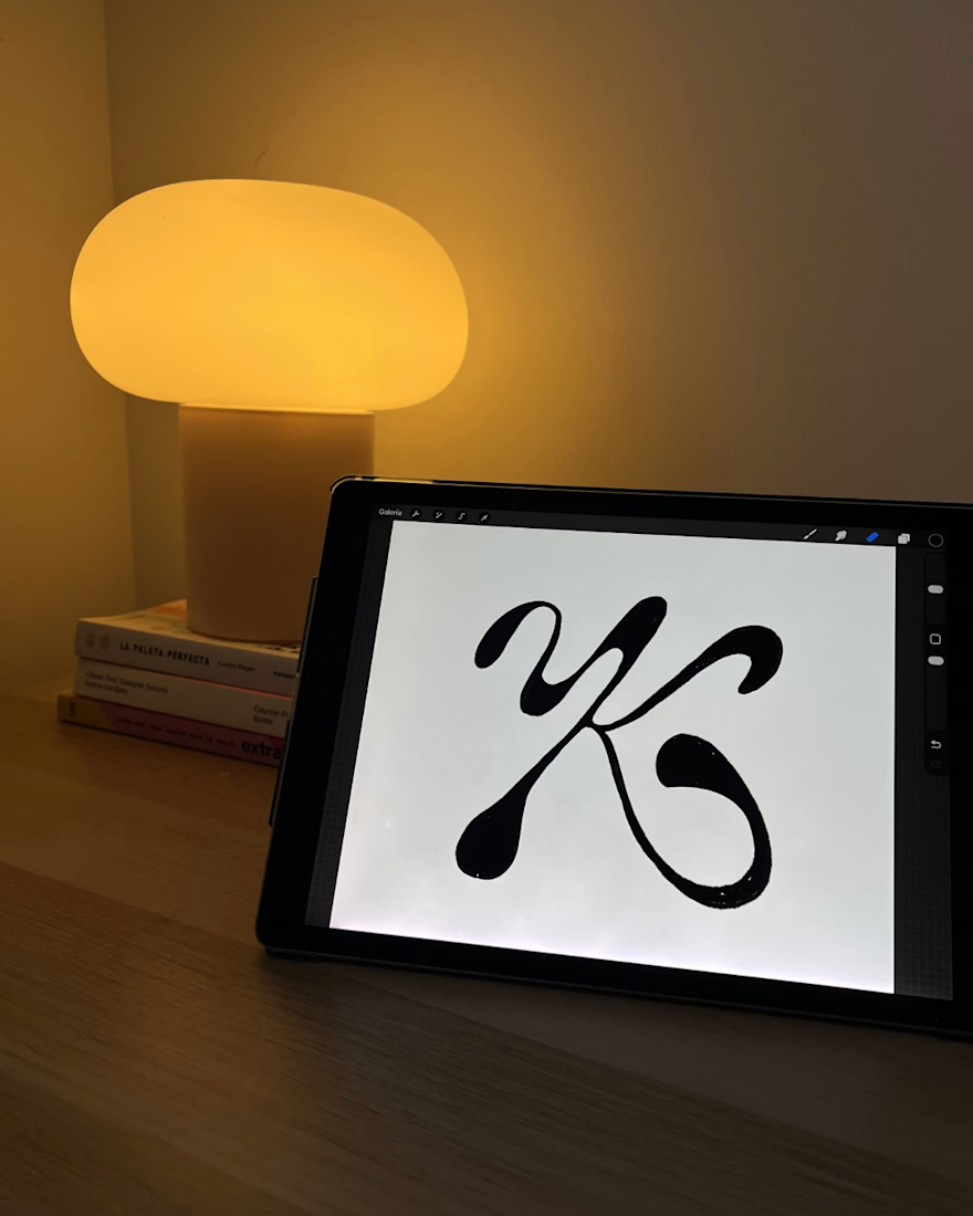



The K on the tablet has more life than most finished marks I see, and the glossy metal piece in the third frame shows the curve can carry weight outside a screen. Honest pushback: a mark this strong sitting in an archive is the real cost of skipping the pitch. Did the K lose on legibility, or was it the direction?

300 followers on Contra! 🎉
Thank you to everyone who follows my journey and supports my work. Your support means a lot! 🙌
Looking forward to connecting with more creatives, collaborating on exciting projects, and continuing to grow together.
#freelancerlife #Contra #independent #webdesign #uidesign

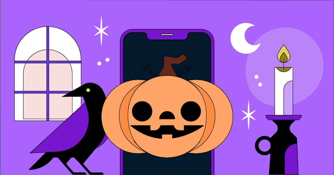
🎃🎃🎃 Halloween special, part 1: the scariest things that happen to apps after launch
🕯️ The App Store rejection email. It lands the morning of your big announcement
🔔 The permission prompt asked too early. One tap on "Don't Allow" and push notifications are gone for good
🕸️ The slow screen. Nobody complains. Users just quietly stop opening the app
🧟 The forgotten test account. It breaks, and App Review rejects you for something you never saw
🪦 The abandoned app. No updates for a year, and the OS update that finally kills it
The antidote is boring and works every time: test early, monitor everything, ship small.
Which one scares you most?:)))

Love this!