The network for creativity
Join 1.25M professional creatives like you
Connect with clients, get discovered, and run your business 100% commission-free
Creatives on Contra have earned over $150M and we are just getting started
Back to feedPost

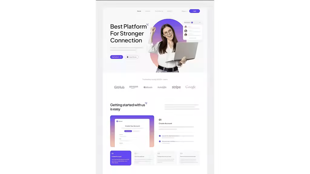
This project focused on designing a webinar and online workshop platform that feels simple, confident, and approachable.
We structured the site around a natural user journey: why the platform matters, what it enables, how it works, and real proof it delivers. The visual system uses clean spacing, readable typography, and modular components to reduce cognitive load and make the product feel familiar at first glance.
Onboarding was simplified into a four-step flow with clear CTAs, supported by testimonials and recognizable brand trust markers.
The result is a platform that feels easy to understand, comfortable to use, and credible enough to trust - suitable for instructors, attendees, and organizations.
Tags:
UI/UX, Landing Page Design, Webflow/Framer-Ready, Accessibility-Focused, Framer, Jitter.video


The network for creativity
Join 1.25M professional creatives like you
Connect with clients, get discovered, and run your business 100% commission-free
Creatives on Contra have earned over $150M and we are just getting started





