The network for creativity
Join 1.25M professional creatives like you
Connect with clients, get discovered, and run your business 100% commission-free
Creatives on Contra have earned over $150M and we are just getting started
Back to feedPost
🖥️ #FIGMAMAKEATHON
Title: MixLayer - DJ Production Mode or SoundSkin UI for Apple Music App
⚠️ Problem: Since iOS26 launched and MacOS introduced “AI Mixing,” I created an interactive live music editing experience within the Apple Music App, inspired by live editing styles like Abelton Live or Tractor Tools.
🖥️ Design: My #FigmaMakeathon 2026 Challenge Prototype:
🔊 Solution: “My MixLayer DJ Production Mode Soundskin UI Tool” is for Apple Music and iTunes Library users on iOS and MacOS, from beginners to seasoned music production pros. It offers live interactive FX Tools for House, Trance, and Hardgroove genres.
🔗 Figma Community File Link: https://www.figma.com/community/file/1610509664678637947/msfitnessny-figma-make-contra-hackathon-2026

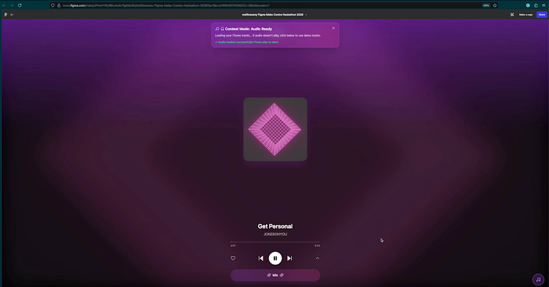

Apparently, the video demo clip I made while mixing 2 tracks live may have been too large above.. so here is a screen shot of the third screen in the DJ Surface
(1) Press, ▶️ Play to start the Track on the first screen shown above on the track: "Get Personal." (2) Click, The...
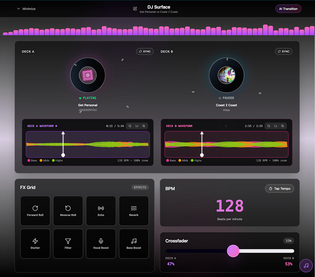
I uploaded my demo video clip here: https://youtu.be/54fkdfYa4Lg
✨ So, I whipped up a Design Portfolio Case Study further explaining my contest entry and project build using Figma.Make for my MixLayer - DJ Production Tool - UI SoundSkin - Prototype Concept which I intended to be (potentially) implemented in a future Apple Music App update.
🖥️...
The network for creativity
Join 1.25M professional creatives like you
Connect with clients, get discovered, and run your business 100% commission-free
Creatives on Contra have earned over $150M and we are just getting started





Related posts

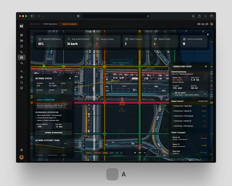
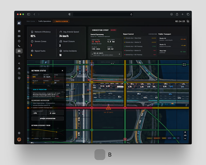
One problem. Two design directions. Which would you choose?
For AEGIS / 001.05 . Traffic Operations, we explored two approaches to the same challenge: helping city operators understand congestion, incidents and network-wide disruptions without overwhelming them with information.
Both solve the same operational problem. Different approaches to hierarchy and interaction.
If you were behind the control desk . Option A or Option B?
#smartcities #enterpriseux #productdesign #digitaltransformation #jemirae


1 voted
33%
2 voted
67%
3 votes
Closed


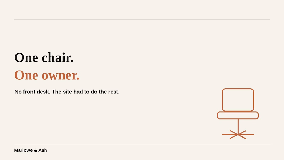
it's one chair. one owner. no front desk, no assistant, nobody picking up the phone.
that's exactly why the booking site had to do more work than most salons' ever will. built for #lovablechallenge, submitted via @contra — would appreciate a like:



Good luck Rahul 🙌

When people try a demo of your product, they should be able to tell right away what belongs to the service and what is only there to help them demo it.
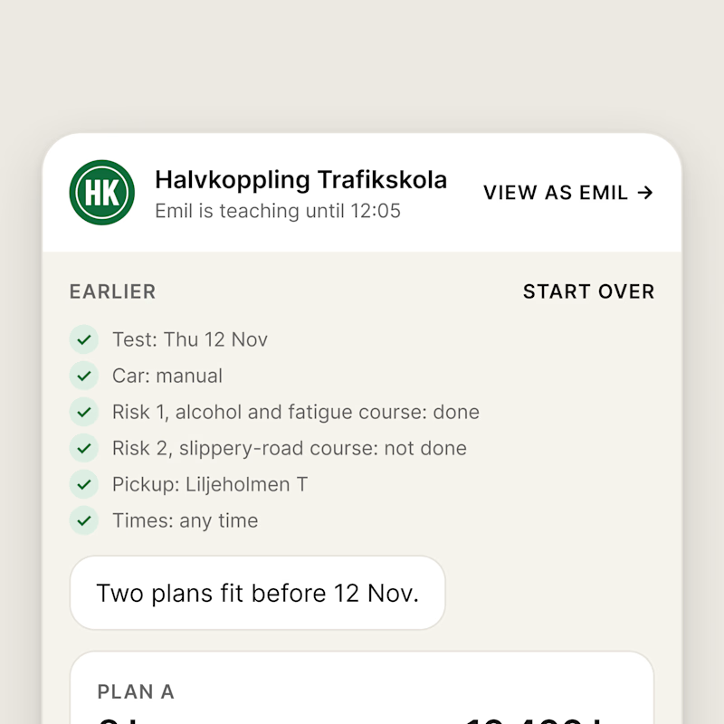
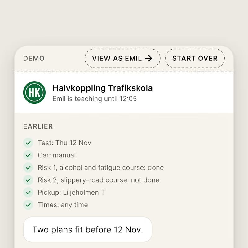
In my booking chat for a driving school, I noticed the tester links were a little confusing: VIEW AS EMIL sat in the chat header and START OVER next to the learner's answers, as if they were part of the service.
A is how it looked before. B is the change I made: I moved the demo controls into a DEMO bar on top, in their own dashed style.
Which screen is clearer?
0 voted
0%
5 voted
100%
5 votes
Closed

Demo bar for sure.