The network for creativity
Join 1.25M professional creatives like you
Connect with clients, get discovered, and run your business 100% commission-free
Creatives on Contra have earned over $150M and we are just getting started
Back to feedPost



The network for creativity
Join 1.25M professional creatives like you
Connect with clients, get discovered, and run your business 100% commission-free
Creatives on Contra have earned over $150M and we are just getting started





Related posts

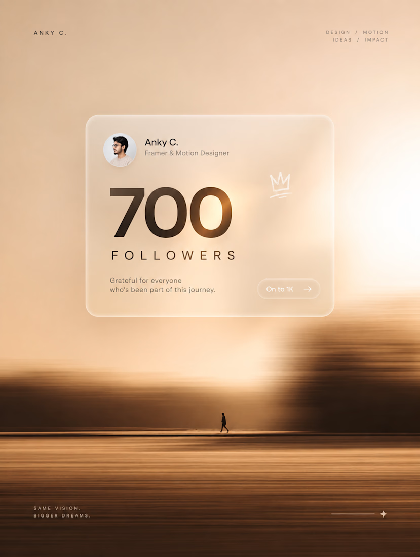
700 followers on Contra. 🫶
A small number, but a big milestone for me.
700 → 1K. Let’s keep going. ⚡
PS: Yes, the post is AI-generated.
At this point, I’m just supervising. 😂



Nothing but high end

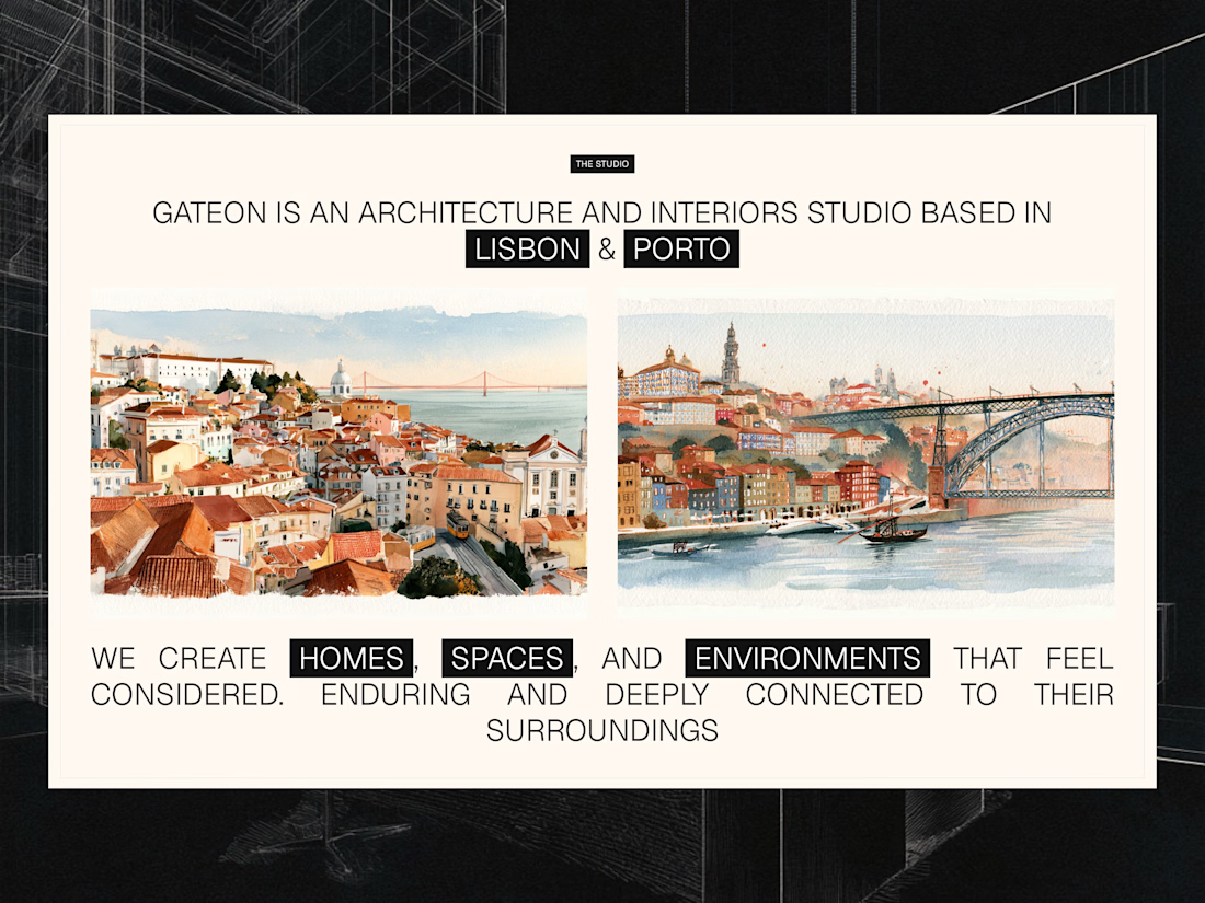
Studio section for Gateon, a interior design and architecture studio with bases in Lisbon and Porto